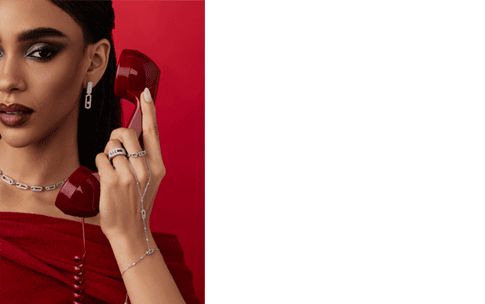


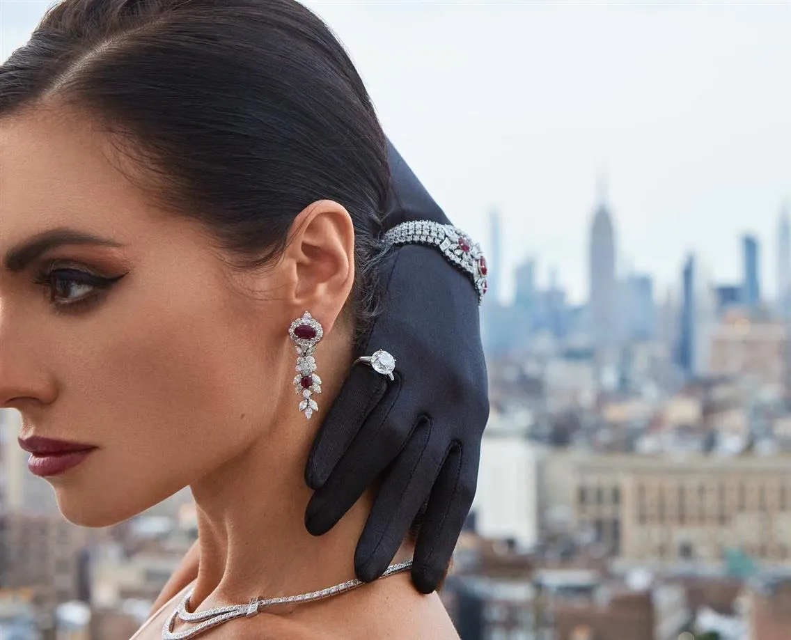
Creative Directors Every Commercial Photographer Should Follow
Behind every fashion campaign or editorial spread that has stayed in the cultural memory, there is usually someone whose name does not appear in the photograph credit: the creative director. These are the people who decide why an image exists, how it fits into a larger narrative, and where it lives in the world. They shape everything around the shot: the concept, the casting, the styling, the crops, and which photographs actually get used.
Photographers who understand how creative directors think become significantly more valuable on commercial productions. They bring ideas that serve the project rather than just their own vision. They understand the invisible architecture behind campaigns that last. They contribute to work that generates conversation rather than simply documenting clothes.
This article covers the creative directors who have shaped commercial photography from the mid-twentieth century to the present, and what photographers can take from studying their work.
Part of our complete resource: Commercial Product Photography for Photographers
How Creative Directors Define the Look of Entire Decades of Photography
The blown-out, raw aesthetic of early 2000s editorials, the hyper-polished campaigns of the '80s, the gritty realism that crept into luxury advertising in the 2010s — these weren't random trends. Creative directors with the authority and vision to push entire industries shaped them.
When a creative director at a major magazine or brand makes a bold choice, others pay attention. When Vogue starts shooting in a particular way, other fashion magazines take note. When a luxury brand successfully adopts a grittier, more documentary-style approach, competitors start wondering whether to follow.
This influence extends beyond fashion and advertising. Editorial creative directors have shaped how we think about page layout, the relationship between image and text, and even how we consume visual information. The way Instagram users intuitively understand visual flow and pacing was built over decades by magazine creative directors who understood how to guide a reader's eye across a spread.
Pioneers Who Shaped Photographic Storytelling
These are the people who established principles that we still follow today, often without realizing we're following them.
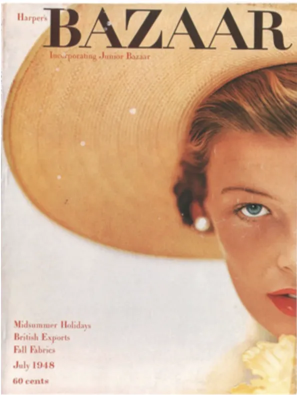
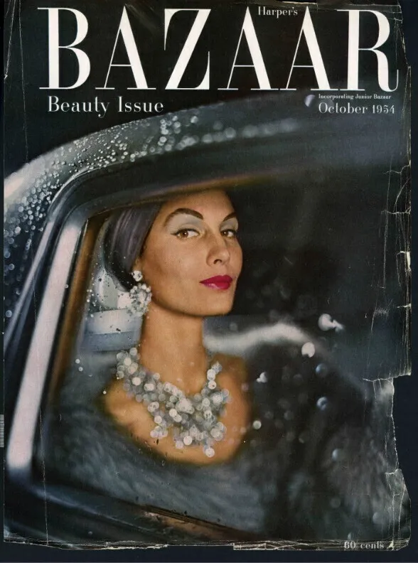
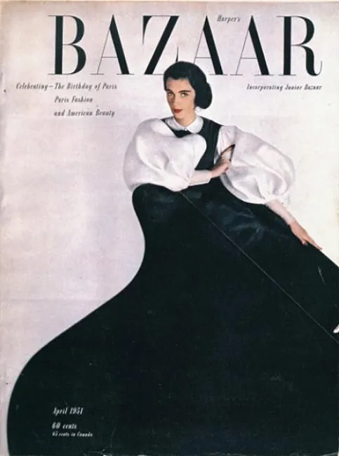
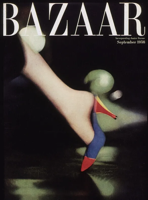
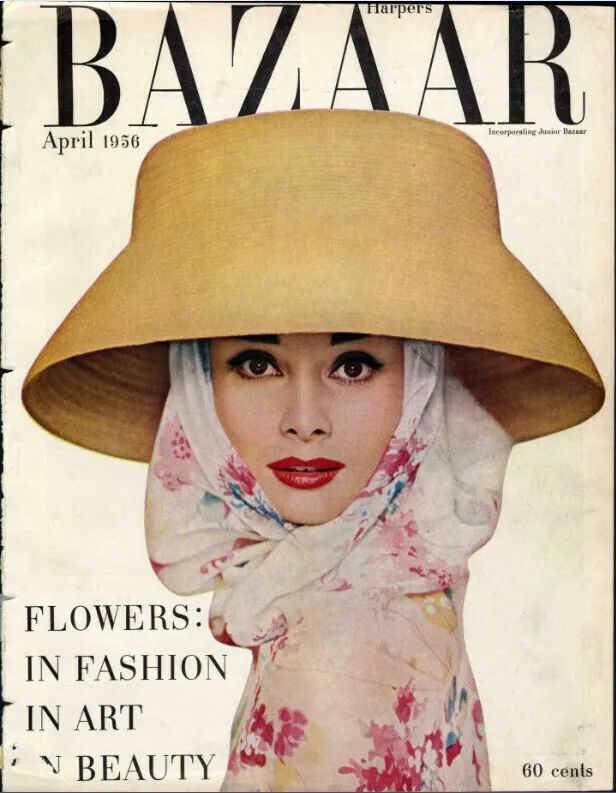
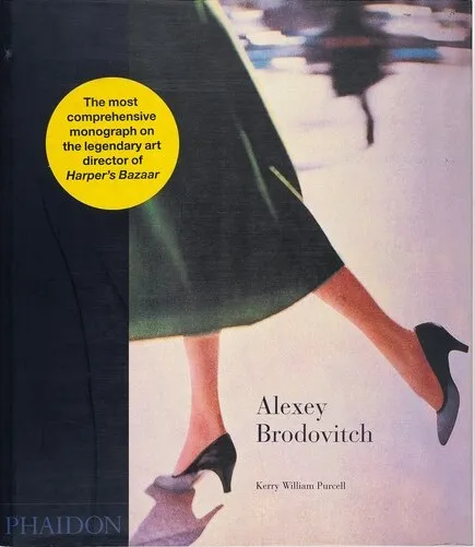
Alexey Brodovitch (Harper's Bazaar)
Brodovitch ran art direction at Harper's Bazaar from 1934 to 1958, and he essentially invented modern fashion photography. Before him, fashion images were stiff and illustrative. They existed to show the clothes clearly, almost like technical drawings. Fashion photography wasn't considered an art form.
Brodovitch changed that completely. He introduced dramatic cropping that would cut off heads or slice through bodies, radical choices that emphasized mood and movement over literal documentation. He used white space in revolutionary ways, letting images breathe on the page instead of cramming every inch with content. He encouraged photographers to experiment with motion blur, unusual angles, and unconventional compositions.
He also transformed the relationship between photographer and art director. Brodovitch ran a famous Design Laboratory where he mentored young photographers and designers, teaching them to think beyond conventional approaches. Richard Avedon was one of his students, and their collaboration at Harper's Bazaar produced some of the most dynamic fashion photography ever made. Brodovitch would create layouts that played with scale, juxtaposed images in unexpected ways, and treated each spread as a complete artistic composition.
His approach was rooted in European modernism, as he'd been exposed to constructivism and the Bauhaus before emigrating to America. He brought that sensibility to American fashion photography, insisting that commercial work could also be genuinely innovative and artistic. Every time you see a photo that bleeds off the page or uses negative space boldly, that's Brodovitch's influence.
The principles he established are: layout matters as much as the image itself, that fashion photography can convey emotion and atmosphere rather than just information, and collaboration between photographer and art director can produce something greater than either could achieve alone. These remain foundational to the field.
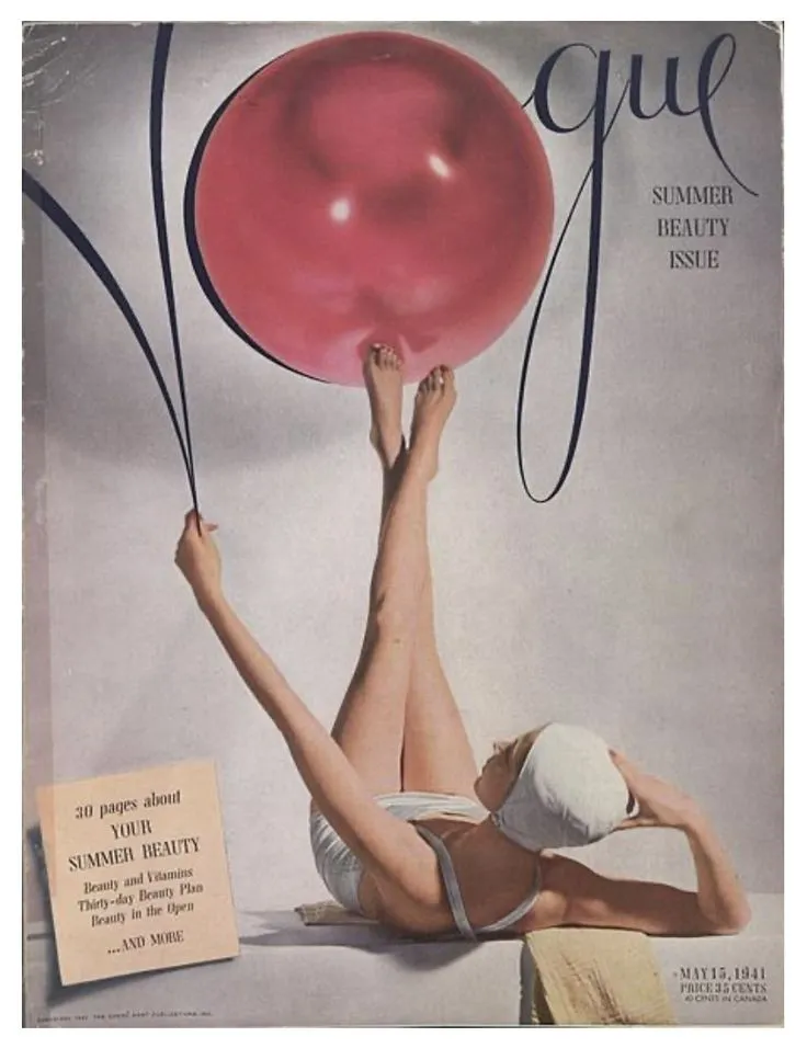
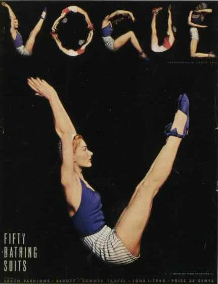
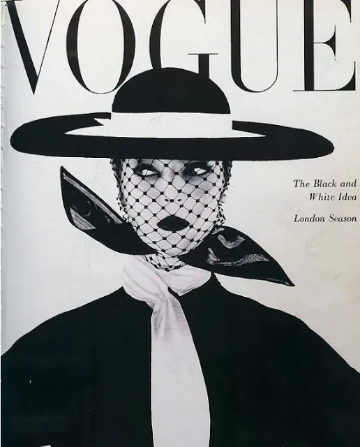
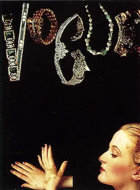
Alexander Liberman (Vogue)
As editorial director at Vogue for decades (starting in the 1940s), Liberman shaped mid-century fashion photography. He championed photographers like Irving Penn and Helmut Newton, giving them space to experiment while maintaining the magazine's polished, aspirational identity. His tenure set the tone for how high fashion was visually communicated for generations.
Liberman was himself a photographer and painter, which gave him a deep understanding of visual composition. He brought a fine art sensibility to commercial fashion photography, encouraging photographers to think of their work as more than just documentation of clothes. Under his direction, Vogue published images that were technically perfect but also artistically ambitious.
He had an eye for talent and wasn't afraid to take risks on photographers who were doing something different. He gave them challenging assignments and significant creative freedom, but he also maintained high standards. If a shoot wasn't working, he'd say so. He pushed photographers to refine their ideas and execute them with precision.
Liberman's approach to page layout emphasized elegance and clarity. He understood how to balance striking images with readable text, how to create visual variety across an issue while maintaining a cohesive identity. His design principles influenced not just fashion magazines but editorial design more broadly.
Fabien Baron (Calvin Klein)
Baron brought minimalism to its peak in the '90s, especially through his work with Calvin Klein. Those stark, almost austere campaigns, often shot by Steven Meisel, communicated through space, reduction, and breathing room. Baron understood that less could be more, and he applied that philosophy to everything from perfume ads to editorial layouts.
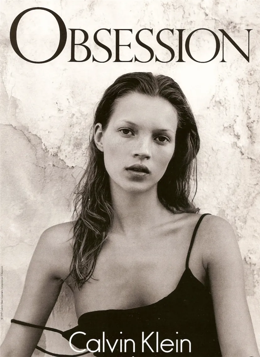
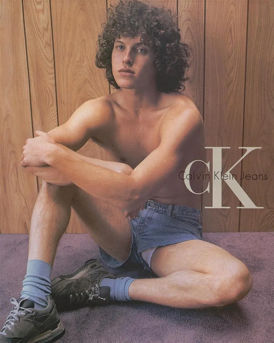
His Calvin Klein campaigns were exercises in restraint. Simple typography, often just the brand name in small letters. Huge amounts of white space. Images that were pared down to essential elements: a body, a face, a product, nothing extraneous. The effect was powerful precisely because of what wasn't there. In an era when many ads were busy and cluttered, Baron's work stopped you with its quietness.
But calling Baron's work "minimal" undersells its sophistication. Every element was carefully calibrated. The exact placement of text, the specific crop of an image, the relationship between elements on the page, all of it was considered down to the inch. His layouts looked effortless, but that effortlessness required meticulous attention to detail.
Baron also understood how to maintain consistency across different media. A Calvin Klein campaign needed to work as a magazine spread, a billboard, a perfume box, and eventually, digital formats. He created visual systems that were flexible enough to adapt while maintaining a clear identity.
His influence extended beyond Calvin Klein. He's worked with numerous fashion and beauty brands, launched and redesigned magazines, and consistently pushed for work that's elegant, refined, and unafraid of simplicity. Photographers who've worked with Baron talk about how demanding he is, but also how much they learn from his exacting standards and clear vision.
Creative Directors Who Defined Editorial Visuals
While some creative directors built legacies over decades, others redefined what editorial photography could be through sheer narrative force and willingness to push boundaries.
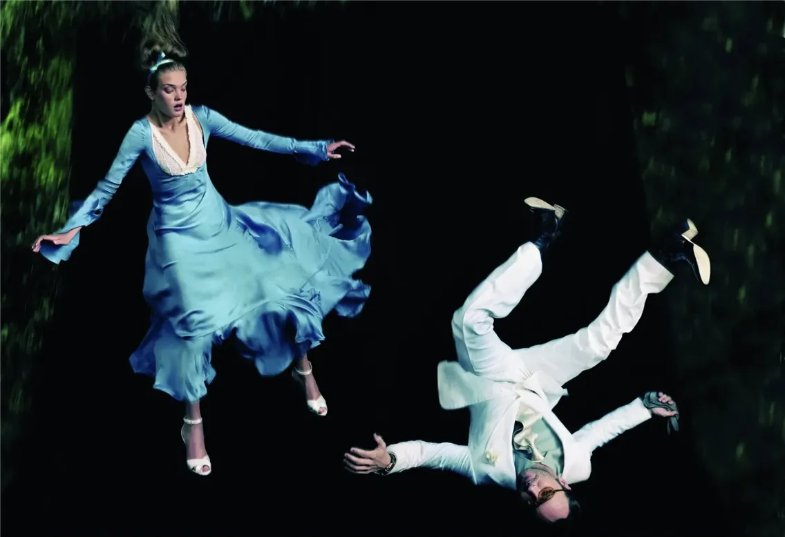
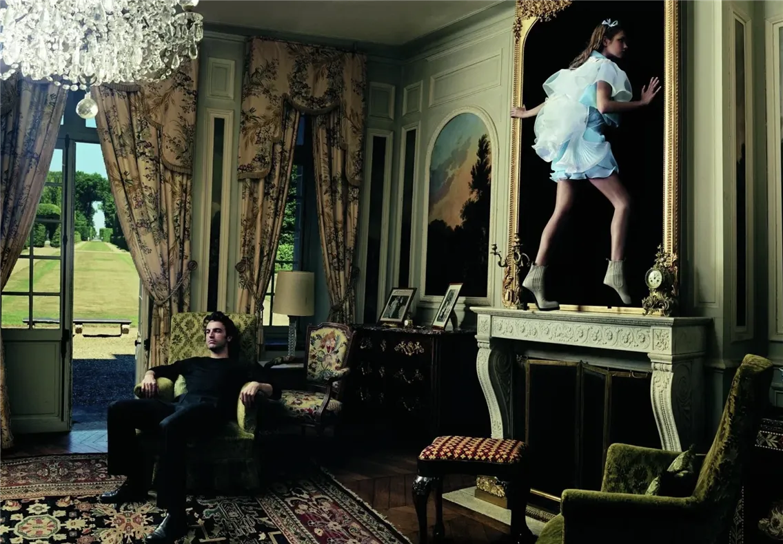
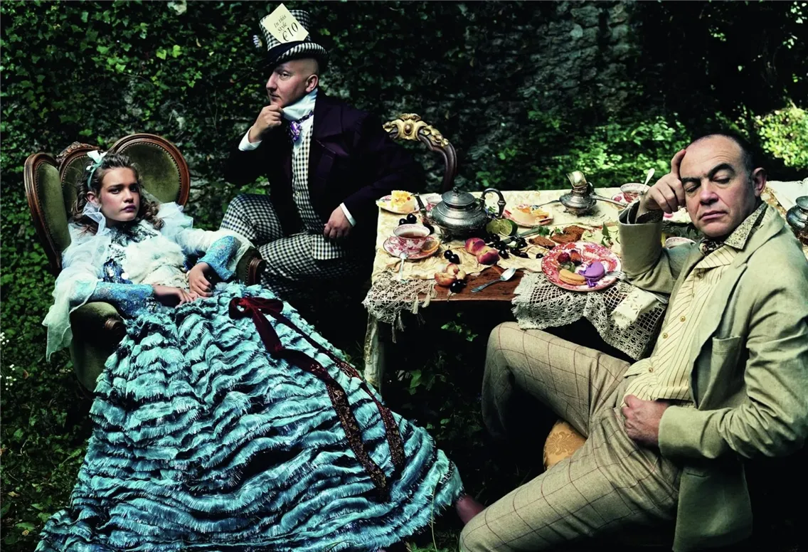
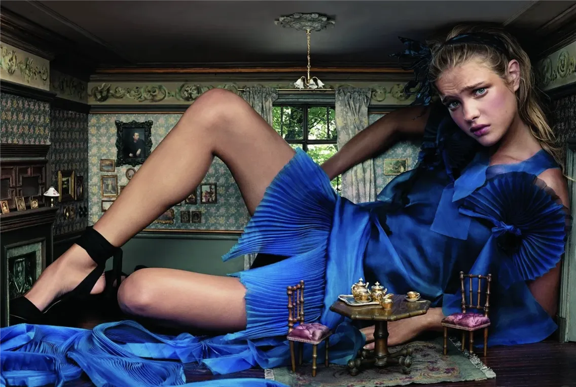
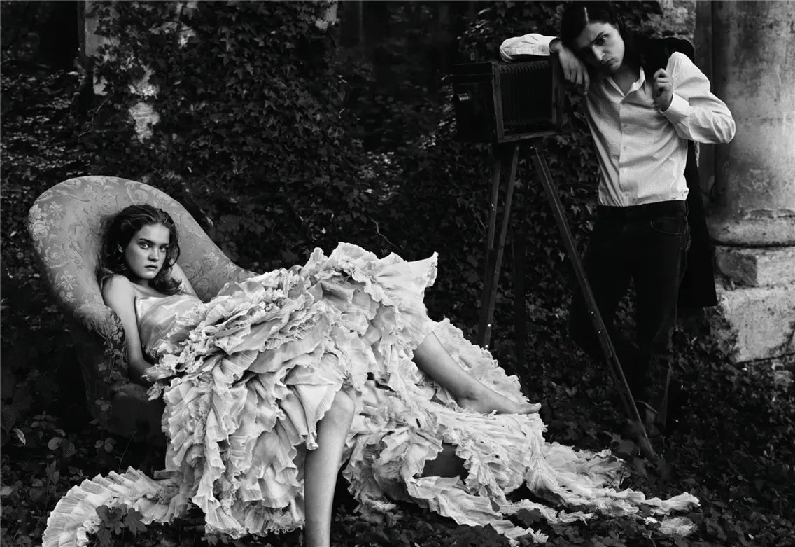
Grace Coddington (Vogue)
Coddington spent over 25 years as creative director at American Vogue, and her editorials were distinctive for their storytelling ambition. Her spreads felt cinematic, with clear characters, settings, and emotional arcs. Photographers working with her weren't shooting pretty clothes; they were illustrating chapters of a story only she could see.
A typical Coddington editorial might span ten or more pages and tell a complete story. Maybe it's a fantasy narrative about a woman escaping to the countryside, or a meditation on youth and aging, or a fairy tale reimagined with contemporary fashion. She'd work with the photographer to create images that built on each other, that had pacing and progression. Early images might establish the setting and mood, middle images would develop the narrative, and final images would provide resolution or leave questions lingering.
Her references were deep and varied: art history, literature, cinema, theater. She'd reference Pre-Raphaelite paintings, Fellini films, Victorian novels, ballet productions. She was remixing them through the lens of contemporary fashion. The result was work that felt both timeless and completely current.
Coddington's process was famously intense. She'd spend months planning a single editorial, scouting locations, finding the right cast, and working with designers to pull clothes that would work for the story. On set, she was deeply involved in every detail: the placement of a hand, the way light hit a dress, the expression on a model's face. Photographers who worked with her regularly, like Steven Meisel and Annie Leibovitz, understood her visual language and could help bring her visions to life.
Her approach demonstrated that fashion imagery could have depth, drama, and real narrative structure. She proved that editorial fashion photography could be as rich and complex as any other form of visual storytelling. Her influence can be seen in every fashion editorial that attempts to tell a story rather than just showcase clothes.
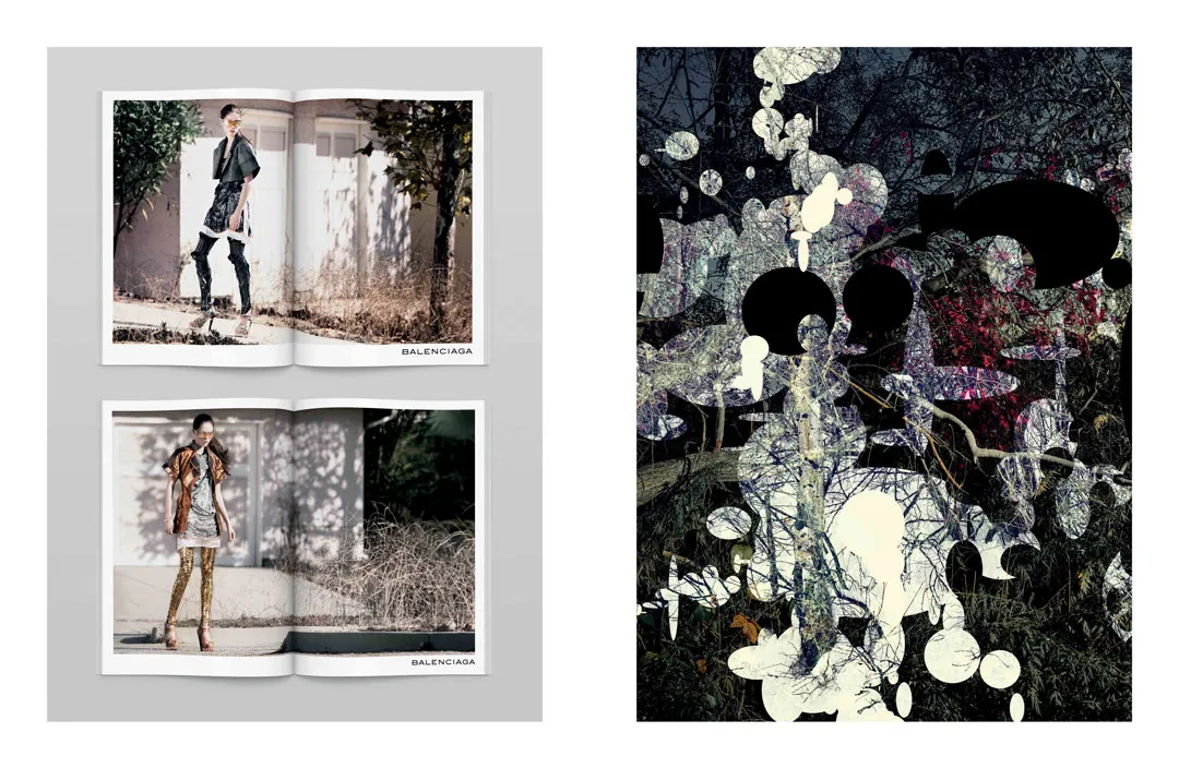
Ezra Petronio (Self Service, Petronio Associates)
Petronio brought a rawness to luxury. As founder of Self Service magazine and through his agency Petronio Associates, he directed campaigns for brands like Yves Saint Laurent and Balenciaga that felt stripped-down and honest. His aesthetic rejected perfection in favor of authenticity and edge, even in high fashion contexts.
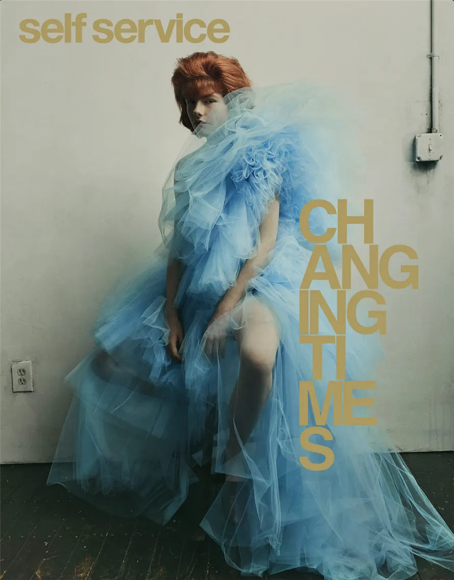
Self Service, which Petronio launched in the late '90s, was positioned as an anti-fashion fashion magazine. The photography was often grainy, the models looked like real people rather than mannequins, and the overall vibe was more art journal than glossy fashion bible. But it was still showcasing high fashion, but Petronio just refused to present it in the traditional, overly polished way.
This aesthetic carried over to his commercial work. When he directed campaigns for luxury brands, he brought that same rawness and authenticity. Images might be slightly out of focus, lit with available light, shot in unglamorous locations. Models might look tired or moody rather than perfectly camera-ready. The clothes were still beautiful and carefully styled, but the context felt more human and less aspirational in the traditional sense.
Petronio's approach resonated particularly well with younger audiences who were skeptical of traditional luxury advertising's perfectionism. His work suggested that luxury didn't have to mean unattainable, could be aspirational while still feeling authentic and accessible. This philosophy influenced a generation of creative directors who came after him.
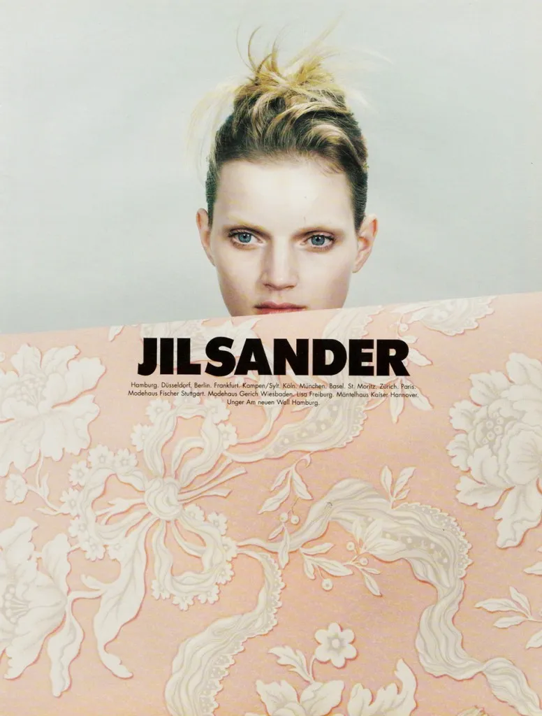
Marc Ascoli (Jil Sander, Yohji Yamamoto)
Ascoli's work for brands like Jil Sander and Yohji Yamamoto redefined minimalist fashion photography. His direction was quiet, precise, and deeply considered. He understood how to use stillness and negative space to create images that felt almost architectural. For photographers, working with Ascoli meant learning restraint and trusting that simplicity could carry weight.
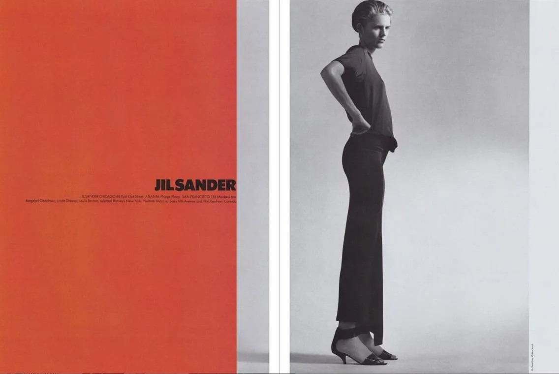
Where some creative directors fill the frame with energy and detail, Ascoli stripped away everything non-essential. His images often featured a single figure in a large, empty space. The lighting was usually soft and even, avoiding drama. The model's pose and expression were subtle, almost neutral. The focus was entirely on the garment's form, its relationship to the body, and the overall composition.
This approach required tremendous discipline from photographers. There was nowhere to hide: no dramatic lighting to add context, no busy backgrounds to fill the void, no extreme poses to catch the eye. The image had to work through pure form, proportion, and the quality of light. Every small choice became crucial because there were so few elements in play.
Ascoli's images had a meditative quality, inviting viewers to slow down and really look. They worked beautifully in print, where their simplicity stood out amid more chaotic layouts. They also translated well to large-scale formats like billboards, where their clarity and restraint had a real impact.
His influence can be seen in contemporary fashion photography's ongoing fascination with negative space and restraint, particularly in luxury contexts where brands want to communicate sophistication and refinement.
Contemporary Creative Directors Behind Campaign Aesthetics
Today's creative directors navigate a more complex landscape: social media, diversity conversations, and brands that need to work across dozens of platforms simultaneously. They are dealing with shifting cultural expectations and audiences that demand both visual sophistication and authentic representation.
Olivier Rizzo (Prada and Miu Miu)
Rizzo has been behind some of the most distinctive Prada and Miu Miu campaigns in recent years. His creative direction has a specific visual language, often surreal, sometimes playful, always meticulously styled. He works closely with photographers to create imagery that's instantly recognizable as his, even when the photographer changes from campaign to campaign.
What makes Rizzo's work distinctive is his willingness to embrace strangeness. His campaigns often feature unusual casting choices, unexpected color combinations, and surreal styling that borders on costume. Models might be photographed against garish colored backgrounds, styled in ways that clash deliberately, or posed in awkward or theatrical positions. The effect is eye-catching and memorable, yet every strange choice serves a purpose.
Rizzo understands that in today's overinformed visual environment, brands need to have a unique voice. Pretty, conventional fashion imagery gets scrolled past. But something unconventional, something that makes a viewer stop and ask what they are looking at — that cuts through. His work for Miu Miu in particular has embraced this philosophy, creating campaigns that feel like strange little films or theater productions.
But the strangeness never overwhelms the clothes. Rizzo is still fundamentally focused on showcasing the garments, just in ways that are more interesting than realistic fashion photography. He's also skilled at creating work that functions across different media, his campaigns work as magazine spreads, social media posts, retail displays, and outdoor advertising.
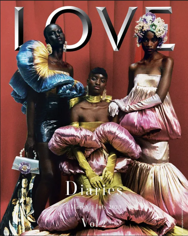
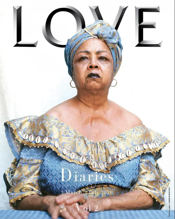
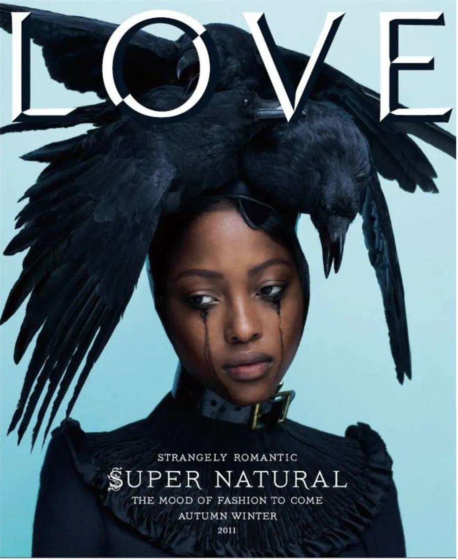
Katie Grand (Marc Jacobs, Miu Miu)
Grand founded Love magazine and has directed campaigns for Marc Jacobs, Miu Miu, and numerous other brands. She's known for bold, sometimes provocative imagery that pushes boundaries while staying deeply rooted in fashion history. She's a master at casting and styling, and photographers who work with her know they're part of something that will generate conversation.
Grand's work often plays with fashion archetypes and references. She might do a campaign that riffs on '70s Helmut Newton aesthetics, or create an editorial that references '90s grunge but with a contemporary twist. She's encyclopedic in her knowledge of fashion history and photography history, and she uses that knowledge to create work that feels both familiar and fresh.
Her casting choices are consistently interesting. She's not afraid to use unconventional models or to cast in ways that subvert expectations. She'll pair emerging unknowns with established supermodels, or cast people who wouldn't traditionally be considered fashion models. This approach has kept her work feeling current and culturally engaged.
Grand also understands provocation. Some of her work has courted controversy, pushing boundaries around sexuality, gender, or conventional beauty standards. But the provocation is connected to broader conversations about representation, power, and the gaze. Photographers working with her need to be comfortable with work that might generate strong reactions.
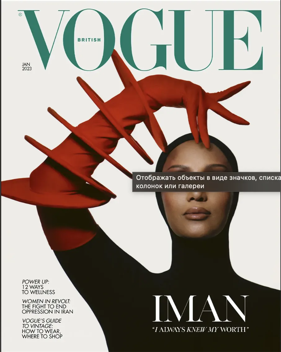
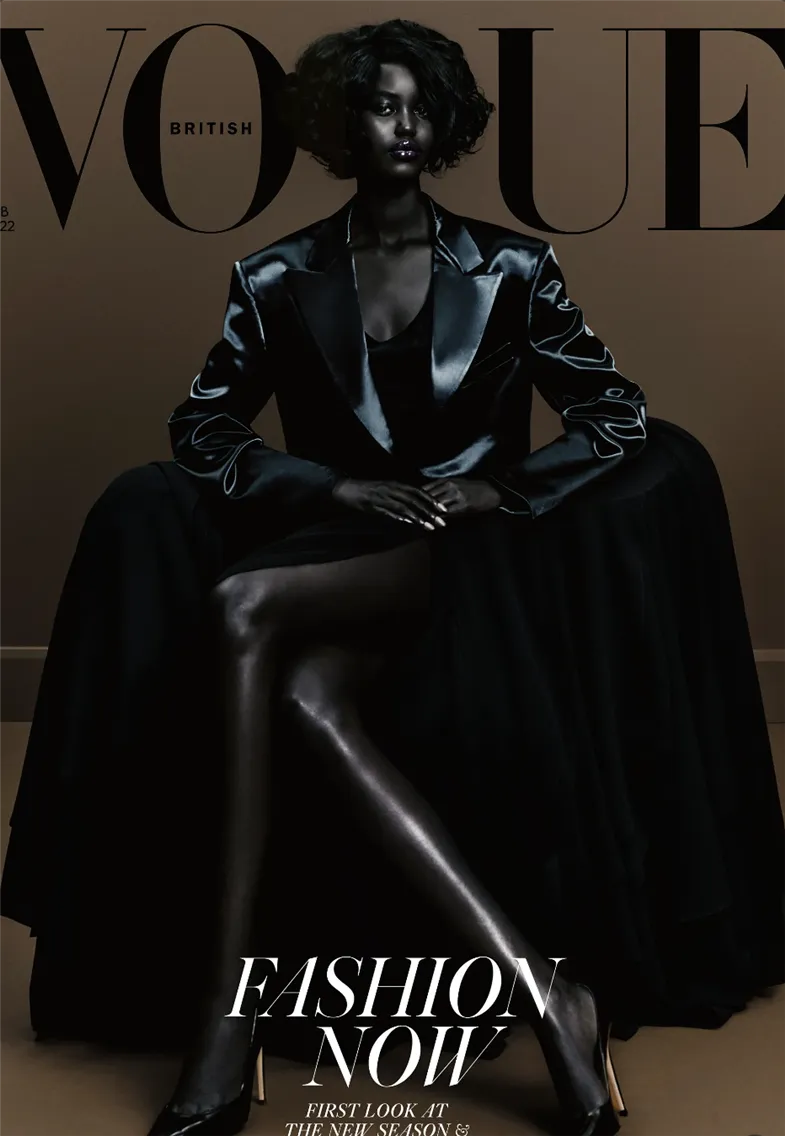
Edward Enninful (British Vogue)
As editor-in-chief of British Vogue (a role that includes creative direction), Enninful reshaped what the magazine could look like. He brought in diverse voices, unexpected casting, and narratives that felt urgent and contemporary. Under his direction, photographers were contributing to cultural conversations about representation, identity, and power.
Enninful's first cover for British Vogue featured model Adwoa Aboah and was shot by Steven Meisel. The image was striking and direct, and it signaled that the magazine would be different under his leadership. Subsequent covers featured diverse casts, challenged conventional beauty standards, and highlighted voices that hadn not traditionally been centered in fashion media.
Enninful's impact changed the magazine's visual language to feel more documentary, more real, less reliant on traditional fashion photography's perfectionism. He commissioned photographers to shoot in ways that felt more connected to real life. He featured more clothing from diverse designers, highlighted social issues, and used the magazine's platform to amplify conversations about race, gender, and class in fashion.
For photographers, working with such creative direction meant considering who was in front of the camera, what story was being told, and what message the work was sending. It meant being open to diverse beauty standards and willing to photograph subjects in ways that felt authentic rather than overly styled.
His tenure at British Vogue demonstrated that a major fashion magazine could be both commercially successful and culturally progressive. He proved that audiences wanted to see themselves reflected in fashion media, and that the industry's traditional narrowness around representation wasn't inevitable; it was a choice that could be changed.
What Photographers Can Learn from Creative Directors
Understanding how creative directors think makes photographers more valuable on commercial productions. When photographers understand the framework creative directors are operating within, they can contribute more meaningfully to the work.
Reading Brand DNA Before Shooting
Strong creative directors can look at a brand and immediately understand its visual language. They understand what the brand would never do, what it has done too much of, and what new territory it should explore. Photographers who develop this same skill become genuine assets to their clients.
Studying brands before pitching or shooting for them builds this understanding. That means looking at past campaigns, not just the most recent one but several years back. What is consistent? What has changed? What visual elements appear repeatedly? What is the color palette, the mood, the casting, the locations? Is the photography always high-contrast or softer? Are models looking at camera or looking away? Are images tightly cropped or do they have breathing room?
The deeper the understanding of brand identity, the more a photographer's work feels like a natural fit rather than something imposed from outside.
Thinking "Campaigns" not Poses or Setting
One strong shot is valuable. A cohesive campaign that works across formats gets a photographer rehired. Creative directors think in systems: how do the ads relate to the Instagram grid? How does the editorial spread support the campaign's message? How do the images work in sequence?
A photographer thinking this way does not focus only on capturing a hero image. They consider what else the client needs: vertical versions for stories, square versions for feed posts, and landscape versions for websites and billboards. Variety across different framings, different moments, and different energies — all related, all part of a system.
Images also need to work together to tell a story. An editorial requires pacing: wide shots to establish setting, medium shots to show outfit details, close-ups for emotion or texture. Images that can be sequenced into a narrative flow rather than a collection of unrelated frames.
The Importance of Collaboration and Flexibility
Creative directors manage dozens of moving parts simultaneously. The photographers they return to are those who bring ideas to the table but stay flexible when the direction shifts. Protecting a personal vision works in personal work. On campaigns, collaboration is the currency.
This does not mean executing whatever is asked without question. Good creative directors want photographers who have opinions and ideas. But those ideas need to be in service of the project's goals, not the photographer's personal vision.
A creative director is accountable to the client or the brand. When they push back on ideas, it is not obstruction — it is an attempt to deliver work that meets the brief, stays on-brand, and satisfies stakeholders who are not on set. Understanding their position makes the collaboration more productive.
Where to Study Their Work
The magazines that built reputations on strong creative direction are the primary study material: Vogue, Harper's Bazaar, Self Service, Love, i-D, Dazed, 032c, Another Magazine. Studying these means more than browsing casually. It means analyzing the layouts, how images are cropped and placed on the page, the relationship between photographs and typography, and how a multi-page editorial builds momentum through pacing and variety.
Paying attention to mastheads connects names to visual approaches. When a creative director moves from one publication to another, the visual identity shifts with them, and that shift is immediately legible once the pattern has been noticed.
Revisiting notable campaigns analytically is equally valuable. Calvin Klein in the 1990s under Fabien Baron: what makes those campaigns feel cohesive? How do they use space and minimalism? Prada and Miu Miu under various creative directors: how does the visual identity shift with different leadership? Gucci across its multiple reinventions over the past few decades: what drove each transition?
The analysis extends beyond photography to styling, casting, cropping, and overall aesthetic choices. Reverse-engineering the decision-making — why this model, why this location, why this color palette, what is this campaign communicating beyond the product — builds the visual intelligence that makes a photographer more useful in a creative director's process.
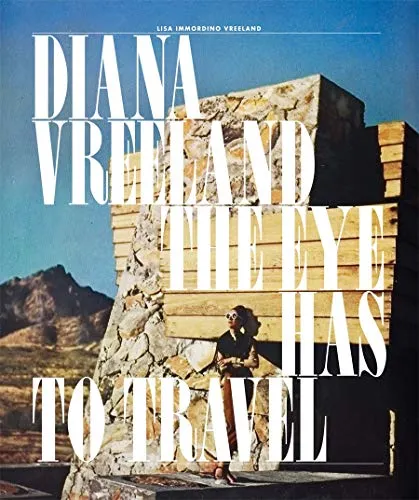
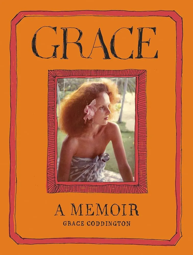
Books and monographs offer the deepest access to individual creative visions. Many creative directors have published books or been the subject of retrospectives: Diana Vreeland: The Eye Has to Travel, Fabien Baron: Works 1983-2019, Grace: A Memoir by Grace Coddington, Alexey Brodovitch by Kerry William Purcell. These volumes include behind-the-scenes material, rejected work, and commentary that reveals the thinking behind final results in ways that finished campaigns alone cannot.
Museum and gallery exhibitions are worth seeking out when available. Fashion photography exhibitions often include layouts, contact sheets, and contextual material that shows how campaigns came together. Institutions like the Victoria and Albert Museum, the Museum of Modern Art, and various fashion museums regularly mount relevant exhibitions.
Online archives are increasingly accessible. The Condé Nast archive has digitized decades of Vogue and other publications. Many magazines have put their back catalogs online. Individual creative directors and photographers maintain websites and social media presences where they share work and process. Tracing how visual languages evolved over time using these resources builds a historical perspective that is difficult to develop from contemporary work alone.
Studying contemporary work actively complements the historical study. Reading interviews with creative directors in publications like Business of Fashion, The Cut, Design Observer, and trade publications reveals how they think about briefs, brands, and collaboration.
Building a personal reference library consolidates all of this. When work resonates, saving and organizing it by creative director, brand, or aesthetic approach creates a resource to return to regularly. The more visual material absorbed and analyzed, the better the understanding of the patterns and principles that make certain work effective.
Taking Creative Direction Into Your Own Work
Understanding creative directors changes how photography is perceived. The invisible architecture behind every campaign, every editorial, and every brand image that has staying power becomes readable. The decisions that produced it stop looking arbitrary and start revealing their logic.
Photographers who build lasting commercial careers are those who can think in campaigns, bring ideas while remaining flexible, and understand themselves as part of a larger creative process. That understanding is what makes collaboration productive rather than merely transactional.
For further reading:
- How to Shoot for Fashion Magazines: The Roadmap to Vogue
- Build a Strong Fashion Photographer Portfolio
- Clothing and Fabric Retouching Techniques
- Creative Product Photography: Ideas and Inspiration
- What Does a Creative Director Do in eCommerce Photography?
- Creative Director vs Artistic Director in Commercial Photography


