




Do You Need White Background Photos for an eCommerce Website?
In eCommerce, visuals are the pitch. Before the product description, before the reviews, the photo makes the first impression. The background is the stage. Get it right, and the product shines. Get it wrong, and even a well-made SKU fails to capture attention or, worse, drives potential customers away.
White backgrounds are the industry standard for a reason: they are clean, consistent, and make the product the center of attention. The term "white," however, refers to a spectrum. There is pure white, used on Amazon and most major marketplaces. There is open light, off-white, and muted color backgrounds. Each has its use case.
Some are required to meet marketplace standards. Others are used to communicate brand identity. The most effective eCommerce brands know when to follow the standard and when to depart from it strategically.
This guide covers the different types of white and neutral backgrounds, when to use each, how background choice affects specific product categories, and how to build a background system that scales across an entire catalog.
Part of our complete guide: The Ultimate Guide to eCommerce Product Photography
Why White Background Product Photography Dominates eCommerce
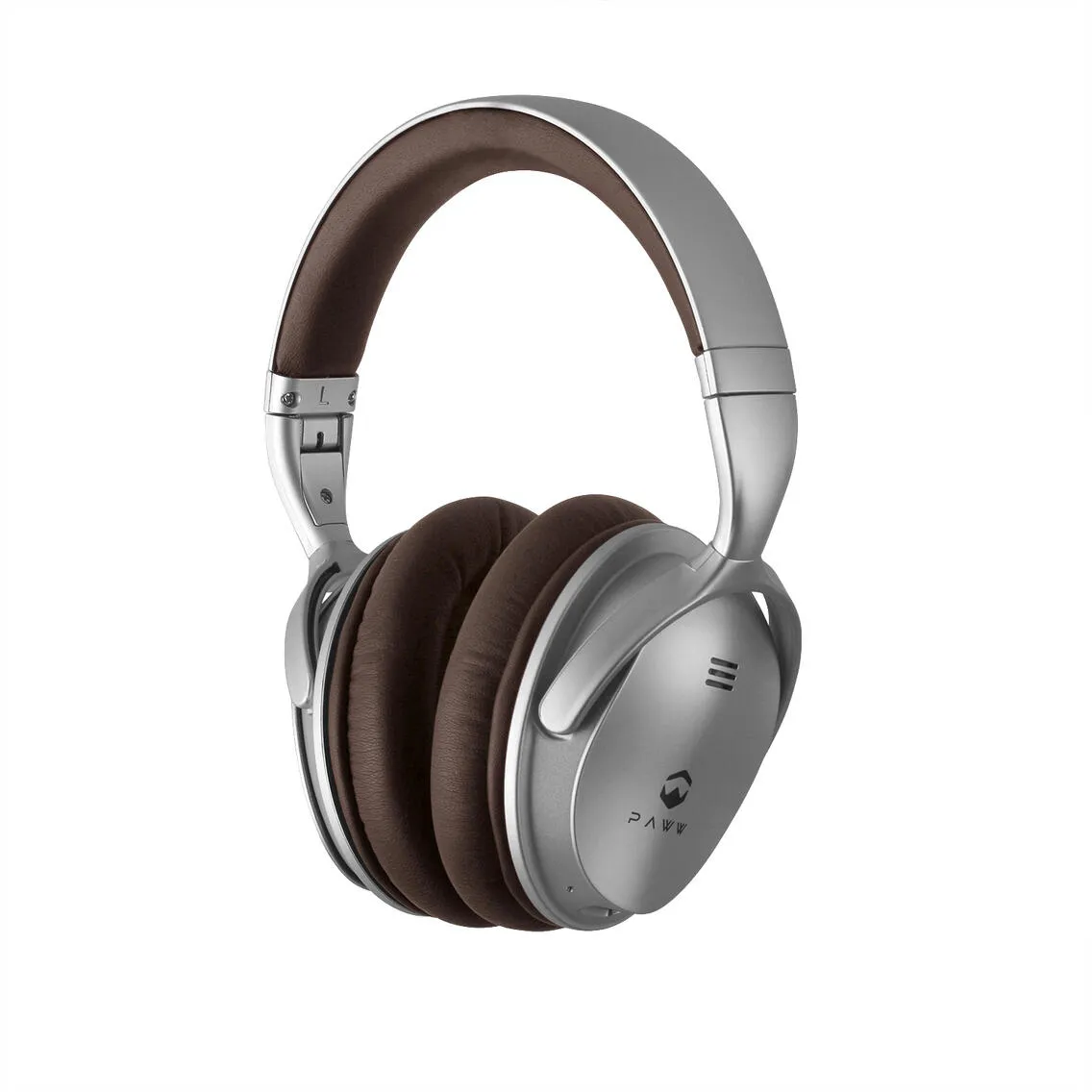
A white background does one critical thing: it makes the product the sole focus. Product catalog pages with uniform, pure white backgrounds help small or new eCommerce sites look as professional as well-established retailers like Macy's or Amazon. That sense of order and professionalism instills trust that can make shoppers feel confident buying, especially when they cannot touch or try the product first.
White Backgrounds Help with Product Comparison and Reduce Returns
Backgrounds affect how clearly a product appears, which directly impacts purchase decisions. When someone is comparing two rings, two backpacks, or two shades of foundation, a neutral background makes subtle differences visible.
Clarity is what gives customers confidence to click Add to Cart. If a photo creates uncertainty the customer either abandons the product or buys it and returns it. Both outcomes are bad for business. A product on a white background gives customers what they need: a clear view, no distractions, and no confusion.
For how photography accuracy directly affects return rates: Reducing Product Return Rates Through Accurate Photography
Understanding Different Types of Seamless Backgrounds for Product Photography
The background is not just an aesthetic choice, it is part of the user experience. It directly shapes how a customer perceives the brand, processes information, and decides to buy.
Pure white backgrounds: the platform-approved standard
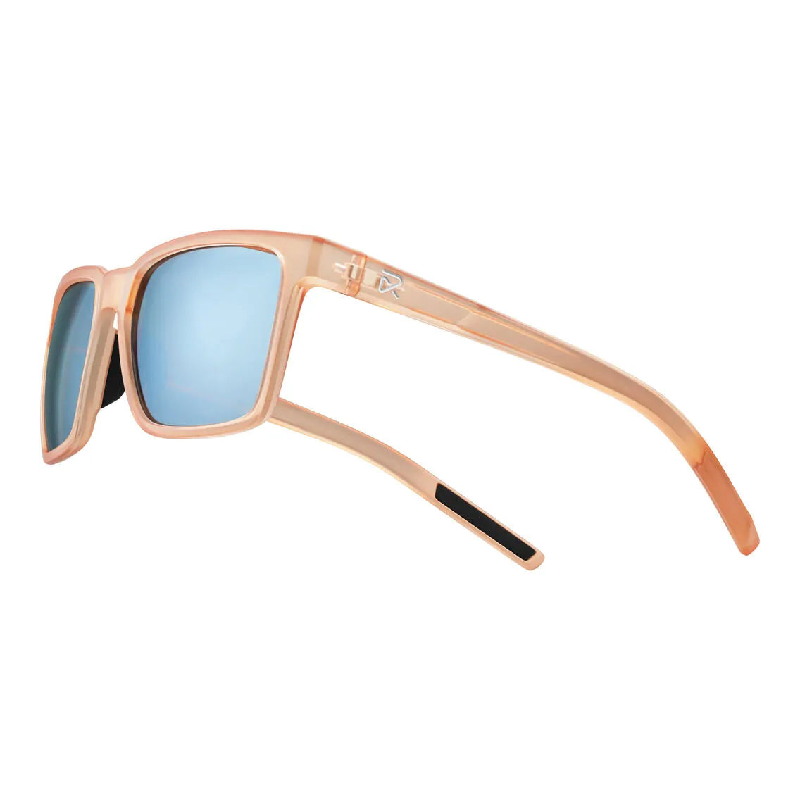
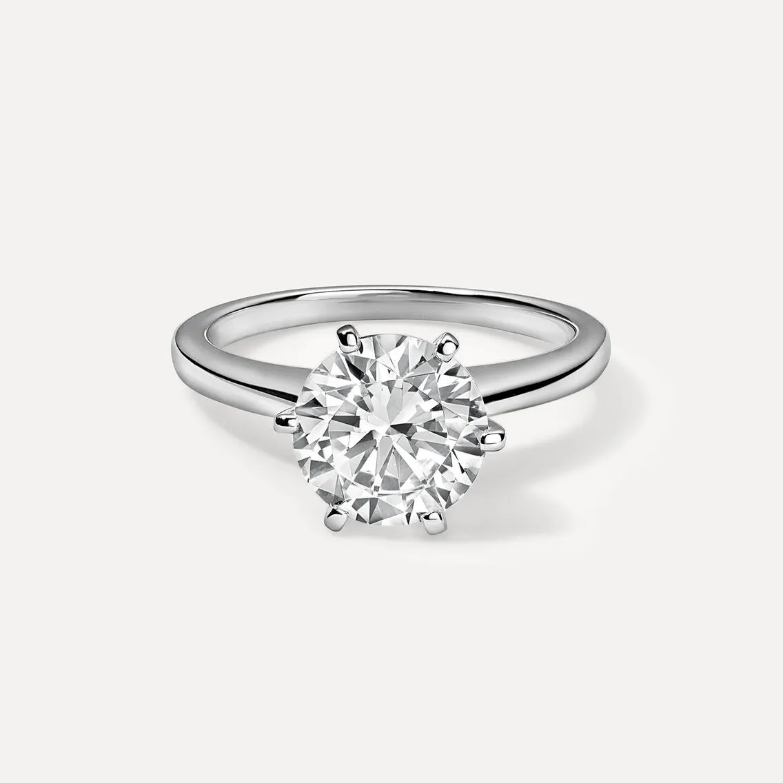
Pure white means RGB 255,255,255. It is the cleanest possible white, with no gradients, no variation. It gives the product a professional, isolated look that emphasizes every detail.
If you are selling on Amazon, Walmart, Macy's, Ssense, or other major marketplaces, white backgrounds are mandatory for primary product images. No exceptions.
Beyond platform rules, pure white also works exceptionally well for:
- Comparison shots between similar SKUs
- Technical products, supplements, or any item where specs matter
- When you want high contrast and zero distractions
Pure white product photos can look sterile if used across an entire DTC catalog, and in certain product categories can feel outdated. But as infrastructure for marketplace listings, nothing replaces it.
Also, there is the technical side. White and near-white backgrounds typically offer easier compression, better compatibility with background removal and AR tools, higher quality on mobile screens, and faster load times — all of which matter as the majority of purchases now happen on mobile.
For how Amazon image specifications affect listing performance: 5 Reasons Your Amazon Sales Have Slowed Down
Off-white Backgrounds: Editorial Neutrals
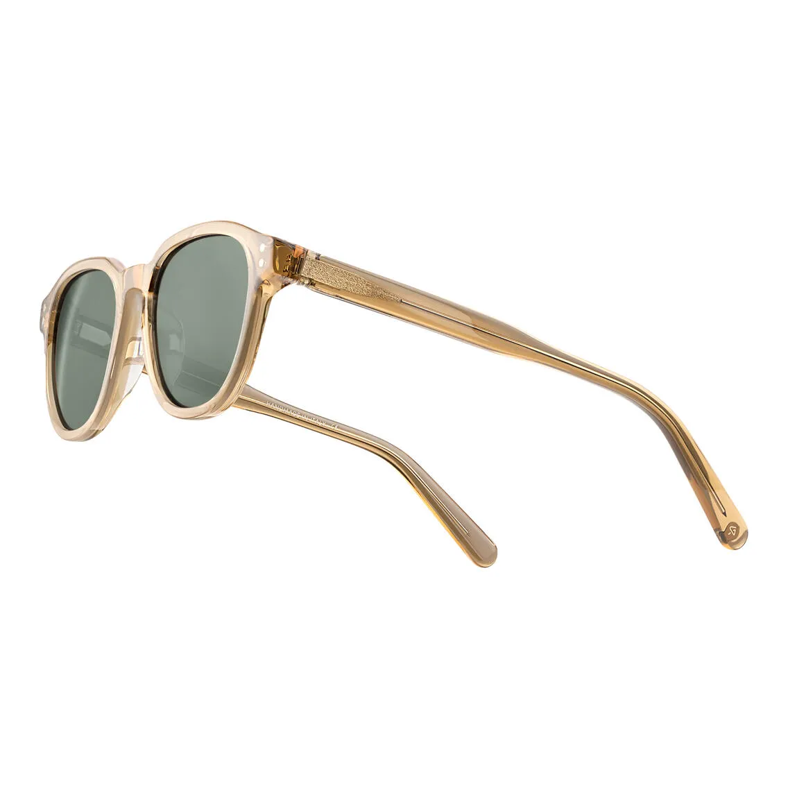
Off-white backgrounds (eggshell, ivory, bone, pale grey, muted peach, or beige) still function as neutral, product-focused backgrounds but create a completely different mood.
Off-white is ideal when you want your brand to feel:
- more tactile
- editorial
- soft
- approachable
- eco-conscious.
Off-white also solves a common production problem: light-colored products that get lost on pure white. White clothing, transparent skincare bottles, pale ceramics, and light-colored bags can disappear into a pure white background. On a soft neutral with a slight tonal offset, these products read clearly and with the depth they deserve.
From a brand perspective, off-white backdrops differentiate product pages from the marketplace crowd. It is one of the most efficient ways to make an eCommerce site feel custom, editorial, and genuinely branded rather than generic.
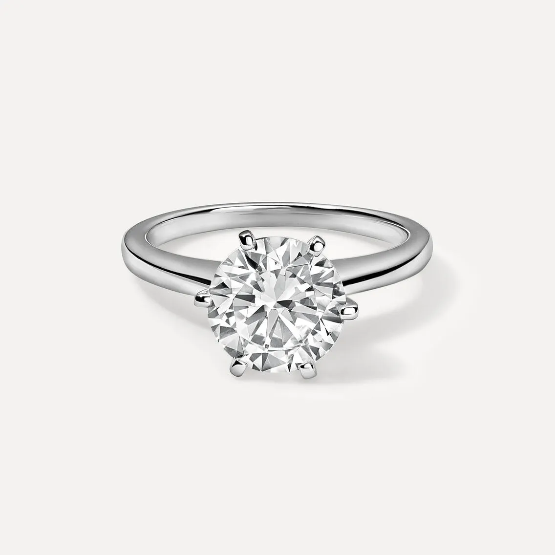
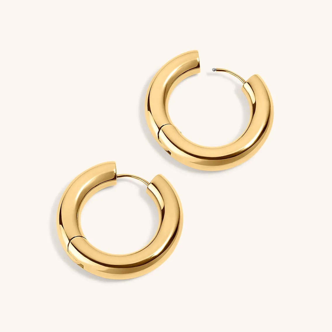
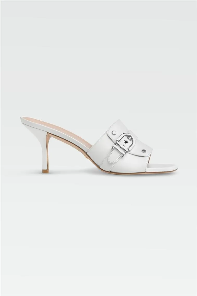
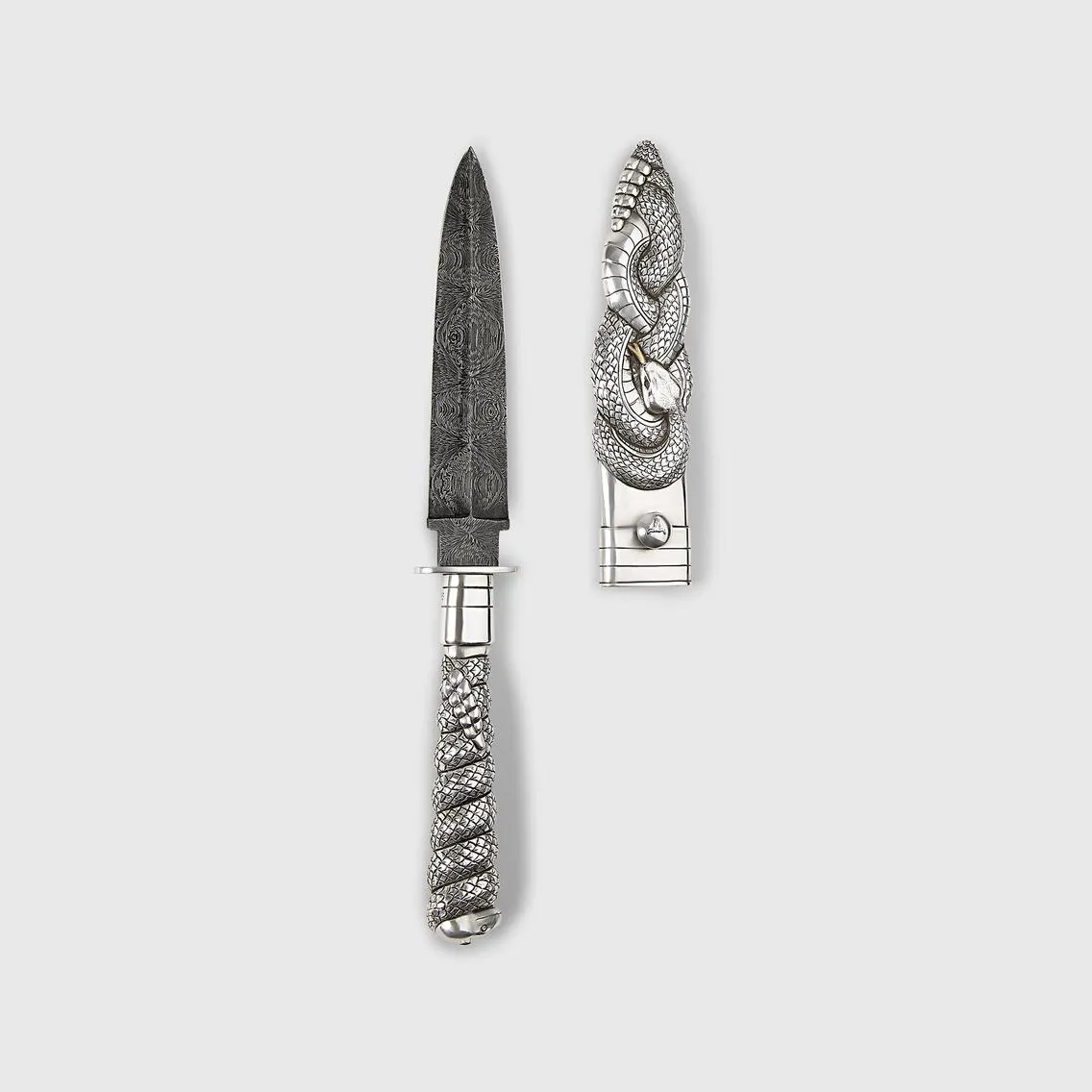
Open light photography: realism without clutter
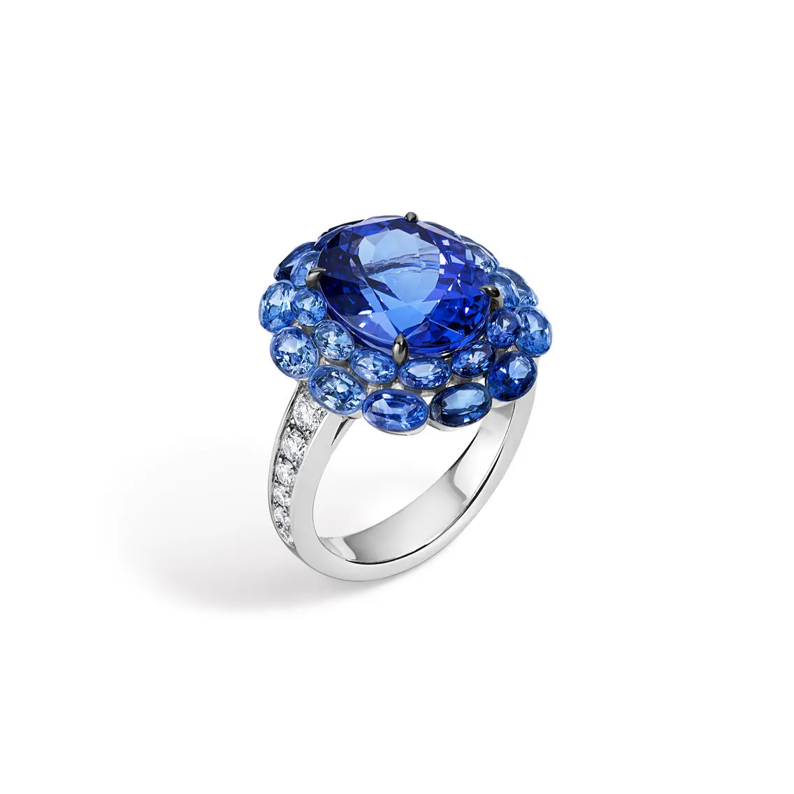
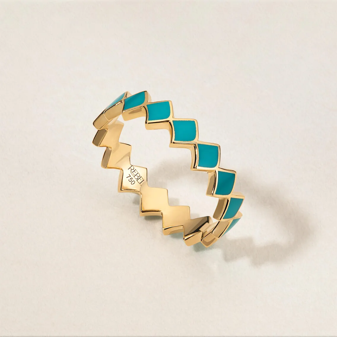
Open light photography is a specific approach rather than a background color. It uses natural or directional lighting to create subtle shadows, gradients, and dimension around the product, producing images that feel grounded and lifelike while remaining clean and minimal.
Where pure white can feel clinical and off-white can feel soft, open light feels real. There is a hint of shadow beneath the product, a natural gradient that keeps the image grounded. The background is still light and uncluttered, but the product has presence and weight.
Open light works particularly well for apparel, footwear, jewelry, and tabletop items where three-dimensionality communicates quality. It creates a more editorial feel while remaining versatile for product detail pages. For brands with emotional or design-forward positioning, open light is often the better choice over pure white for DTC channels.
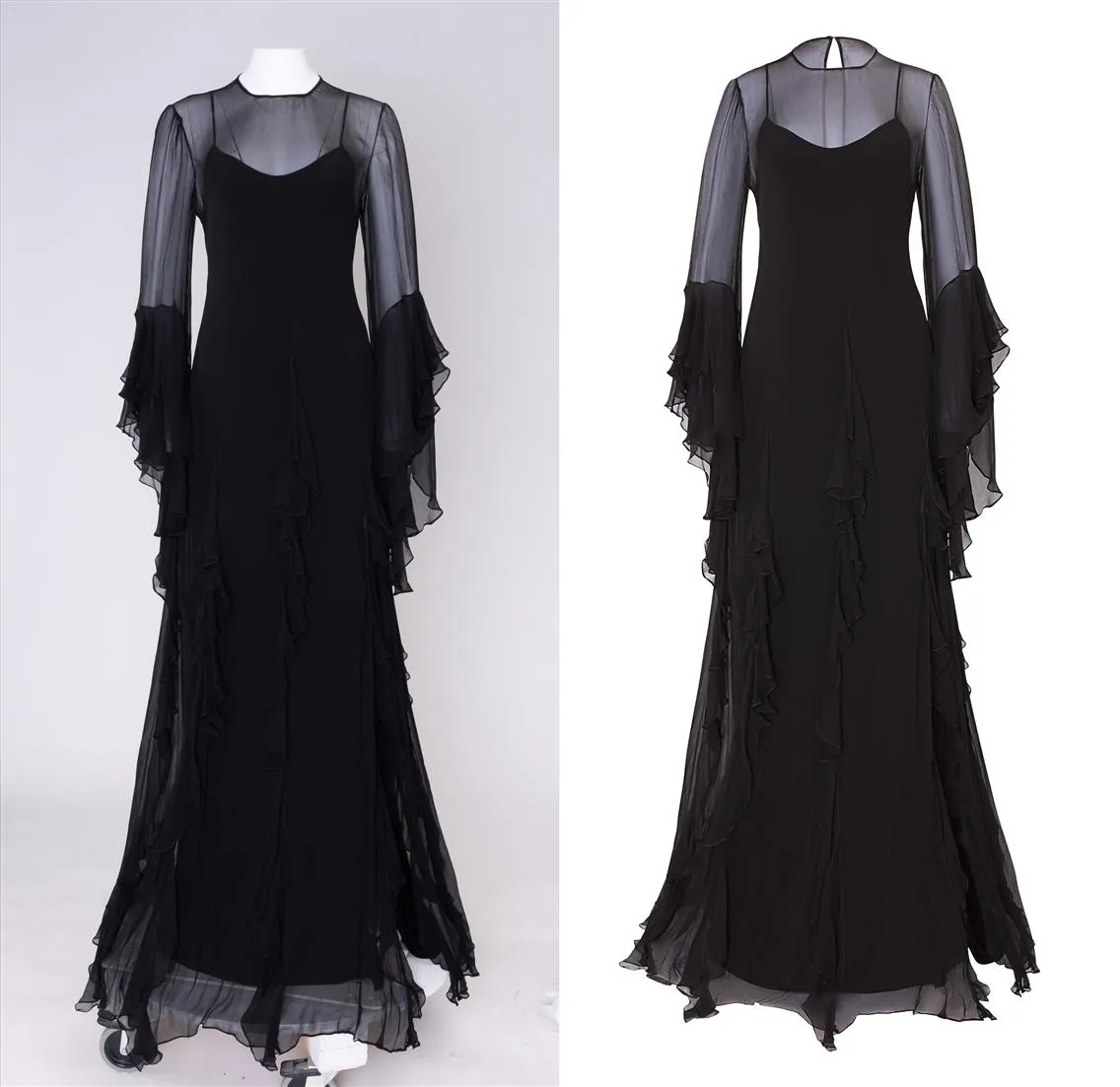
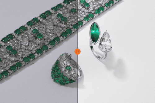
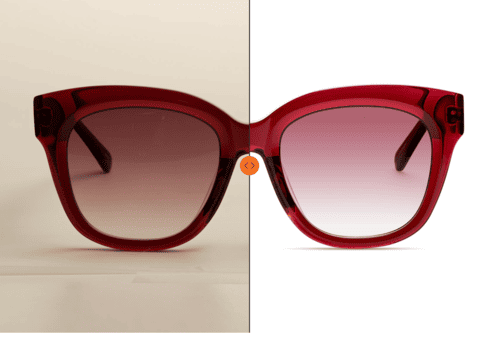
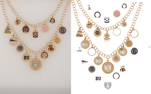
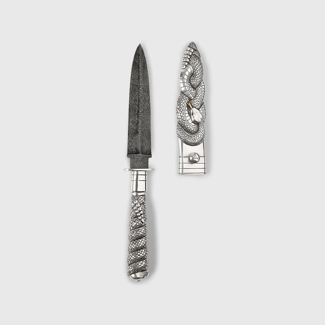
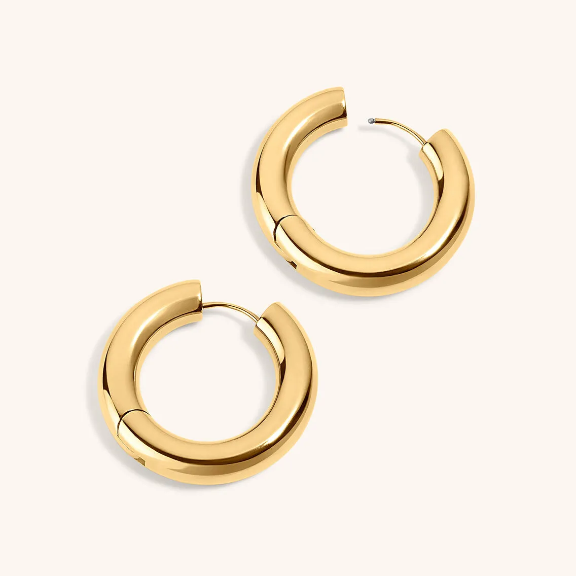
LenFlash specializes in open light photography. The portfolio images below show the technique applied across product categories:
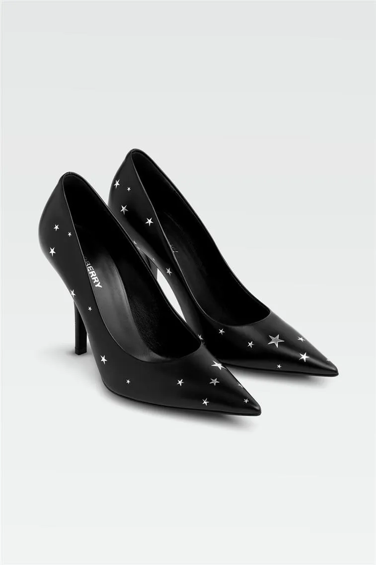
For a complete guide to open light photography technique see also: Open Light Product Photography
Using Colored Backgrounds to Build Brand Identity
White backgrounds are reliable, scalable, and safe. But there are moments when color is the most effective way to present products — particularly when building brand identity.
Color can do something white cannot: convey a mood, stop the scroll, make people feel something. Some of the most recognizable DTC brands have made background color part of their visual DNA. Glossier's millennial pink, Our Place's muted kitchen tones, and Bala's playful lavender and lemon became as recognizable as their logos. The backdrop became part of the brand.
Colored backgrounds work best for:
- For hero shots on your homepage
- For email marketing and social content
- For campaign visuals and paid ads
- When your product color contrasts nicely and pops off the background
- When you’re building a mood, seasonality, or collection theme
A summer capsule collection on a soft sand background communicates more than any caption. A skincare brand using mint or seafoam evokes freshness without stating it.
The important constraint: color works when it is part of a cohesive system. Your palette should be informed by brand identity and applied consistently. Color used randomly across SKUs produces a catalog that feels chaotic rather than curated.
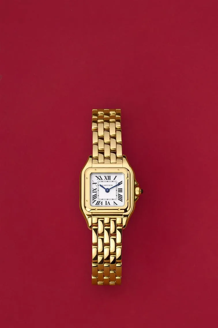

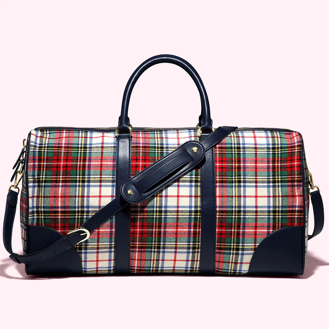
For how brand identity informs background and visual system decisions see also: Art Direction Guidelines for Jewelry and Fashion Brand Photoshoots
When colored backgrounds hurt more than they help
There are real risks with colored backgrounds when used without intention. If the background color clashes with product colors or skin tones, or if there is no consistent color system across SKUs, the site feels chaotic. On product pages with many SKUs, color distracts from product shape and detail. Major platforms including Amazon will reject colored backgrounds for primary images entirely.
For core product pages and large catalogs, white or near-white wins on every practical dimension: cleaner, faster to load, easier to crop, and more future-proof. Colored backgrounds should be used strategically, not universally.
How to Combine Background Types in One Visual System
The most effective approach for growing eCommerce brands is a tiered background strategy that uses each background type where it performs best rather than choosing one universally.
Pure white serves as the infrastructure: marketplace listings, wholesale catalogs, and retailer submissions where platform specifications are non-negotiable.
Open light or off-white serves branded DTC product detail pages and catalog imagery where the brand has visual control and can communicate more character than marketplace requirements allow.
Colored backgrounds serve homepage banners, email hero images, paid advertising, and campaign content where mood and brand recognition matter more than product documentation.
| Context | Background type |
|---|---|
| Amazon, Walmart, Macy's primary image | Pure white RGB 255,255,255 |
| Zalando, ASOS, Farfetch catalog | Pure or near-white |
| DTC product detail pages | Open light or off-white |
| Homepage hero and collection pages | Off-white or colored |
| Email campaigns and paid social | Colored or lifestyle |
| Press kit and editorial | Lifestyle or styled |
| White or pale-colored products | Off-white with tonal offset |
This tiered approach means a single product can have three background variants produced from one shoot: pure white for Amazon, open light for the branded website, and a colored version for the summer campaign. Planning this from the start of production, rather than reshooting for each context, significantly reduces the per-image cost of maintaining a complete multi-channel asset set.
Maintaining consistency across an expanding catalog
When a brand shoots 20 SKUs in January and 30 more in June, ensuring backgrounds match across both batches requires a documented system rather than good intentions. The practical tools are a background specification document that records the exact setup used — background material, distance from subject, lighting positions, and post-production color values — a physical color reference card photographed at the start of each shoot session, and a centralized asset system like LenFlash Cloud where approved reference images are accessible to every retoucher working on the catalog.
Without this documentation, color drift accumulates quietly. Each new shoot batch looks slightly different from the previous one, and the catalog begins to look assembled from different sources rather than produced as a coherent system.
For building a visual style guide that governs background consistency across shoots: Art Direction Guidelines for Jewelry and Fashion Brand Photoshoots
Standardizing Backgrounds Across SKUs for Efficiency
A standardized background system is not just a visual decision, it is an operational one. When backgrounds are defined and documented, every new product shoots into an existing system rather than requiring new creative decisions. Creative teams can build reusable templates for lighting, props, and styling. Post-production can apply consistent color grading across batches. New SKUs, collections, and sub-brands all fit into the established framework without rebuilding it.
The alternative — treating each shoot as a fresh creative decision about background — produces a catalog that looks assembled rather than designed and requires progressively more retouching time as the inconsistencies between batches accumulate.
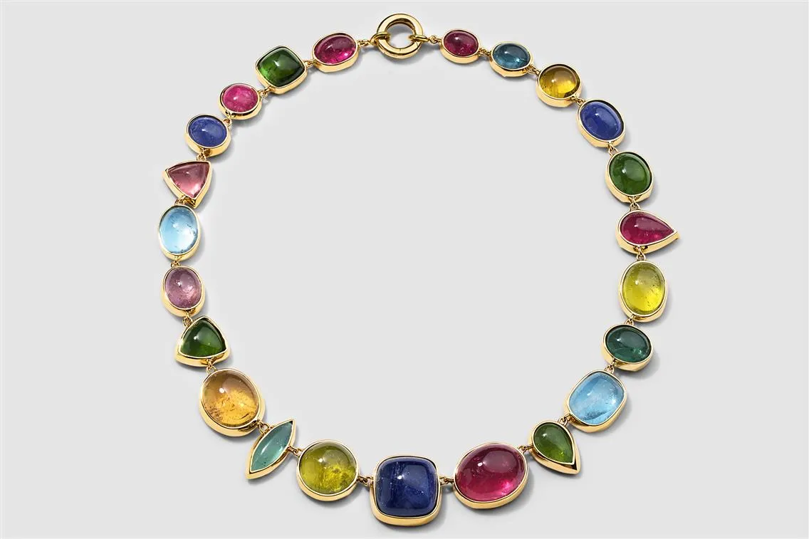
Now, imagine the original was on a busy tile floor with colored lighting and shadows. That’s not scalable. You’re not just shooting a product, you’re recreating a set. Every. Single. Time.
By using standardized backdrops, your assets remain consistent across product lines. This allows creative teams to build templates for lighting, props, and styling, resulting in faster, cheaper, and more reliable post-production. Additionally, you can split-test colors and angles without redoing full shoots.
This system helps future-proof your content as you expand to new SKUs, collections, or even sub-brands.
Background Choice by Product Category
Background recommendations are not universal. Different product categories have specific characteristics that make certain backgrounds more or less effective.
Jewelry — pure white can flatten the three-dimensionality of metal surfaces and make gemstones look less vibrant. A subtle gradient from near-white to light grey adds depth and dimension while remaining marketplace-compliant as a secondary image. Open light photography creates the shadow play on metal surfaces that communicates material quality. For a complete guide to jewelry photography: eCommerce Brand's Guide to Jewelry Photography
Apparel — pure white meets Amazon requirements for primary images. For DTC product detail pages, off-white or open light communicates fabric texture and material character more effectively than clinical pure white. Dark garments need careful exposure on white backgrounds to retain surface detail. For a complete guide to apparel photography backgrounds: Product Photography for Clothing and Accessories Brands
Beauty and skincare — off-white backgrounds communicate premium positioning and work well for the soft, clean aesthetic that beauty brands typically require. Transparent bottles and pale packaging need a tonal offset from the background to read clearly. For beauty photography: Macro Beauty Photography for Makeup, Cosmetics, and Skincare Brands
Perfume — fragrance photography uses background as a primary mood tool. The color and tone of the background communicates the fragrance's character before the customer has read a word. For perfume photography: How Perfume Photography Turns Invisible Scents into Brand Stories
Home goods and furniture — lifestyle backgrounds showing products in real environments are the primary format for home goods because scale and proportion communication requires contextual reference. Pure white or off-white catalog shots serve marketplace listings and comparison purposes. For lifestyle photography: Strategic Impact of Lifestyle Photography on eCommerce Business
Luxury products — luxury photography uses background tone as a positioning signal. Cool, controlled tones communicate precision. Warm tones communicate approachability. Architectural neutrals communicate contemporary luxury. For luxury product photography: What Luxury Product Photography Actually Involves
Building a Background System That Scales
The background decision is ultimately a system decision. A brand that defines its background standards early in terms of what pure white specification serves its marketplace listings, what open light setup serves its DTC pages, what color palette serves its campaigns, photographs every subsequent collection into a framework rather than starting from scratch each time. That consistency compounds. The catalog builds visual equity. Post-production becomes faster. New SKUs fit without rework.
LenFlash has been producing white background, open light, and off-white photography for eCommerce brands from our New York studio since 2004. Online ordering with real-time quotes before you ship anything.