


10 Common Mistakes in Product Photos Editing (Even Pros Make Them!)
A good shoot does not guarantee good images. The lighting was controlled, the angles were right, the product looked exactly as it should on set, and then post-production introduced problems that were not there before.
Retouching is where a strong shoot either gets delivered or gets undone. The mistakes that cause this are consistent, predictable, and fixable, which is why they are worth knowing before they show up in a final delivery.
Part of our complete guide: How Product Photo Editing Services Impact Online Sales
Mistake #1: Unbalanced Exposure
Exposure is the foundation of an image’s tone, mood, and detail clarity. In product photography, exposure mistakes can ruin an image by hiding critical product details or misrepresenting the product altogether. Overexposure flattens textures and blows out highlights, while underexposure obscures features in murky shadows. For photographers working in e-commerce, mastering exposure is critical to delivering professional-grade results that meet client expectations.
Losing Fine Photo Details
Overexposure can destroy the micro-details in textures, such as leather grains, fabric weaves, or fine engravings on metal surfaces, making high-value products like jewelry or luxury items appear less valuable. Underexposure swallows up details in shadows, erasing subtle features like stitching or beveled edges. Both issues diminish the product’s perceived quality.
Customers rely on product images to make informed decisions. When they can’t see the details clearly, they question the quality of the product and hesitate to buy. Exposure consistency ensures all product features are visible and sharp, building customer trust.
Lack of Color Fidelity and Poor Light Representation
Color Accuracy Through Exposure: Overexposure washes out colors, altering their vibrancy and realism. For example, an emerald-green dress might appear pale or even yellowish, leading to customer disappointment. Underexposure can oversaturate tones, making neutral shades like beige or pastel hues look muddled. Accurate exposure allows the product’s true colors to come through.
Highlight-to-Shadow Ratio: Inconsistent exposure disrupts the balance of highlights and shadows, making the product look unnatural. Reflections on glossy surfaces may turn harsh, while matte surfaces lose their depth. Balanced exposure creates a natural look that enhances the product’s realism.
No Depth and Dimension
Exposure directly affects how three-dimensional a product appears. Properly exposed images retain depth by balancing shadows and highlights to define shape and volume. For reflective surfaces like glassware or metals, managing exposure ensures the product doesn’t appear flat or distorted by glare. This is especially critical for products that rely on showcasing precision craftsmanship, like watches or electronics.
Inconsistent Exposure Across a Product Line
Inconsistent exposure across a product line disrupts the visual flow of a catalog. If one item appears overly bright and another overly dark, it not only confuses customers but also damages the brand’s professionalism. Exposure balance ensures all images align with the same tonal and lighting standards.
How to Avoid Exposure Editing Issues
Use Histograms for Precision
The histogram is your most reliable tool in post-production. It provides an accurate breakdown of highlights, midtones, and shadows, showing if any part of the image is overexposed or underexposed.
Pay close attention to clipped highlights or shadows (areas with no detail). Use exposure and tone adjustment sliders to restore information in these regions, ensuring no part of the image looks blown out or crushed.
Leverage Adjustment Layers
Curves adjustment layers allow you to target specific tonal ranges like shadows, midtones, or highlights. You can brighten the midtones while keeping highlights intact or deepen shadows without losing details in brighter areas. Use Levels to control the overall brightness and contrast. Adjust the black and white points carefully to stretch the tonal range without distorting the image.
Dodge and Burn for Local Refinements
Targeted dodge and burn techniques allow you to make localized adjustments to exposure. For example, brighten shadowed areas of a product while maintaining the integrity of the highlights. Use dodge to subtly highlight edges or reflective surfaces and burn to enhance shadows, giving the product more depth and realism.
Utilize Luminosity Masks
Luminosity masks allow you to edit specific tonal ranges with precision. For example, you can adjust just the highlights without affecting the midtones or shadows, or vice versa. This ensures targeted corrections without over-editing. Create masks for shadows, midtones, and highlights, and adjust each range individually for optimal tonal balance.
Blend Exposures for Complex Products
For products with challenging tonal ranges, such as reflective metal or glass, manually blend exposures using layer masks in Photoshop. Merge images with different exposure levels to preserve details in both the highlights and shadows. For certain products, use HDR techniques sparingly to enhance the dynamic range. Ensure the final result looks natural and not overly processed.
Match Exposure Across a Catalog
When working on a product catalog, compare exposure levels across similar images to ensure consistency. A slightly brighter or darker image can disrupt the overall flow of the catalog. Apply global exposure adjustments using batch editing for efficiency, but review each image individually to maintain high standards.
Preview and Test for Platform Consistency
Exposure can vary across devices and environments. Test your images on various screens, including mobile devices, desktops, and tablets, to ensure they appear balanced in all viewing conditions. Preview images in formats and layouts used by e-commerce platforms to confirm that exposure complements the overall shopping experience.
Mistake #2: Inaccurate Texture and Colors in Product Photography Retouching
Online buyers rely entirely on images to understand the material, quality, and appearance of a product. When textures are over-smoothed or colors are inaccurately rendered, it can mislead buyers and lead to dissatisfaction, returns, and lost confidence in the brand.
Why Accurate Texture and Color Are Critical in E-commerce
Products Are Judged by Their Visual Representation
Customers form opinions about a product based on its texture and color. A leather bag should look supple, showing natural grain and stitching details. A gemstone must appear clear and vibrant, accurately reflecting its cut and quality. When these elements are poorly represented, the product loses its perceived value, even if it’s high-quality in reality.
Mismatched Expectations Create Customer Frustration
Inaccurate colors or artificial textures set false expectations. For example, a vibrant red dress that arrives looking more maroon will disappoint the buyer, leading to returns and potential negative reviews. Accurate retouching aligns the image with what the customer will receive, building trust.
True-to-Life Representation Reduces Returns
E-commerce brands face high return rates due to mismatched expectations. Maintaining accurate textures and colors ensures that the product image reflects the reality of the item, significantly reducing return-related losses. And believe us, brands value cost-effective photographers.
Textures and Colors Differentiate Products
Subtle differences in texture or tone often distinguish premium products from standard ones. Capturing these nuances in your retouching highlights the craftsmanship and quality of high-value items, such as luxury goods or artisanal products.
Common Texture and Color Retouching Mistakes
Over-Smoothing Textures
This mistake often occurs when retouchers use aggressive noise reduction or overuse tools like frequency separation. While it removes imperfections, it also erases essential texture details, making products like leather, fabric, or metal look flat and unnatural.
Over-Sharpening Details
Over-sharpening exaggerates edges and creates harsh, unnatural lines, especially on reflective or delicate surfaces like jewelry and glass. This makes the product look overly processed rather than realistic.
Inaccurate Color Adjustments
Incorrect color grading or poor calibration often leads to color shifts. For example, a subtle gold tone may become too yellow, or a soft pink fabric might appear neon. These inaccuracies mislead customers and harm credibility.
Ignoring Color Consistency Across Images
Even if a single image is accurate, inconsistency in color tones across a catalog creates confusion. A navy blue jacket that looks slightly different in every image fails to communicate a cohesive product identity.
Flattening Highlights and Shadows
Over-editing shadows or highlights can remove depth, especially in textured surfaces like wood or metal. This makes the product appear two-dimensional and less tactile.

Techniques for Preserving Authenticity in Texture and Color
Calibrate Monitors and Devices
Accurate retouching begins with proper calibration. Use a hardware calibrator to ensure your monitor displays colors and brightness accurately. This minimizes the risk of unintentional color shifts during editing.
Color Profile Management
Work within the appropriate color space, such as sRGB for web or Adobe RGB for print. Converting files between color spaces improperly can lead to shifts that distort the product’s true color.
Use Reference Images and Physical Samples
Keep a physical sample of the product nearby for comparison. If that’s not possible, ask the client for accurate reference images or use swatches to match textures and tones during retouching.
Selective Editing for Texture Refinement
Use masking to target specific areas for texture adjustments. For instance, reduce noise selectively in shadowed areas while keeping sharp textures in focus regions intact. Apply frequency separation sparingly to clean imperfections without erasing natural details like leather grains or fabric threads.
Layer-Based Adjustments
Use adjustment layers in Photoshop for non-destructive edits. For example:
- Hue/Saturation Layers: Fine-tune specific color ranges without altering the entire image.
- Dodge and Burn Layers: Enhance texture depth by emphasizing highlights and shadows subtly, preserving dimensionality.
Mistake #3: Image Inconsistency in a Product Catalog
When colors, lighting, or angles differ from one product image to the next, it can create confusion, disrupt the shopping experience, and undermine the client’s brand identity. Ensuring visual cohesion is a vital necessity.
Consistency in images signals to customers that the brand is meticulous and reliable. If product photos vary in brightness, tone, or composition, it sends a subconscious message of carelessness, which can erode trust in the product and the brand as a whole. See methods for ensuring catalog consistency below.
Develop and Follow a Comprehensive Style Guide
Define specifications for lighting, angles, exposure, shadows, backgrounds, and color profiles. For example, decide whether to use hard or soft shadows and specify consistent camera settings like aperture and focal length. For catalogs showcasing multiple views (e.g., front, side, top), define and document the exact angles to be used for each product type. Establish a strict color calibration workflow, ensuring that product colors are consistent across all images, regardless of lighting changes.

Batch Editing for Efficiency and Accuracy
Apply uniform adjustments, such as exposure or white balance corrections, across all images in a batch to ensure consistency. For example, synchronize Lightroom settings for images shot in the same session.
While batch edits save time, always review each image to make minor corrections where needed. For instance, subtle lighting variations may require individual refinements.
Adopt Workflow Uniformity Across Projects
Use the same camera, lens, and lighting setup for every product session within a catalog. Consistency at the shoot level reduces variability during retouching. If working with other photographers or editors, ensure everyone follows the same style guide to avoid discrepancies.
Before final delivery, view all images in a grid layout to spot inconsistencies in color, brightness, or composition. This overview facilitates the identification and correction of outliers.
Mistake #4: Wrong or Missing Reflections and Shadows
Balancing Realism with Effective Shadow and Reflection Work
Shadows are critical for creating a sense of space and dimension. A well-placed shadow helps customers understand the product’s shape. Without a shadow or with one that’s too harsh or poorly aligned, the product appears disconnected from its environment, losing credibility.
Reflections, on the other hand, are essential for products with shiny surfaces like glassware, jewelry, and electronics. A properly executed reflection highlights the quality of materials, emphasizing their smoothness, polish, or transparency. Poorly done reflections, or none at all, make these products look dull and lifeless, undermining their appeal.
Read more about retouching intricate products with reflections, like watches and jewelry, in our article “Jewelry and Watch Product Photography Editing and Post-Production Techniques”.
Techniques for Accurate Shadows and Reflections
Understand the Light Source
The foundation of accurate shadows and reflections lies in understanding your image’s light source. Analyze its direction, intensity, and placement:
- Shadows should fall naturally away from the light, mirroring the product’s contours and depth.
- Reflections should mimic how light interacts with the product’s surface, whether it’s a crisp highlight on polished metal or a soft glow on glass.
Use Layer Masks for Shadow Precision
Shadows aren’t one-size-fits-all — they must follow the product’s shape and placement. Using layer masks allows you to adjust shadows dynamically, softening edges or blending transitions to create a realistic fade. Gradual shadows work well for soft materials, while defined shadows complement hard surfaces.
Contour Shadows to Match the Product’s Shape
Shadows must align with the product’s geometry: rounded objects, like bottles, should cast curved shadows; flat products, like tablets or books, need tight, shallow shadows to reflect their proximity to the surface.
Reflections That Enhance, Not Distract
For glossy products, reflections can elevate the image. Duplicate the product layer, flip it vertically, and adjust the opacity to create a natural reflection. Add a gradient mask for a fade effect, and slightly blur the edges for realism. Subtlety is key; reflections should enhance the product, not compete with it.

Mistake #5: Insufficient Attention to Product Itself, Details, and Distractions in Photography Retouching
In product-centric commercial retouching, the product is always the hero, and every detail matters. Dust on a reflective surface, fingerprints on glass, or even small inconsistencies in texture can detract from the product’s visual appeal and reduce the image’s professional quality. These overlooked details not only compromise the product’s presentation but also reflect poorly on the photographer or retoucher’s expertise.
Techniques for Detail-Oriented Retouching
Inspect the Product at a Micro Level
- Work at high magnifications (100–200%) to spot tiny imperfections, especially in areas with high texture or reflectivity. Divide the image into sections to ensure every part of the product is reviewed systematically.
- Add temporary adjustment layers like Curves or Levels to boost contrast and reveal hidden imperfections, such as dust or smudges, that may not be visible under normal settings.
Utilize Clone and Healing Tools for Seamless Corrections
Spot Healing Brush Tool: Ideal for small blemishes like dust, scratches, or stray fibers.
Clone Stamp Tool: Use this for more complex areas where patterns or textures need to be preserved, like stitching on fabric or grain in leather. Adjust opacity and brush softness for seamless blending.
Patch Tool: Perfect for larger areas, such as cleaning smudges on reflective surfaces or removing wrinkles on fabric.
Clean Up Background Distractions
Use selection tools to isolate the product and remove distracting elements in the background. Even faint shadows or light spills can detract from the product’s clarity and focus.
Consistent Tone and Material Clarity
For products with multiple materials (e.g., a watch with a leather strap and metallic case), ensure each material is edited appropriately. Retouch reflective surfaces with care to maintain their shine, while keeping textured areas natural and sharp.
Match the Image to the Product’s Purpose
Ensure that the final image reflects the product’s true qualities. For example:
A sleek smartphone should look pristine and futuristic, with no smudges or dust. A handcrafted ceramic piece might retain slight natural imperfections to showcase its artisanal quality. A ring gemstone should have true-to-life texture, color, and even imperfections. This ensures an accurate product presentation.
Mistake #6: Weird Crops That Compromise Product Context and Overall Composition
A well-balanced crop enhances composition, ensures all critical product features are visible, and aligns with e-commerce platform requirements. Poor cropping, however, can distort context, cut off essential details, and confuse customers. While cropping is often used to refine an image, it must always prioritize the product's visual clarity and purpose.
Common Crop Mistakes and Solutions
Cutting Off Essential Product Details
Cropping too close to the product, cutting off edges or key elements like logos, handles, or important features. Always review the product’s critical components before cropping. Leave enough padding around the product to ensure nothing is unintentionally excluded, even in zoomed-in views or resized formats.
Unbalanced Framing
Centering the product poorly, leaving it awkwardly positioned with too much negative space on one side. Use grid overlays to align the product within the frame. Follow the rule of thirds or center the product depending on the composition's intent.
Ignoring Aspect Ratios
Cropping without considering platform requirements, leading to inconsistent thumbnails or poor display on mobile devices. Research the platform’s standards and crop accordingly. For example: Amazon recommends a white background with the product occupying at least 85% of the frame. Social media platforms like Instagram prefer square or portrait crops (1:1 or 4:5).
Misusing Negative Space
Including too much empty space, making the product look small or insignificant within the frame. Ensure the product fills the majority of the frame while leaving sufficient breathing room. The balance between space and focus enhances visual appeal.
AI as a Helper, Not a Replacement
AI cropping tools are becoming increasingly sophisticated, offering quick solutions for framing and alignment. However, they should be seen as tools to assist photographers and retouchers, not as replacements for professional judgment. AI can automate batch cropping for catalogs or suggest alignments based on common standards, saving time for repetitive tasks. But AI doesn’t understand the nuances of product-centric retouching. It might crop too aggressively or fail to account for unique product features. Always review and refine AI-assisted crops to ensure they align with your creative vision and the product’s context.
Mistake #7: Over-Editing in Product Retouching
Recognizing the Impact of Over-Retouching on Authenticity and Sales
When textures are overly smoothed or colors appear unnaturally vibrant, the product loses its tangible feel, making it look artificial. For instance, a leather bag with no visible grain may seem plastic-like, while excessively polished reflections on jewelry can strip away its realistic shine, making it appear digitally rendered. Customers rely on images to accurately represent the product; if the image feels inauthentic, trust in the product and the brand erodes.
Over-editing can also feel like false advertising. When customers receive a product that doesn’t match the image, whether due to altered colors, exaggerated features, or misrepresented textures, they’re likely to feel deceived. This disconnect leads to dissatisfaction, increased returns, and harm to the brand’s reputation, as well as the photographer’s credibility.
Finally, for photographers and retouchers, over-editing signals a lack of understanding of balance. Professional clients may perceive such work as amateurish, questioning the photographer’s ability to deliver refined, honest, and effective images. Read more about the impact of ethical retouching in our dedicated article.

Tips to Avoid Over-Retouching
Adjust Layer Opacity for Natural Results
When using tools like frequency separation, color grading, or sharpening, reduce layer opacity to scale back edits. Overly bold changes are often a sign of over-retouching.
Preserve Texture with Selective Editing
For materials like leather, fabric, or metal, retain natural textures using: Frequency separation to clean imperfections without flattening detail. Dodge and burn to enhance highlights and shadows subtly, adding dimension without artificial effects.
Keep Color Enhancements Subtle
Avoid pushing saturation or hue adjustments too far. Use precise tools like Hue/Saturation layers to tweak specific color ranges. Ensure that your adjustments enhance the product’s natural colors without altering them entirely.
Edit in Small Increments
Apply changes in gradual steps and regularly compare your edits to the original image. Use the “before and after” view to check whether your adjustments maintain authenticity or veer into exaggeration.
Step Away and Reassess
Take a break during the editing process. Fresh eyes often reveal excessive edits that you might not notice while deeply focused on the task.
Embrace Imperfections Where Appropriate
Not every product needs to look flawless. Handcrafted or artisanal items, for instance, benefit from retaining subtle imperfections that highlight their authenticity and uniqueness.
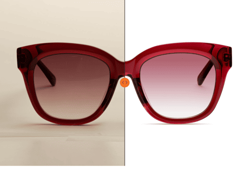
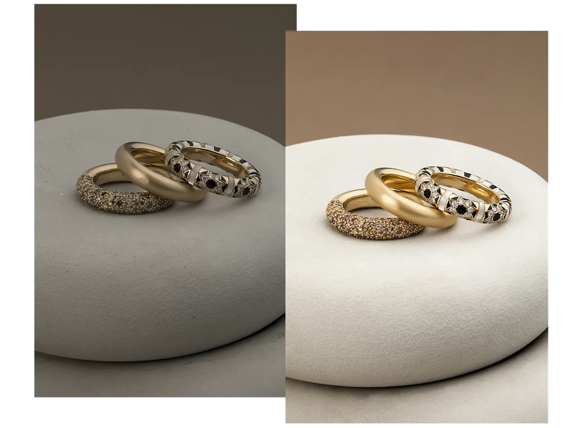
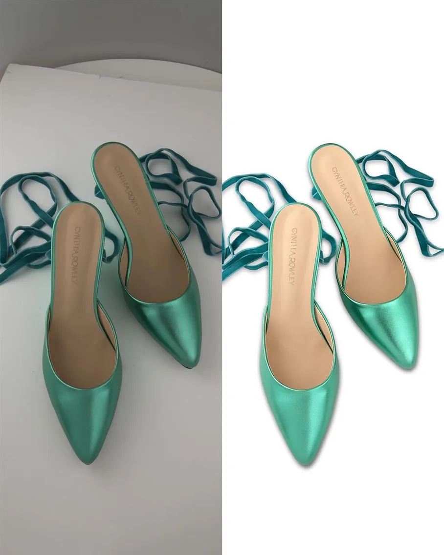
Mistake #8: Irrelevant Backgrounds That Distract From the Product
Overly busy, mismatched, or poorly executed backgrounds compete with the product for attention, detracting from its details and quality. For product photography, the background should always serve the item, not the other way around. Many e-commerce platforms, such as Macy’s or Kohl’s, have strict guidelines requiring neutral backgrounds. Adhering to these standards ensures compliance, avoiding potential listing rejections.
Techniques for Background Optimization in Product Photos
Use Solid Colors for Versatility
Solid colors, especially white, gray, or black, are timeless and versatile. They keep the focus on the product and work well for a wide range of items. Avoid overly bright or clashing colors that can overshadow the product. For example, a neon green background may overpower a subtle, pastel-toned product.
Incorporate Subtle Textures When Appropriate
Subtle textures, like a soft gradient or a muted marble effect, can add depth without detracting from the product. For instance:
- Jewelry often looks refined against a gentle gradient.
- Rustic items, like wooden furniture, might pair well with lightly textured backdrops that evoke natural tones.
Ensure the texture complements the product’s aesthetic and doesn’t compete for attention.
Leverage Background Removal for Clean Edits
When a shoot produces distracting or mismatched backgrounds, use background removal techniques in post-production:
- Use selection tools or masking in Photoshop to isolate the product.
- Replace the background with a clean, solid color or subtle gradient.
- Pay attention to fine details, like intricate edges, ensuring the masking is precise and natural.
Maintain Realism with Shadow and Light Integration
When replacing or editing backgrounds, ensure the product’s shadows and reflections align naturally with the new environment. This preserves realism and prevents the product from looking “cut out” or floating.

Mistake #9: Low Sharpness That Reduces Visual Clarity
The Role of Sharpness in High-Resolution Product Images
Sharpness directly influences how customers perceive the product’s detail, texture, and overall quality. A lack of sharpness makes images appear soft, dull, and unprofessional, causing viewers to question the product’s craftsmanship and value. In e-commerce, where customers often zoom in to inspect intricate details, maintaining clarity is critical.
Techniques to Enhance Sharpness without Artifacts
Use Selective Sharpening for Targeted Precision
Apply sharpening selectively to key areas of the product, such as edges or textured surfaces. Avoid sharpening smooth areas like backgrounds or glossy surfaces, which can introduce noise and artifacts. Tools like layer masks in Photoshop allow you to isolate sharpening to specific regions without affecting the entire image.
Leverage High-Pass Filters for Subtle Enhancements
- Create a high-pass filter layer in Photoshop:
- Duplicate the image layer.
- Apply a High-Pass Filter (found under Filter > Other > High Pass).
- Set the blend mode of the layer to Overlay or Soft Light.
- Adjust the opacity to control the intensity of the sharpening effect.
This technique enhances edge clarity without over-sharpening, keeping the product’s details crisp and natural.
Combine Sharpening with Texture Enhancements
Dodge and Burn: Use subtle dodging and burning to enhance the perception of sharpness by emphasizing highlights and shadows along the edges.
Clarity Adjustments: Tools like Lightroom’s Clarity Slider boost mid-tone contrast, making textures appear sharper without introducing edge artifacts.
Avoid Over-Sharpening
Over-sharpened images look unnatural and create distracting halos around the edges. View the image at its intended resolution and platform size. What looks sharp at full resolution may appear too harsh or soft when resized for a website or mobile display. Always check the final output context.
Mistake #10: Neglecting Size and Resolution Settings
The size and resolution of product images directly affect how customers experience the online store. Neglecting these settings can lead to poor-quality visuals, slow website performance, or even formatting issues on various platforms. High-resolution images are essential for showcasing detail and texture, but they must also be optimized to balance quality and functionality. Properly managing size and resolution ensures a seamless and professional presentation.
Tips for Optimal Resolution and File Size in Product Photography Editing
Understand Platform Guidelines
Research the resolution and size requirements for the platforms you’re working with. Adhering to these standards ensures images display correctly and leverage platform-specific features, like zooming.
Work in High Resolution During Editing
Always edit images at their highest resolution. Working in high resolution preserves detail and prevents artifacts when resizing later for web or other uses.
Export for Web with Compression
Use export tools in Photoshop or Lightroom to compress images for web without sacrificing noticeable quality. Save images as optimized JPEGs or WebP files, which provide smaller file sizes with excellent visual fidelity.
Resize Images Strategically
Avoid resizing images by cropping or stretching, as this can distort the product. Instead: Use proportional resizing tools to maintain aspect ratios. When working on large catalogs, use batch editing tools to apply consistent resolution, resizing, and compression settings across all images. Software like Adobe Lightroom allows for fast and efficient batch processing.
Save Images for Multiple Uses
Save images in different resolutions tailored for specific purposes:
High Resolution: For zoom functionality and print materials.
Optimized for Web: For faster loading on e-commerce platforms.
Thumbnails: For product galleries or previews.
Product Photography Demands Certain Retouching Skills
In e-commerce, a product image is a visual promise. Customers rely on it to decide whether to trust your client’s brand, spend their money, and ultimately feel confident in their purchase. Here’s why flawless retouching matters.
First Impressions Drive Sales: Customers form an opinion about a product within seconds. An image with uneven lighting, dull colors, or unnatural edits instantly signals low quality, even if the product itself is top-notch. High-quality retouching ensures the image communicates value and professionalism.
Trust Equals Fewer Returns: A significant percentage of online returns happen because the product doesn’t match customer expectations. Accurate retouching prevents this by presenting colors, textures, and details exactly as they are, reducing the gap between expectation and reality.
Perceived Value is Key: A well-retouched product image can elevate a brand. For example, in luxury goods like jewelry or watches, precise retouching highlights the craftsmanship, enhances the perceived worth, and justifies the price point.
Professional retouching is a tool that directly impacts how customers view and trust a product, and whether they’ll hit “Add to Cart.” LenFlash offers expert commercial photo editing services
For how retouching standards and tools are evolving read: New Trends in Retouching for eCommerce Product Photography


