


Packaging Photography and Videography: When the Box Sells the Product
As more purchases moved online, the physical experience of a product became harder to communicate. Brands started leaning on packaging to do that work: a well-designed box became shorthand for quality, a textured label suggested craft, foil stamping implied a premium.
But only if the photography actually showed it.
Most packaging photography does not. It flattens materials, washes out color, and makes a $4 box look identical to a $0.80 one. The details that cost money — embossing, specialty papers, custom finishes — disappear under bad lighting or generic setups.
For brands where margins matter and perception drives price, that is a problem worth solving.
Part of our complete guides: The Ultimate Guide to eCommerce Product Photography and Essential Video Content Types for Your E-Commerce Business
How Packaging Photography Builds Brand Perception
A customer sees your product listing. They have maybe 3 seconds. They're not reading a copy yet, they're looking at the image.
If the packaging photograph shows texture, accurate color, and material quality, they keep looking. If it's flat or poorly lit, they scroll past. The decision happens before they know anything about what's inside.
The issue isn't that packaging photography tricks people into buying. It's that bad photography hides what you actually made. If you used specialty paper or custom finishes, and the photo makes it look like standard cardstock, you've lost the advantage you paid for.
Creating a Visual First Impression
Before someone reads the product name or price, they've already formed an opinion based on the packaging image.
That impression isn't about whether the box is "nice." It's about category placement. Does this look like a $15 product or a $45 product? Does it belong in a boutique or a drugstore? Is it trying to compete on price or quality?
Packaging photography sets that anchor. If the image quality doesn't match the pricing tier you're aiming for, customers either skip it as too expensive or assume it's overpriced for what it is.
Communicating Product Benefits and Quality
Packaging design already does some of this work: highlighting organic certification, displaying ingredient illustrations, and using minimal layouts to convey purity. But photography determines whether any of that actually comes through.
A coffee bag with a transparent window showing the beans inside only works if the photograph captures that detail. Embossed text that's meant to communicate craft needs lighting that shows dimension. A beauty product with airless pump packaging, suggesting hygiene and product preservation, needs to be shot in a way that makes the mechanism visible and understandable.
The benefits you built into the packaging don't register if the photography doesn't support them.
Conveying Band Values Through Consistent Style and Imagery
Brand values show up in packaging choices: sustainable materials, minimal waste, luxury finishes, accessible pricing. Photography either reinforces those signals or muddles them.
A brand positioning itself around sustainability needs photography that makes recycled paper look intentional, not cheap. A luxury brand needs images that show material weight and finishing details. For a full guide to how visual positioning works across luxury and mass market tiers: What Luxury Product Photography Actually Involves
Consistency matters because customers see a product in multiple contexts, often within seconds of each other. If the Instagram post looks different from the product page, which looks different from the marketplace listing, the brand values become unclear. For guidance on building visual consistency across a catalog: Visual Branding for Jewelry Companies

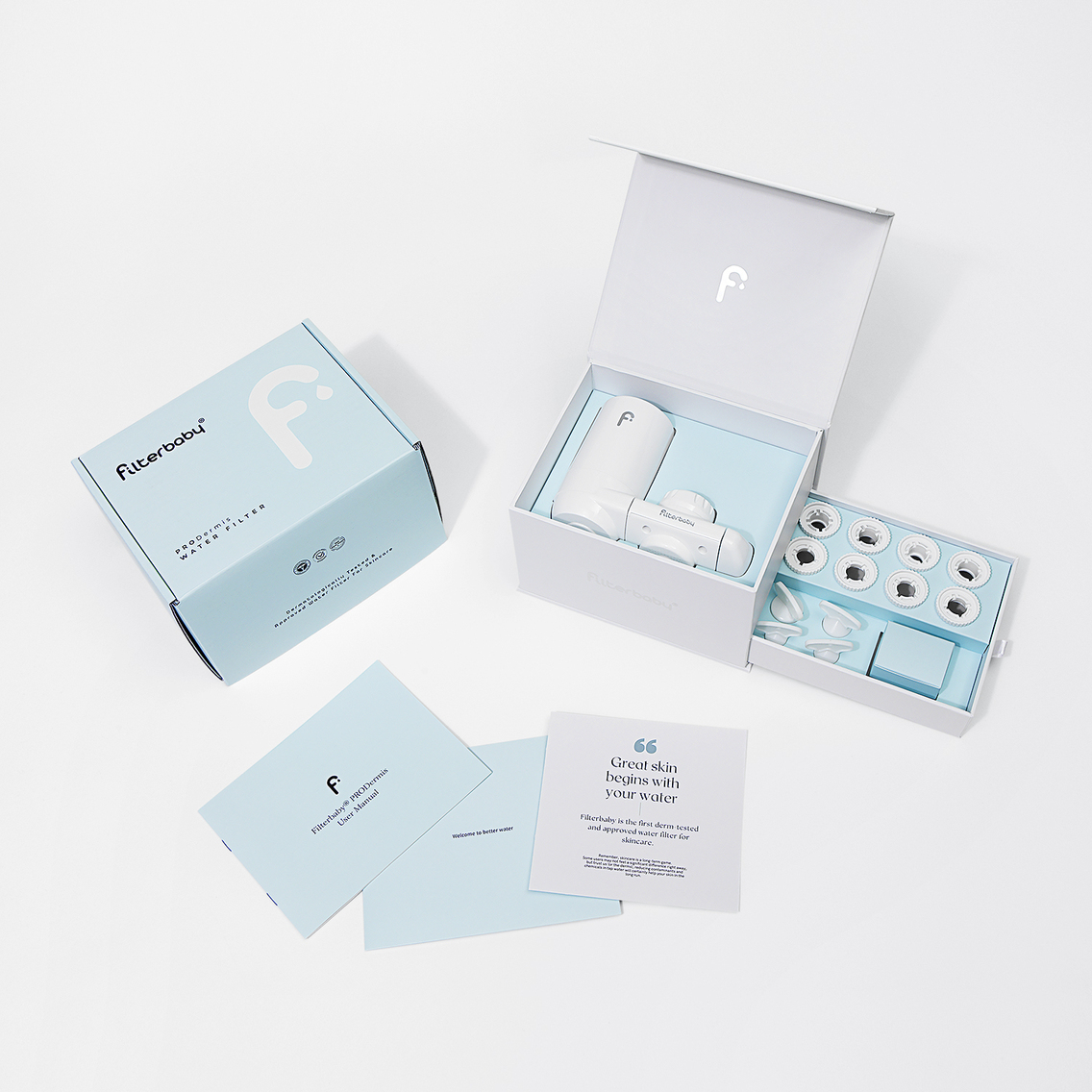
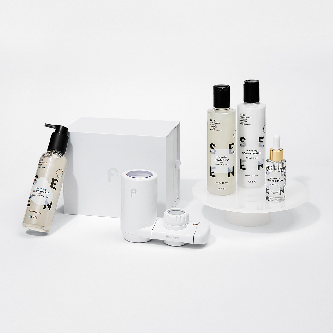
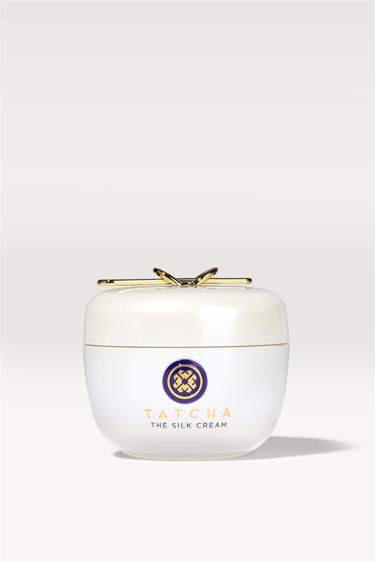
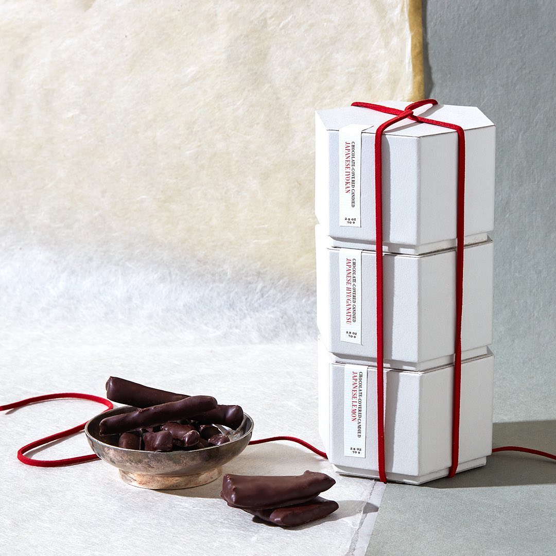
Beauty packaging ideas
RhodeRhode posts shots where multiple glazing fluid bottles are grouped together, some standing, some on their sides, casting long shadows across a cream-colored surface. The shadows are part of the composition, as they add depth and make a simple product feel more dimensional. | 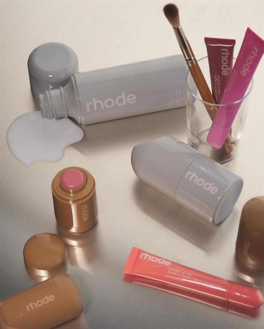 |
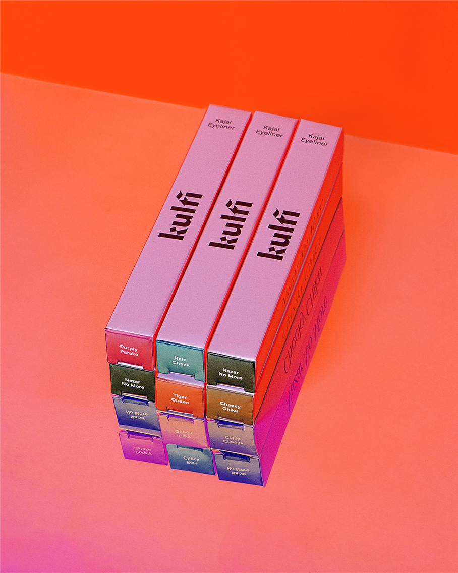 | Kulfi BeautyKulfi Beauty packaging shots often use the gradient backgrounds as part of the composition; the packaging colors either contrast with or complement the surface colors. The arrangements feel deliberate but not overly styled. The holographic caps are visible on the sides of the stacked boxes, catching light differently on each one. |
Topicals Topicals' faded serum bottles have matte tubes with glossy text. Their ecommerce images show this by positioning one light source to create a slight reflection on the text while keeping the tube surface non-reflective. You can see both finishes clearly. |  |
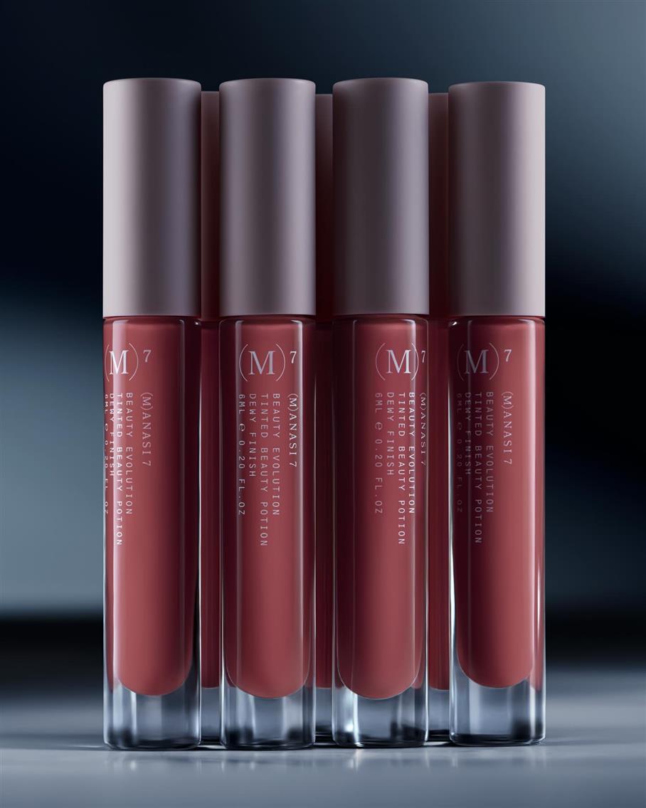 | Manasi 7Manasi 7's photography is minimal and precise. The backgrounds are always neutral: soft grays, blues, whites, or gradient transitions between them. Their compositions are symmetrical and balanced. Products are either stacked vertically, lined up in rows, or arranged in small groups with deliberate spacing. When jars are open to show the product inside, they're positioned so you see both the exterior packaging and the interior texture simultaneously. |
Their video content follows the same approach: close-ups of hands opening compacts or jars, applying product, closing the packaging. The motion is deliberate and unhurried. The brand's clean aesthetic carries through every format.
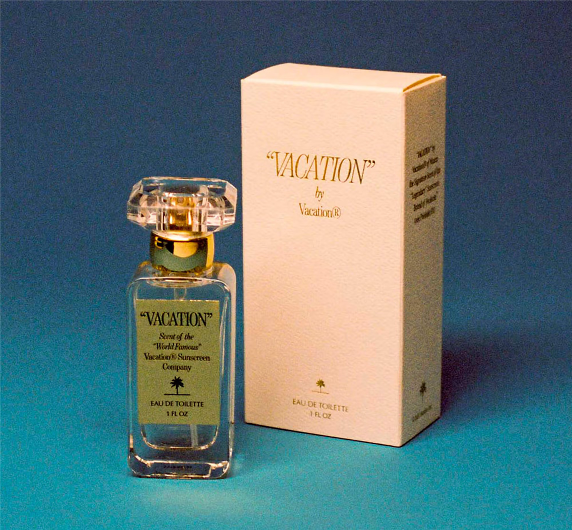
Vacation Inc.
Vacation Inc. built their entire brand on specific retro colors—that particular orange, that specific turquoise. Their product images are lit flat and bright because of their style. Any color or light shift would break the brand recognition.
Merit and Refy
For video, Merit's minimalist powder compact appears in slow 360-degree spins on their Instagram. You see all sides, the magnetic closure, the mirror inside. Refy shoots macro clips of their brow gel wands being pulled from clear tubes for 2 to 3 seconds, showing the brush texture and the product visible through the packaging.
Refy
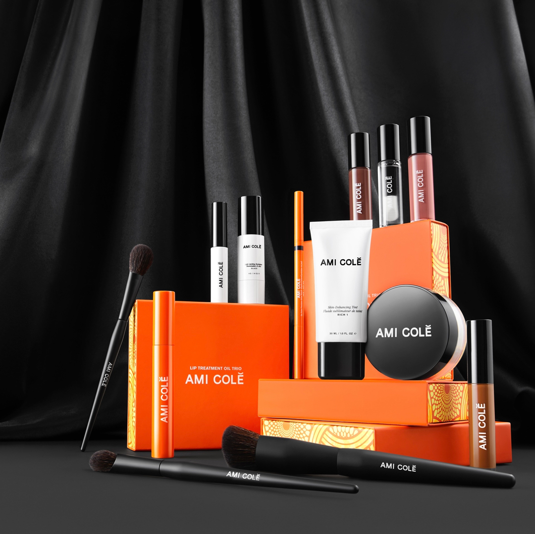
Ami Colé
Ami Colé frequently posts images where the product sits on top of its terracotta-colored box, both in frame. Same lighting, same angle, showing the complete packaging system as one designed object.
For the full technical guide to beauty and cosmetics product photography: Macro Product Photography for Makeup, Cosmetics, and Skincare Brands
For fragrance packaging specifically: How Perfume Photography Turns Invisible Scents into Brand Stories
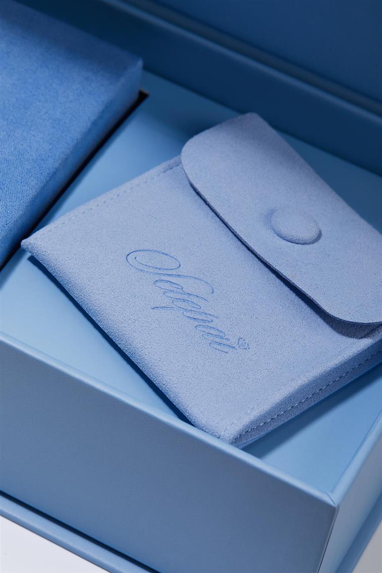
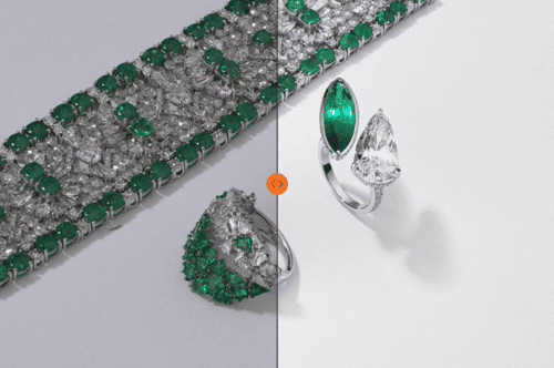
Jewelry packaging ideas
Cartier
Cartier crafted a mesmerizing video where their iconic red jewelry boxes burst forth from the architectural miniature like liberated treasures. These boxes, buoyant as hot-air balloons, carry delicate miniatures of the boutique itself aloft, each adorned with the brand's signature timepieces ticking in perfect harmony. The camera glides through the scene, capturing the whimsical flight as packaging becomes architecture adrift in the sky: elegant, impossible, and quintessentially Cartier.
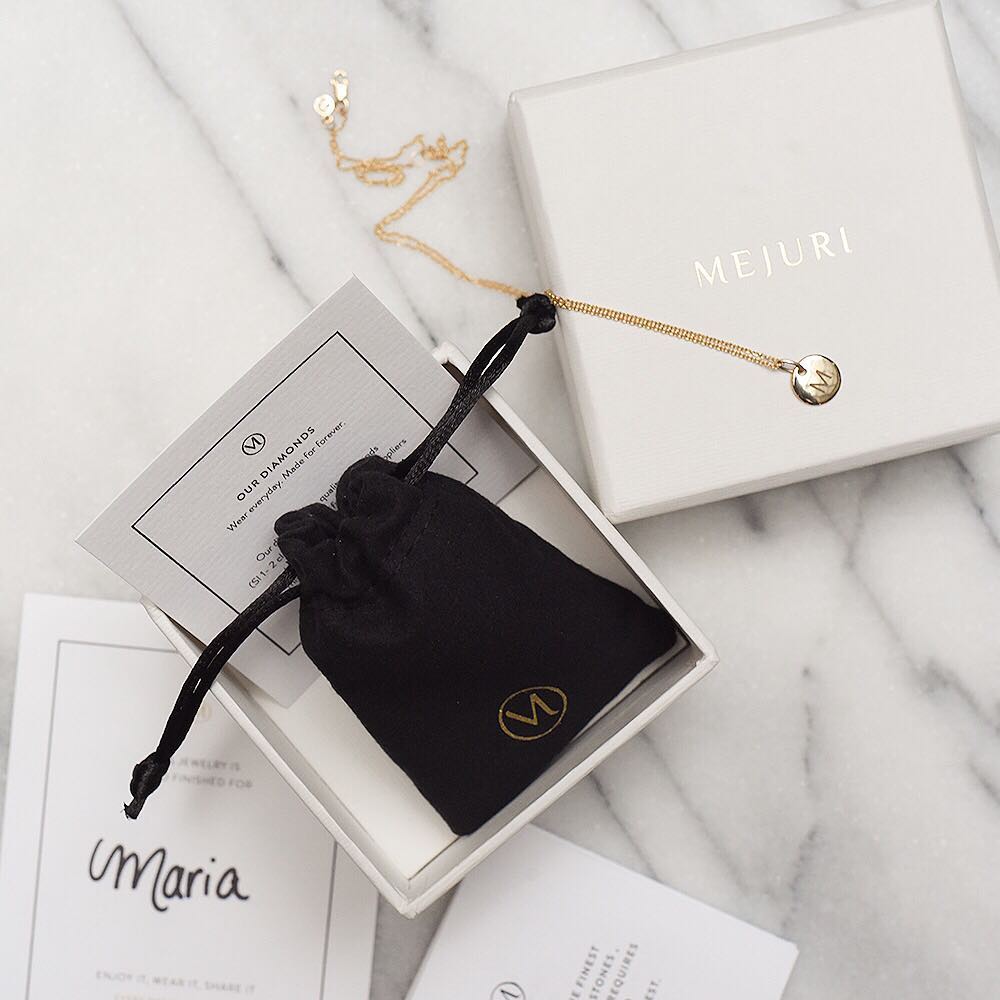
Mejuri
Mejuri's packaging shots are straightforward: jewelry sitting in an open white box against a matching white background. The simplicity works because the focus is on the product, not the packaging. But it only works because the lighting is perfectly dimensional.
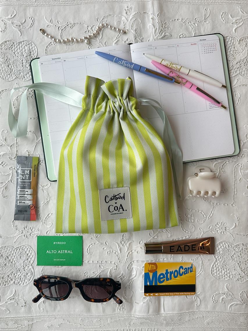
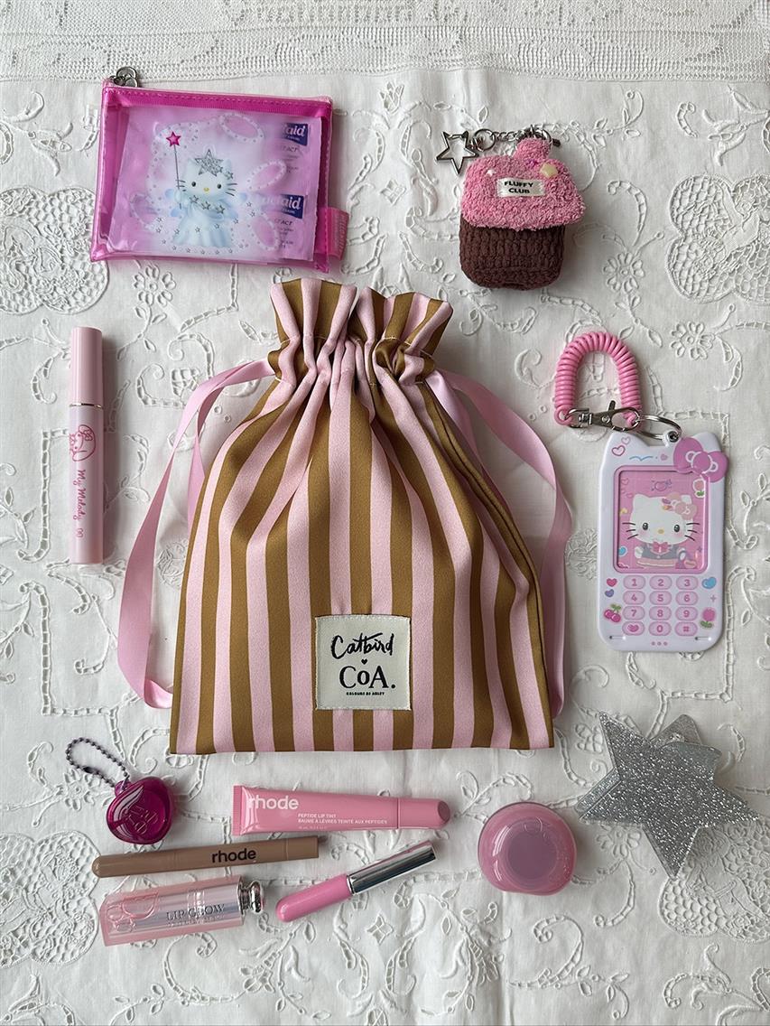
Catbird
Catbird photographs their packaging in lifestyle layout contexts. These aren't styled shoots. They look like someone's life. It makes a $400 ring feel like a real value, not an abstraction.
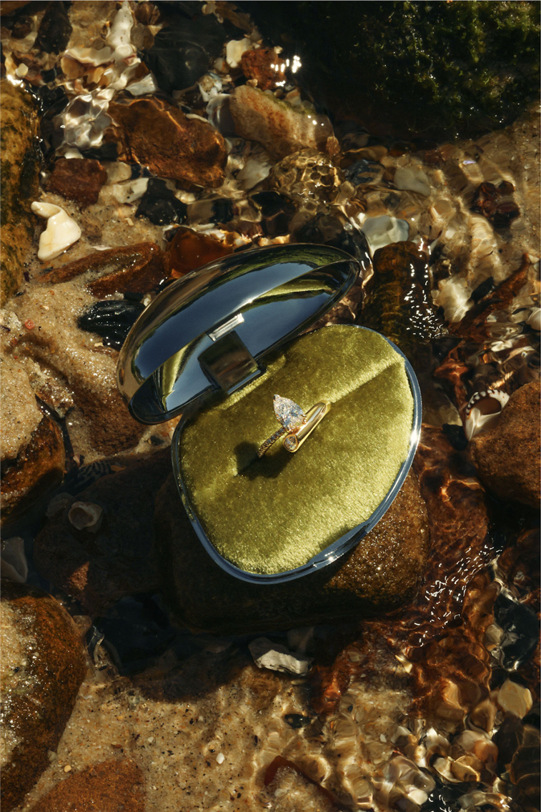
Sarah & Sebastian
Sarah & Sebastian shoot their jewelry boxes in unexpected natural environments. One campaign shows a ring box submerged in shallow tidal water among rocks and shells, the water distorts the view slightly, sunlight penetrates through creating caustic patterns, and the velvet interior stays visible through the open lid. The navy blue exterior and gold velvet create a strong color contrast against the brown and amber tones of the natural setting.
The approach removes the product from typical studio contexts entirely. The box becomes an object in a landscape rather than a commercial product. This works for their brand because it suggests the natural materials and inspiration behind the jewelry itself: pearls, shells, and ocean references that appear in their designs. The packaging photography connects to the product story rather than just displaying the container.
For a complete guide to jewelry photography including packaging requirements: eCommerce Brand's Guide to Jewelry Photography
Food and coffee packaging ideas
Blank Street
Blank Street's coffee bags appear on their Instagram in flat lays, like a bag lying on a colored background that matches one of the accent colors in the package design. The photography is graphic, not atmospheric. It works well because their packaging is already bold and illustrative.
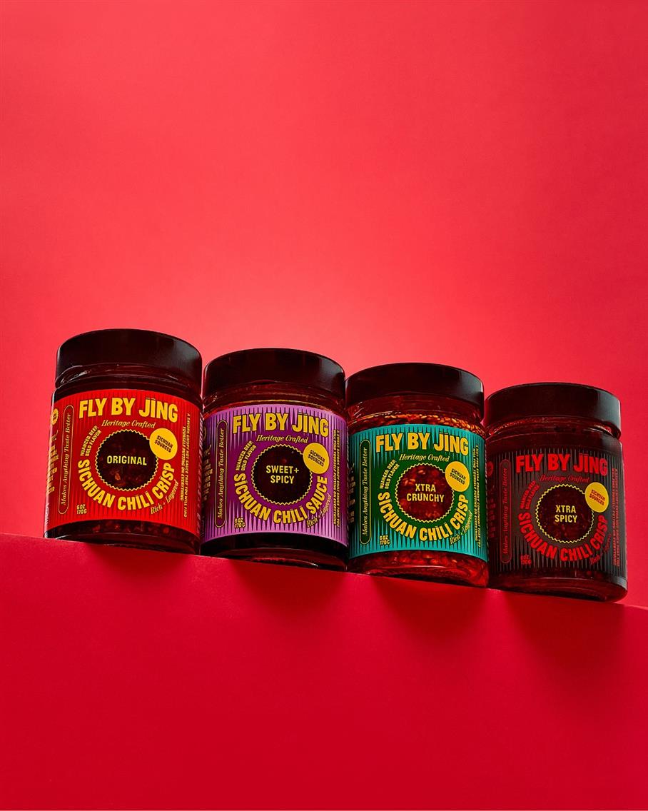
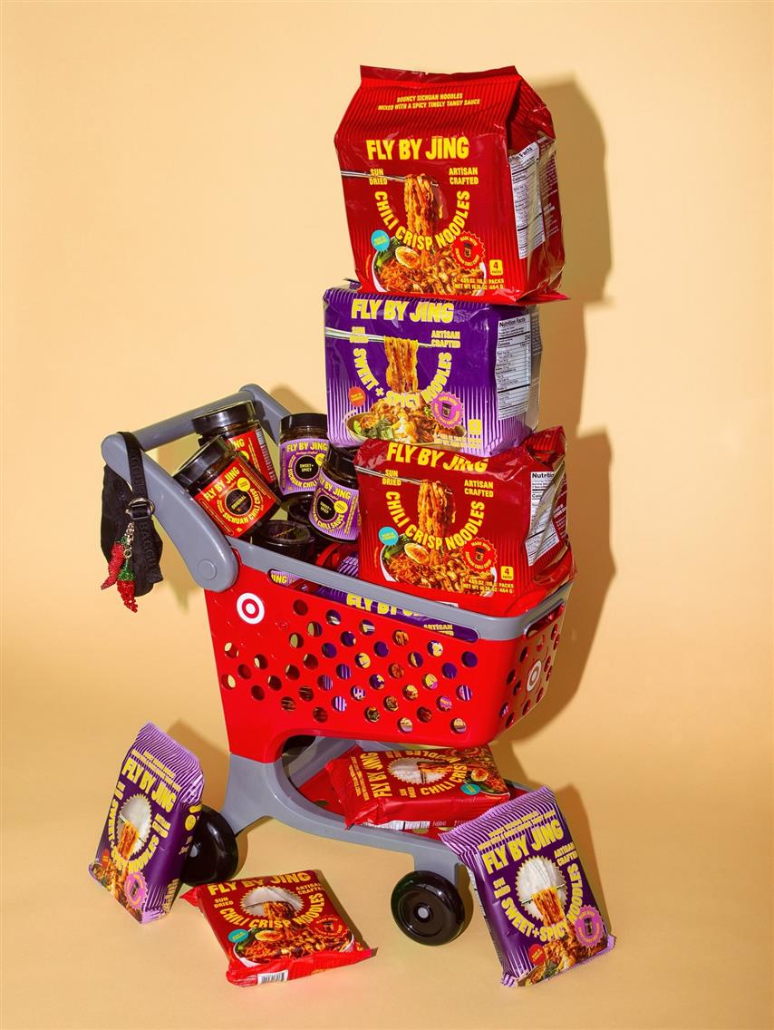
Fly By Jing
Fly By Jing shoots their chili crisp jars at a slight angle with the label facing forward. The red foil on the label catches light but doesn't blow out. There's usually a small reflection on the glass jar. The background is clean like an off-white surface that feels like a kitchen counter or bold-colored for promo shots.
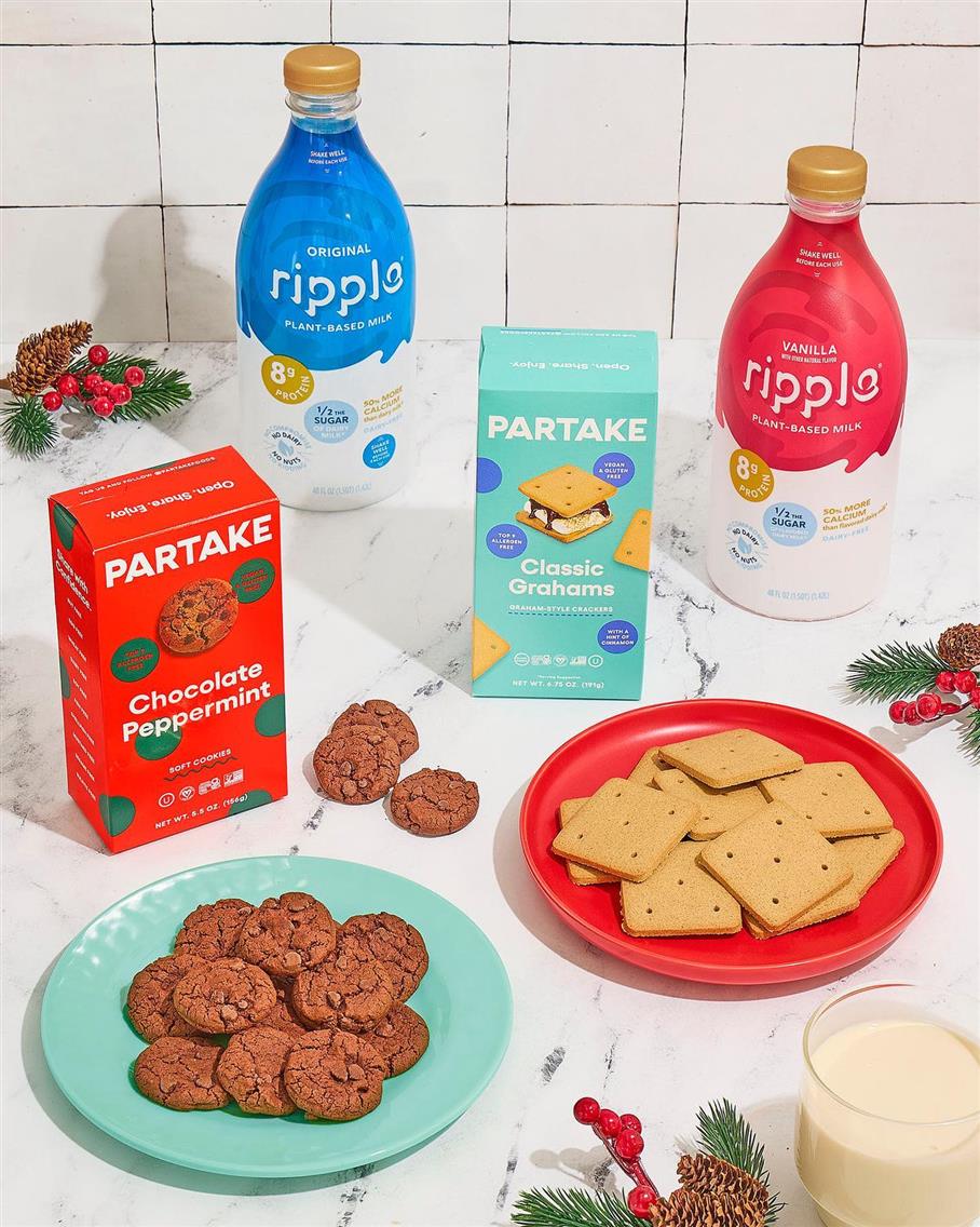
Partake Foods
Partake Foods shoots their cookie boxes at kitchen table height, often with the box partially open and a cookie sitting in front of it. Sometimes there is a glass of milk in the background, slightly out of focus.

Brightland
For video, olive oil brands like Brightland show the full context: footage of olive groves, trees moving in wind, then a cut to the bottle on a kitchen table being tilted to pour oil onto a plate, with bread nearby. The sequence connects the product origin to the usage moment in about seconds.
The bottle stays the consistent visual element across both environments. In the grove, it's shot in natural light, often handheld or with slight camera movement. On the table, the pour is shown in real-time or slightly slowed, and the oil pooling on the plate becomes the final frame.
Olive oil is one of the few packaged food products where the agricultural source is part of the brand story. The video format lets brands show both the romantic origin (the farm) and the practical reality (the dining setup) without choosing between them.
The LenFlash Approach to Product Package Photography
Production starts with pre-production planning: understanding the packaging materials, brand positioning, and intended usage before anything is lit or shot.
Light testing comes first. Matte finishes that go flat under standard lighting, foils that create glare, and textured papers that need specific angles are all resolved before the first frame is captured.
Capture covers hero shots and supporting detail images including close-ups of finishes or embossing, context shots, and alternative angles for social or print use. Retouching focuses on accuracy rather than enhancement. The materials should look like what they actually are. For retouching standards and pricing: Product Retouching at LenFlash
Delivery happens through LF Cloud, where all assets are organized by SKU, format, and usage type. This matters for brands managing multiple product lines or seasonal releases where consistency across shoots is necessary.
Order packaging photography at LenFlash