


Visual Content Psychology in Marketing and Ads
Every brand today is competing in what is often called the economy of attention, where consumers scroll faster, watch shorter, and decide quicker than ever before. In this environment, visuals have become the most powerful form of communication. The brain processes and categorizes an image long before language enters the picture, which means the photograph or video thumbnail a brand chooses defines how it gets perceived in the first instant of contact.
Even the best product can be overlooked if the imagery does not trigger attention or emotion. Visuals are the brain's shortcut for decision-making. Before a person consciously evaluates an offer, they have already categorized the brand: trustworthy or not, affordable or premium, relatable or distant. That judgment happens in milliseconds, almost entirely based on what is seen.
Visual psychology in marketing is not about aesthetics for their own sake. It is about understanding how people interpret imagery and how those interpretations shape trust, perception, and buying intent. Every color, texture, light gradient, and expression carries meaning, together forming a story absorbed faster than any written word.
For modern brands, this understanding is the foundation of effective visual strategy: knowing how to communicate value and emotion through photography and video that does not just attract attention but actively guides perception.
This article covers how consumers actually see, what emotional triggers drive their reactions, and how these principles translate into more persuasive and memorable brand visuals.
Part of our complete guide: Ultimate Guide to Visual Marketing Strategy for eCommerce Business
The Science Behind How Consumers See
How the Human Brain Reacts to Visuals
What makes visuals such powerful marketing tools is how the brain handles them. Humans are wired to recognize, categorize, and emotionally respond to images almost instantly. Visuals are not read the way text is read. They are felt first.
Not all visuals carry equal impact. The brain prioritizes clarity, emotion, and relevance. When a photo or video feels aligned with what is already expected from a category, it gets understood in a split second. When it does not, the viewer pauses, questions, or moves on.
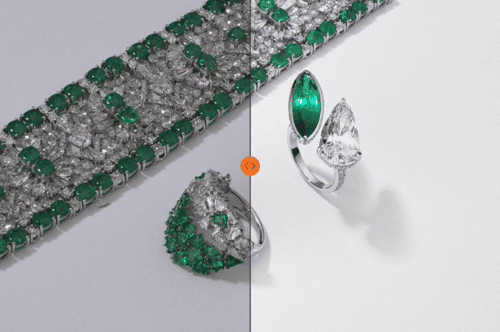
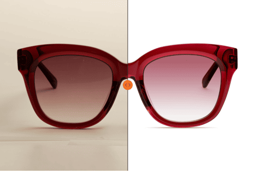
This is the idea behind visual shortcuts: simplified associations the brain builds to evaluate brands quickly. A sleek metallic surface and cool blue gradient lighting instantly signal technology and innovation. Red velvet or deep burgundy tones evoke luxury, confidence, and exclusivity, the register many jewelry campaigns rely on. Clean white backgrounds paired with soft lighting communicate purity, safety, and minimalism, which is why they dominate skincare and beauty photography.
These associations are learned patterns, reinforced through culture, film, advertising, and habit. Once established, they work on autopilot: people register whether a brand feels trustworthy, premium, or accessible before they consciously register what it sells.
When a product photo or brand film communicates the right message visually, it bypasses rational analysis and lands directly in emotional memory. It feels right, even when the viewer could not explain why.

First Impressions and Mental Models of Brands
Before someone decides whether to keep watching or scroll away, the mind has already built a mental model of the brand: what it stands for, how it feels, where it sits on the price and quality scale.
The brain is constantly predicting. When it sees an image, it searches for familiar cues: lighting, tone, composition, even the way a hand holds a product. All of these details quietly signal what kind of brand this is. Accessible or aspirational? Playful or serious? Modern or traditional?
This is why photography and video production set expectations instantly, not just for the product but for the entire brand experience. First impressions are rarely reversible. Once a customer categorizes a brand, everything seen afterward passes through that filter. Visuals do not just need to look good. They need to be strategic and coherent. Every frame, highlight, and motion cue communicates how much care went into quality, design, and storytelling.
Emotional Triggers in Visual Marketing
The most successful campaigns make people feel something. Emotion drives memory, recall, and ultimately purchase intent. Photography and video are especially powerful because they mirror real sensory experience, letting a viewer feel the texture, temperature, and rhythm of a brand before ever interacting with the product.
Emotional design starts with understanding what emotion the target audience is seeking, confidence, peace, excitement, belonging, and translating that state into color, light, motion, and composition.
The Color Psychology Framework
Color is the most immediate emotional language in marketing. Before any story unfolds, before any product is examined, the palette sets the mood. Blue conveys reliability and calm, which is why it dominates technology, finance, and some lifestyle and wellness brands. Red activates energy and urgency. Black signals exclusivity and power. Pastels soften perception and make a brand feel more personal.


Color is always a matter of context and proportion. A luxury jewelry brand might use deep red sparingly to suggest rarity, while a skincare brand leans on the same color for a playful, flirty mood entirely.


Some of the most iconic examples of color psychology are built directly into brand memory: Tiffany's turquoise, a symbol of aspiration and timelessness, and Glossier's pink, representing friendliness and emotional accessibility. These choices become emotional anchors in the consumer's mind.


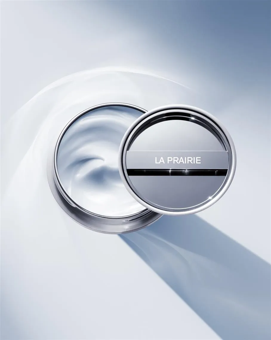
Color also affects perceived material value. Gradient blue lighting can make skincare packaging look futuristic and signal innovation. The same product under warm, diffuse light feels more natural and gentle. The color narrative should evolve with the story being told across campaigns and seasons, emotionally consistent but never static.
Faces, Eyes, and Empathy in Commercial Imagery
Humans are biologically programmed to look for faces. It is the first thing the eye detects and one of the strongest triggers of emotional connection, which is why visuals featuring people consistently outperform those that do not.
A genuine expression or subtle eye movement can shift how viewers perceive the entire message. When a model looks directly into the camera, it creates intimacy, a feeling of being addressed personally. When the gaze is slightly averted, it invites curiosity or suggests aspiration.
Psychologists call this the mirror neuron effect: when people see someone experiencing an emotion, their brains partially replicate it. Seeing joy, calm, or confidence on screen makes the viewer start to feel those emotions too. This is what makes on-model photography and video so effective. It lets the viewer experience the emotion rather than simply observe it.
In commercial storytelling, facial expression, pose, and lighting become the vessel for brand emotion. This is why luxury visuals are rarely loud. Instead of exaggeration, they rely on calm control and nuanced expression that project confidence.
For how to cast and direct models for this kind of emotional resonance: The Smart Way to Find and Choose Models for Your Brand Photoshoot
Textures, Light, and Depth in Photography
Light and texture communicate how something feels, even though it cannot be touched. A high-contrast image with sharp highlights communicates precision, strength, and luxury. Soft shadows and gentle diffusion evoke intimacy and comfort instead.
Texture plays an equally important role. A leather bag under studio lighting reads as powerful and structured. The same bag under soft daylight reads as approachable and lived-in. These tactile qualities make an image believable and emotionally resonant.
Lighting also creates perceived depth, which the brain interprets as realism and quality. In jewelry or beauty photography, carefully controlled reflections make surfaces appear dimensional and valuable. In fashion, directional light sculpts form and guides the eye to where it matters most.
A photograph that feels touchable triggers stronger purchase intent because it bridges the gap between screen and physical reality. This is the practical argument for professional lighting, styling, and retouching: they make the product feel like it exists within reach rather than behind glass.

Cognitive Biases That Shape Visual Decisions
When people look at an image, they rarely see it objectively. Every viewer brings a set of mental shortcuts that help the brain process information faster, and these shortcuts shape perceived value, quality, and trustworthiness long before logic enters the picture. Understanding these biases explains why two identical products can generate completely different reactions depending purely on how they were photographed.
The Familiarity Principle
People trust what they recognize. The more a certain image style, color palette, or layout is seen, the safer it feels. The familiarity principle describes the brain's tendency to prefer what feels known, even subconsciously.
When a brand maintains visual consistency across its channels, from ad campaigns to product listings to social media, it creates psychological comfort. Consumers begin to predict how the brand will look and feel, and that predictability translates directly into trust. This is why many global beauty brands use a consistent light direction and skin tone palette across every campaign: it teaches the brain that this brand equals reliability.
Familiarity does not mean monotony. It means coherence. When visuals evolve naturally within a clear system, the brand identity strengthens without losing its emotional foundation.
The Halo Effect
Another powerful bias is the halo effect, where one strong impression colors the perception of everything associated with it. In visual marketing, a single beautiful image can make an entire brand seem premium. One poorly executed shot can do the opposite just as efficiently.
This effect is especially strong in luxury categories. High-end jewelry, fashion, and fragrance campaigns use flawless visuals to create a cognitive glow around the brand. When the viewer sees meticulous lighting, balanced composition, and emotional depth, they assume the same care exists in the product itself.
Social Proof and Visual Context
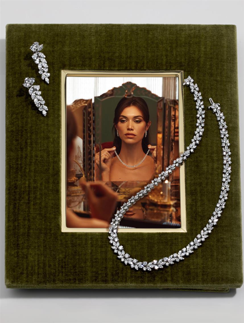
Humans are social learners who rely on visual context to decide what is desirable and trustworthy. This is why a product shown on a model, in a home, or within a lifestyle scene draws attention first and builds trust second. It shows the product in use and activates social proof.
Seeing a product integrated into someone's life triggers a simple thought: if it works for them, it will work for me. The brain mirrors the experience, reducing uncertainty. For beauty or fashion brands, this means campaign visuals that feel lived-in: natural poses, relatable environments, emotional realism. For tech or luxury goods, it means showing the product within contexts that feel aspirational yet believable.

Even small visual cues matter: how a hand holds a perfume bottle, how jewelry catches light during movement, how a model interacts with fabric. The right background, styling, and light create an unspoken narrative of community, belonging, or aspiration.
Storytelling and Sequence in Visual Content
Visual consistency builds a recognizable rhythm in how a brand looks and feels. The brain favors patterns. When it sees familiar color tones, lighting styles, or compositions repeated, it unconsciously links them to memory and emotion, creating brand conditioning over time.
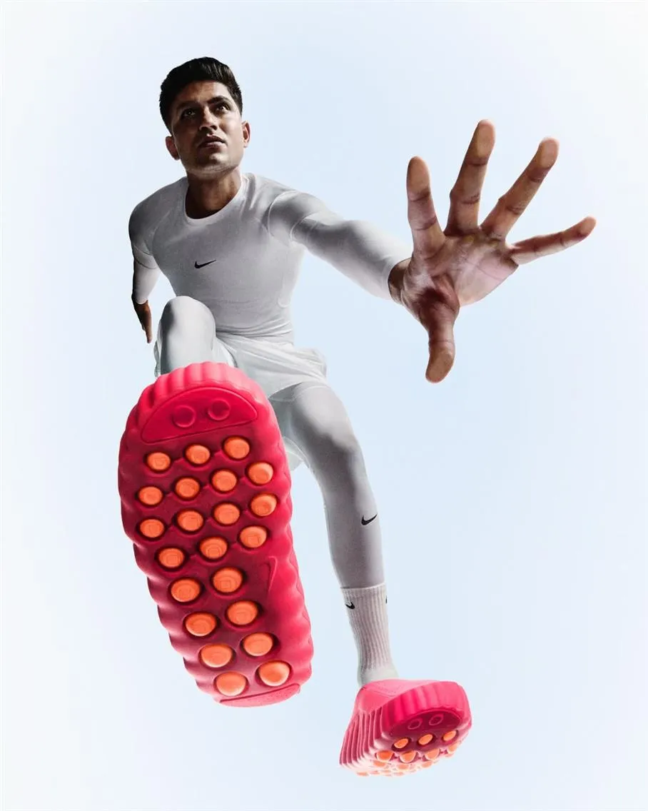
Apple has trained audiences to associate clean backgrounds, balanced light, and controlled reflections with innovation and simplicity. Nike conditions viewers through contrast and motion, carrying energy and human triumph through every frame. Neither brand needs a visible logo for the audience to know whose ad they are watching. The emotion itself is branded.

The same logic applies to smaller and emerging brands. Consistency across campaigns, website imagery, and social content builds the foundation of trust. When every image looks like it belongs to the same visual world, the brand reads as more structured and more credible.
Abrupt visual shifts, like jumping from bright, minimal photography to dark, moody video with no narrative connection, feel jarring because they interrupt memory formation rather than reinforcing it.
A sequence of images can do what a single image cannot: hold attention and change how people think. Moncler's campaign sequencing shows this clearly, building a visual rhythm from frame to frame that mimics how real experience unfolds.


The viewer subconsciously follows a visual rhythm, a shift in light, a close-up turning into a wide shot, or a change in color temperature that suggests movement through time or emotion. This rhythm mimics how we experience real life, which is why narrative visuals are easier to remember. A strong campaign builds a beginning, middle, and end, even without dialogue. The beginning establishes tone and curiosity. The middle reveals detail, texture, or human interaction, the emotional core. The end resolves with satisfaction, confidence, or desire. In still photography, this sequence can appear across a carousel or campaign set. In the video, it flows within seconds.
Color can also act as a narrative tool. Gradual shifts from cool to warm tones, for example, can mirror a transformation story from uncertainty to confidence, from calm to celebration. This technique is used across beauty and fashion campaigns, where emotional resolution becomes part of the product experience.
Storytelling through imagery is a psychological structure that helps consumers connect the dots. When visuals are sequenced intentionally, they mimic how our brains process stories: seeking patterns, anticipating outcomes, and feeling rewarded when the story resolves.
Applying Visual Psychology to Your Brand Strategy
Understanding how visuals shape perception is only valuable when it translates into practical brand strategy. Photography and video are tools for directing emotion, attention, and trust. The question is how to make your visual communication intentional rather than intuitive.
That starts with an audit: looking at your imagery not as a collection of assets, but as a psychological map of what your audience feels when they see your brand.
How to Audit Your Brand Visuals Through a Psychological Lens
When reviewing your visuals, ask whether they make people feel what you want them to feel. Every color, expression, and camera angle influences emotion. Start by identifying the emotional core of your brand. Is it calm and trustworthy? Bold and aspirational? Intimate and sensory?
Then, look at your photos and videos and ask:
- Do these visuals evoke the same emotions across every platform?
- Do they match my audience’s self-image and aspirations?
- Do they look like they belong to the price segment I’m targeting?
- Are the lighting, tone, and atmosphere consistent with my positioning?
These questions reveal psychological gaps, the difference between how your visuals currently feel and what your audience is subconsciously seeking.
Lighting and color are often the biggest giveaways. For example, if your brand promises luxury but your visuals rely on flat lighting and low contrast, the brain interprets it as ordinary. If your brand is about wellness and clarity, but the imagery is dark or overly stylized, it creates emotional dissonance.
Motion matters too. The pacing and flow of edits in video content should mirror your brand’s rhythm. Fast cuts and dynamic movement create urgency and excitement. Slower transitions and lingering close-ups communicate trust and calm. When visuals and brand tone align, the audience experiences emotional harmony, the quiet feeling that everything fits.
This kind of audit is a continuous process of refinement. As consumer expectations evolve, your visual psychology must evolve with them, but always from the same DNA in its core.
Collaborating with Experts Who Understand Visual Psychology
A beautiful image is not automatically persuasive. It becomes effective when it aligns emotion, storytelling, and brand psychology. That’s where expert direction matters.
Photographers, retouchers, and creative directors who understand behavioral cues work beyond aesthetics. They think in layers: what emotion a certain light temperature evokes, how a camera angle changes perceived authority, or how facial expression influences conversion rates.
At Lenflash, every campaign begins with this understanding. Our approach to visual production combines artistic experience with behavioral insight. Whether it’s jewelry, fashion, technology, or beauty imagery, we treat each frame as a psychological statement: how it should feel, what it should say before words appear, and how it should position the brand in the viewer’s mind.
Our process blends creativity and strategy: thoughtful lighting design, controlled texture representation, emotion-led model direction, and retouching that enhances realism rather than perfection. The goal is to make your products and brand feel desirable and real.
FAQ About The Psychology of Visuals
What is visual psychology in marketing?
Visual psychology in marketing is how people interpret and respond to imagery, both consciously and subconsciously. It explains how elements like color, light, composition, and human expression influence perception, emotion, and decision-making. In practice, it helps brands create photography and video that define how a viewer feels about a product and its value before reading a word of copy.
How do visuals affect consumer decisions?
Visuals shape first impressions, set expectations, and trigger emotional reactions that drive behavior. Before reading any text, people decide whether a brand feels trustworthy, luxurious, affordable, or relevant, almost entirely based on imagery.
Why is color psychology important in branding?
Color is the strongest nonverbal form of communication a brand has. It shapes how consumers perceive mood, value, and identity. Blue tones convey stability and trust. Red suggests energy and urgency. Black evokes sophistication and exclusivity. A cohesive color system across photography and video reinforces emotional consistency and makes a brand more recognizable over time.
How can brands apply visual psychology to ads and product photography?
Start with emotional clarity: define what the audience should feel, confidence, desire, calm, and build every visual choice around that feeling. Keep lighting, color palette, and composition consistent with the brand's positioning. In campaigns, sequence visuals like a story, setting tone, building emotion, and resolving with satisfaction. In product photography specifically, treat lighting angle, background tone, and the presence or absence of a human reference point as psychological decisions, not just technical ones.


