

The Secrets of 5 Successful Jewelry Marketing Campaigns
The difference between jewelry campaigns that build lasting brand equity and campaigns that disappear lies almost entirely in visual execution. The concept can be original, the casting can be right, the media budget can be substantial, but if the photography, lighting, and creative direction fail to translate the idea into images that hold attention, none of the rest matters.
We analyzed five jewelry campaigns from brands at very different scales and market positions — Bulgari, Georg Jensen, PDPAOLA, Hernán Herdez, and Missoma — and examined the specific visual decisions that made each one work. The analysis covers lighting technique, casting strategy, color direction, and what each brand's approach communicates about its positioning.
Part of our complete guide: eCommerce Brand's Guide to Jewelry Photography
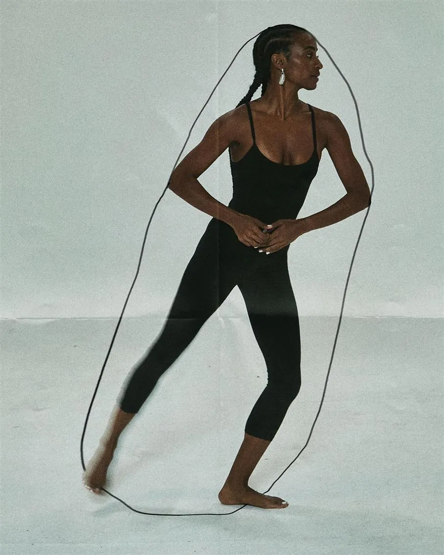
1. Georg Jensen "Reflect Collection" (2022) Punk Heritage Fusion Jewelry Campaign
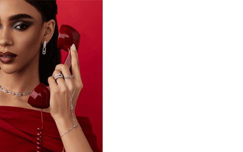
The concept. Shot in a historic Copenhagen mansion, the campaign featured Prince Felix of Denmark and model Fiona Reventlow-Grinling wearing select designs from the Reflect collection. The organic-shaped links in sterling silver and 18kt gold drew influence from '90s London punk aesthetics while maintaining Georg Jensen's Scandinavian heritage. The historic Copenhagen mansion provided gravitas without overpowering product, while casting Prince Felix of Denmark (eighth in line to throne) generated earned media value far exceeding paid placement costs.
Designer Jacqueline Rabun explained: "During the 90s, chains were a particularly important part of daily wear, like a uniform. I became obsessed with the idea of reimagining the link chains to incorporate a more organic and sculptural expression." The campaign successfully combined edgy punk-inspired aesthetics with Georg Jensen's century-long craftsmanship heritage. Van Rijt's architectural photography approach emphasized the sculptural qualities of each piece, while the historic mansion setting provided sophisticated context.
Visual execution. The campaign emphasized individual expression through the tagline "Your jewelry, your way." Rather than traditional luxury positioning, multiple "Friends of the House" were photographed styling the collection personally, showing versatility rather than prescriptive fashion rules.
Van Rijt employed his signature shooting approach, combining natural mansion light with carefully positioned fill, creating what appears to be available light but is actually a highly controlled chiaroscuro technique. The moody, contrasty illumination echoes Rembrandt lighting principles: key light at 45-degree angle creating a triangular highlight on the shadowed cheek, establishing dramatic depth while maintaining product visibility. This lighting choice reinforces punk rebellion message while preserving Scandinavian minimalism.
Campaign deliberately maintains a monochromatic palette (black, white, silver tones) rather than introducing gold pieces, creating a cohesive visual identity while subtly positioning silver as equally luxurious to gold. This challenges jewelry hierarchy conventions, typically gold photographed in warmer, more opulent settings. The cooler palette attracts younger demographics while maintaining sophisticated appeal.
Heritage brands can successfully adopt contemporary aesthetics when visual execution bridges past and present authentically. Architectural photography elevates product sculptural qualities.
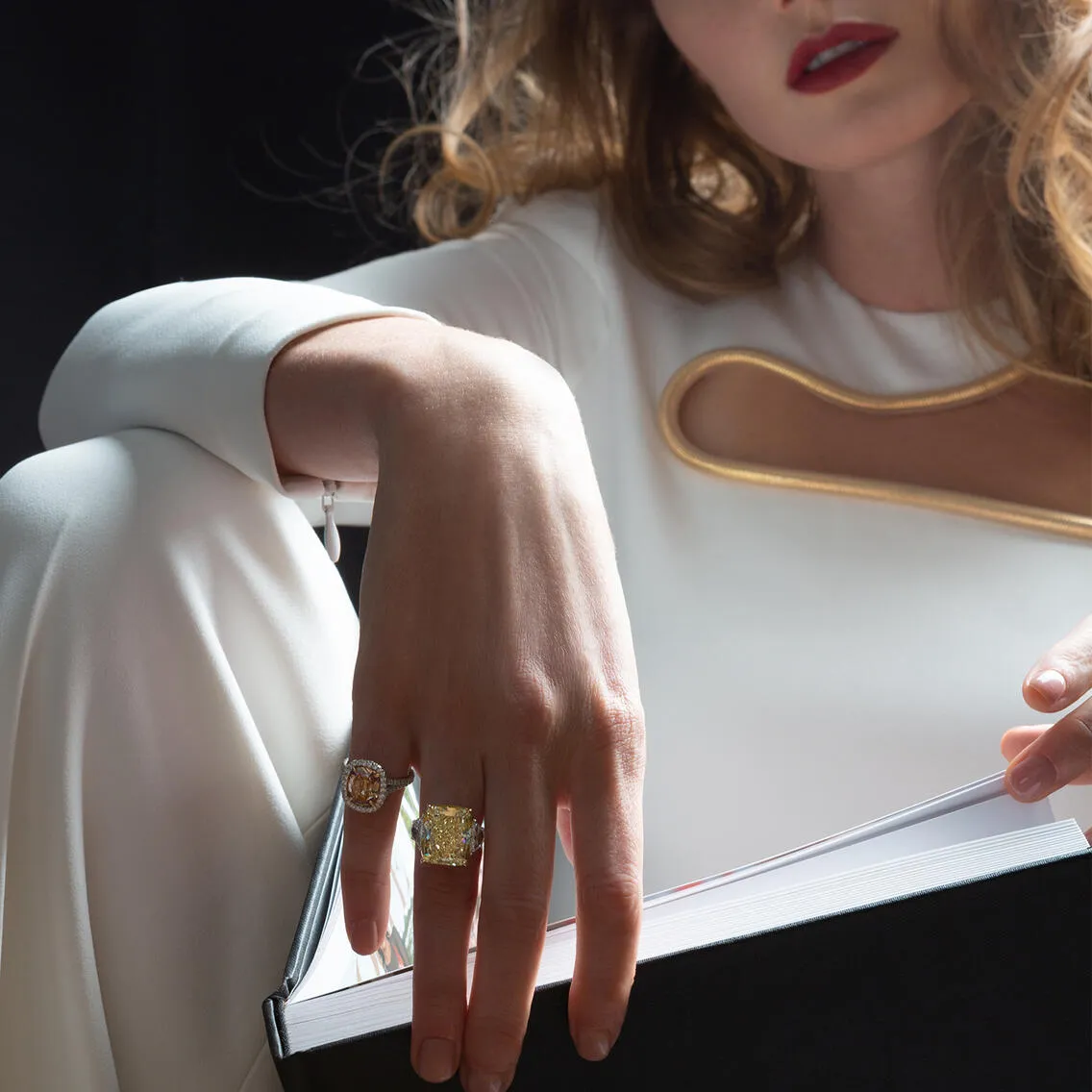
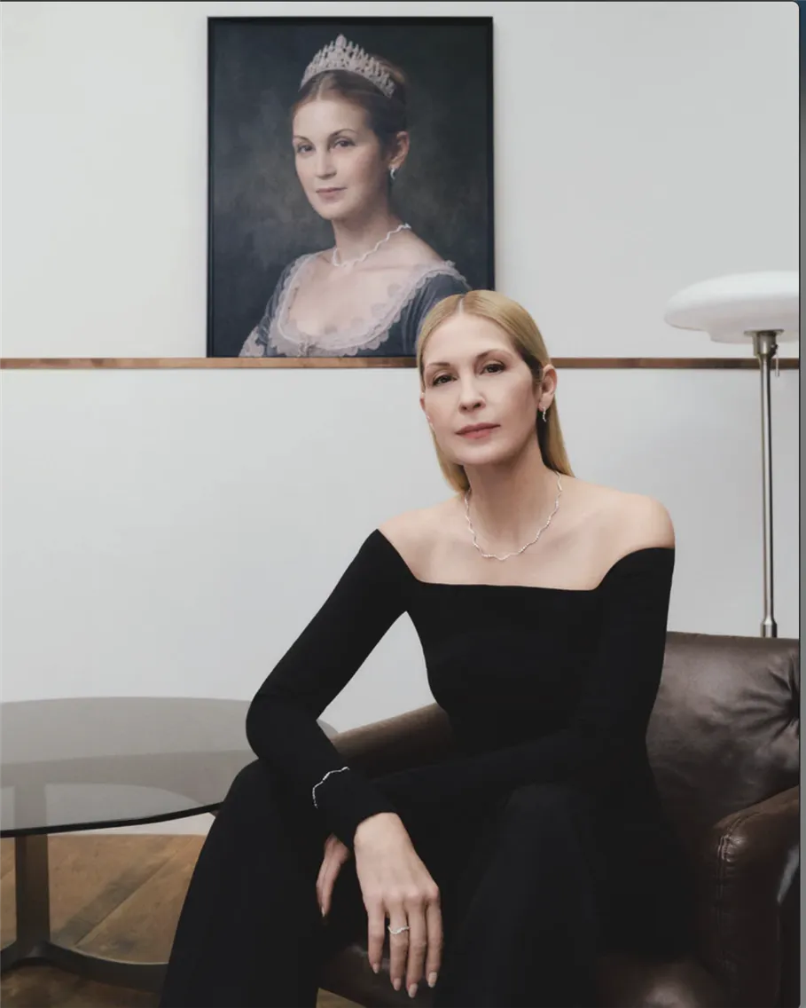
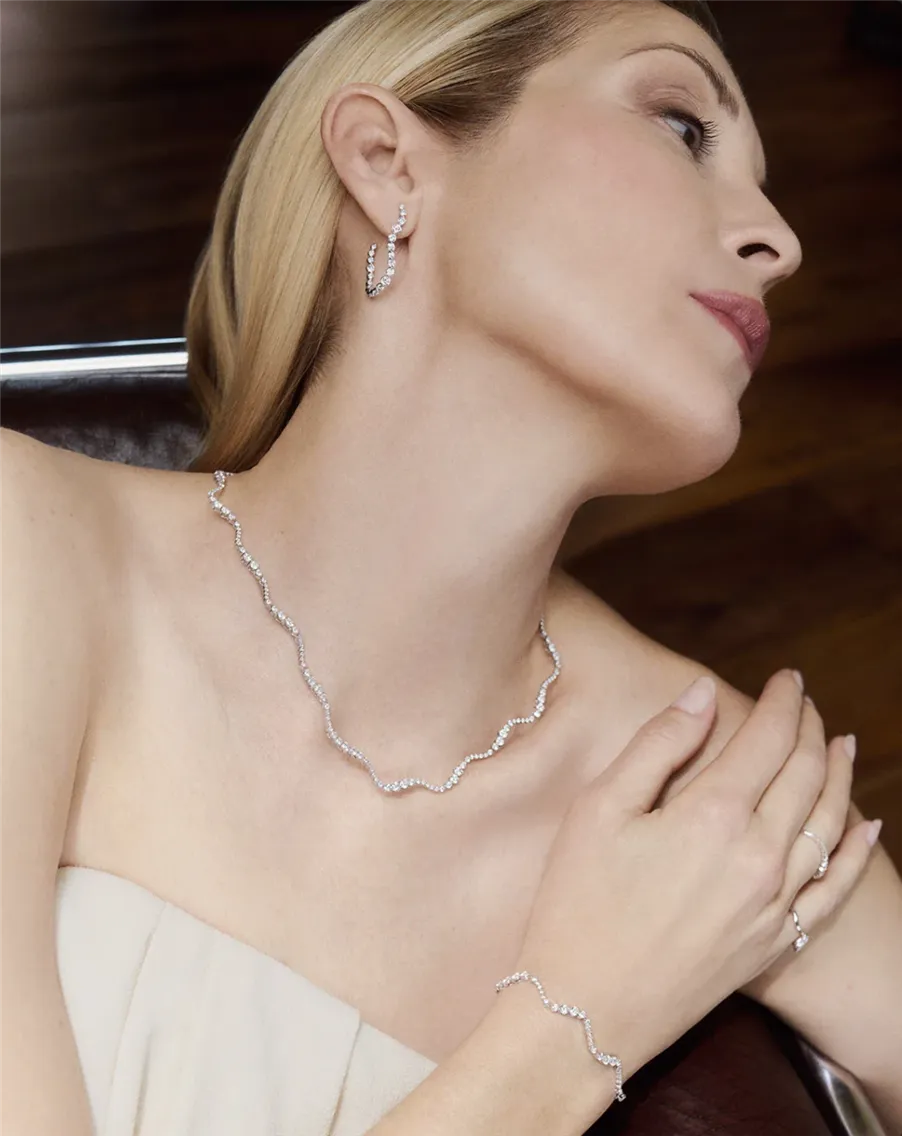
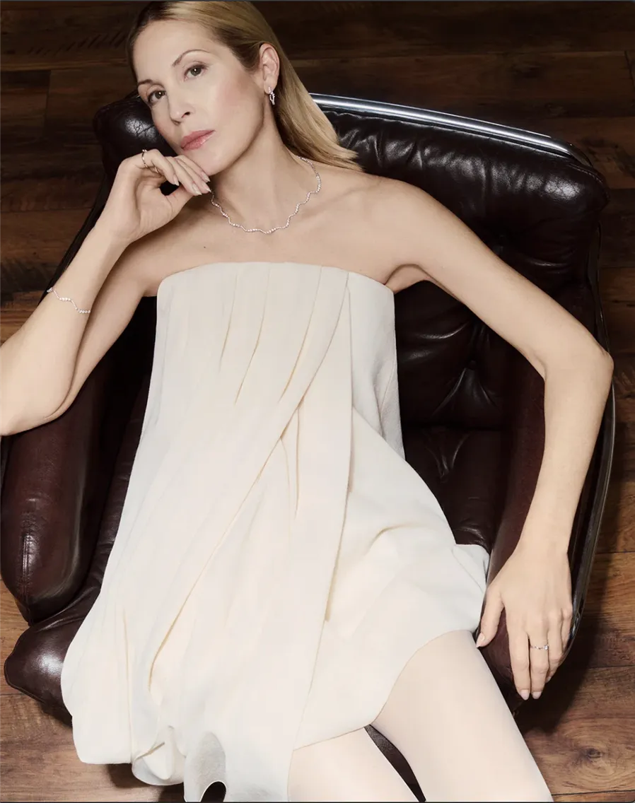
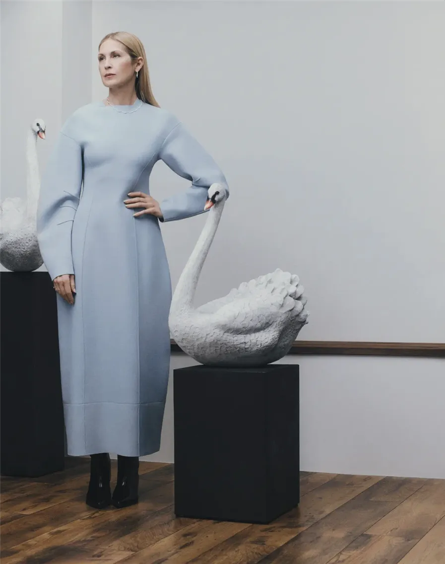
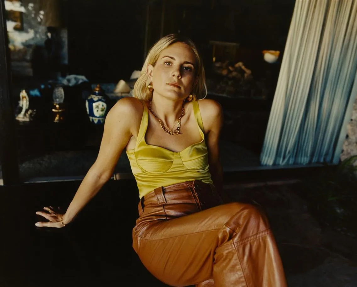
2. PDPAOLA Fine Jewelry Line Launch with Kelly Rutherford (2024)
Selecting Kelly Rutherford represents sophisticated understanding of luxury consumer psychology. Her "Gossip Girl" Lily van der Woodsen character embodies effortless Upper East Side sophistication, precisely the aspirational lifestyle PDPAOLA needed to signal fine jewelry category entry. Unlike younger influencers with transient appeal, Rutherford's 40+ demographic suggests longevity and purchasing power for high-ticket jewelry.
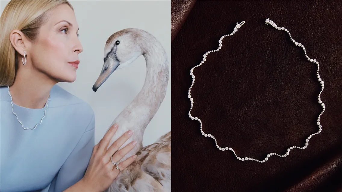
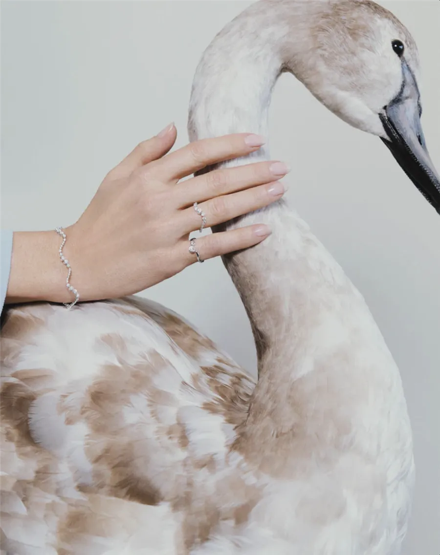
The campaign portrait positions Rutherford as swan queen, suggesting both elegance and authority. This metaphor justifies premium pricing through implied exclusivity while making lab-grown diamonds feel naturally luxurious rather than an artificial alternative stereotype.
Swan imagery plays on multiple semiotic levels: grace, transformation, rarity, and surprisingly, fierce protection of territory (relevant for the competitive fine jewelry market).
3. Hernán Herdez’s Conceptual Art Direction as a Differentiating Strategy for Campaigns
Melissa Hernández's background as art director fundamentally shapes the visual approach, as each image functions as art piece first, commercial photography second. This reversal of priorities creates distinctive market positioning where customers purchase into artistic vision rather than product category. Campaign imagery employs gallery lighting (soft, even illumination, preventing dramatic shadows), neutral backgrounds, and compositional rules from fine art photography rather than commercial jewelry conventions.
Models are often shot from unusual angles, like below, above, or profile, emphasizing jewelry's architectural qualities and relationship to body geometry. This approach requires advanced lighting skills to maintain product detail while creating a conceptual narrative, likely using multiple light sources with diffusion panels to prevent harsh shadows while maintaining dimensional clarity.
Sustainable aesthetics without preaching. Recycled metal messaging is integrated through visual subtlety rather than overt environmental imagery. Photography emphasizes raw, organic textures suggesting natural origins without typical eco-marketing clichés (green colors, nature backgrounds, earth imagery). The aesthetic feels intentionally unpolished compared to luxury jewelry conventions, suggesting authenticity and craftsmanship over mass production perfection.
Independent brand visual language. Campaign imagery embraces imperfection as design element. Slight grain, unconventional cropping, and organic compositions create intimacy impossible for major brands requiring committee approval. This authentic aesthetic resonates with customers seeking alternatives to corporate luxury presentations.
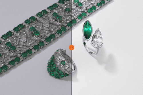
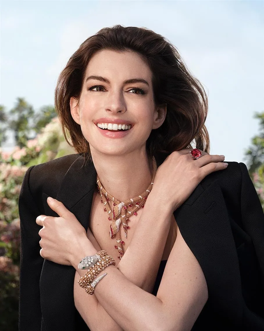
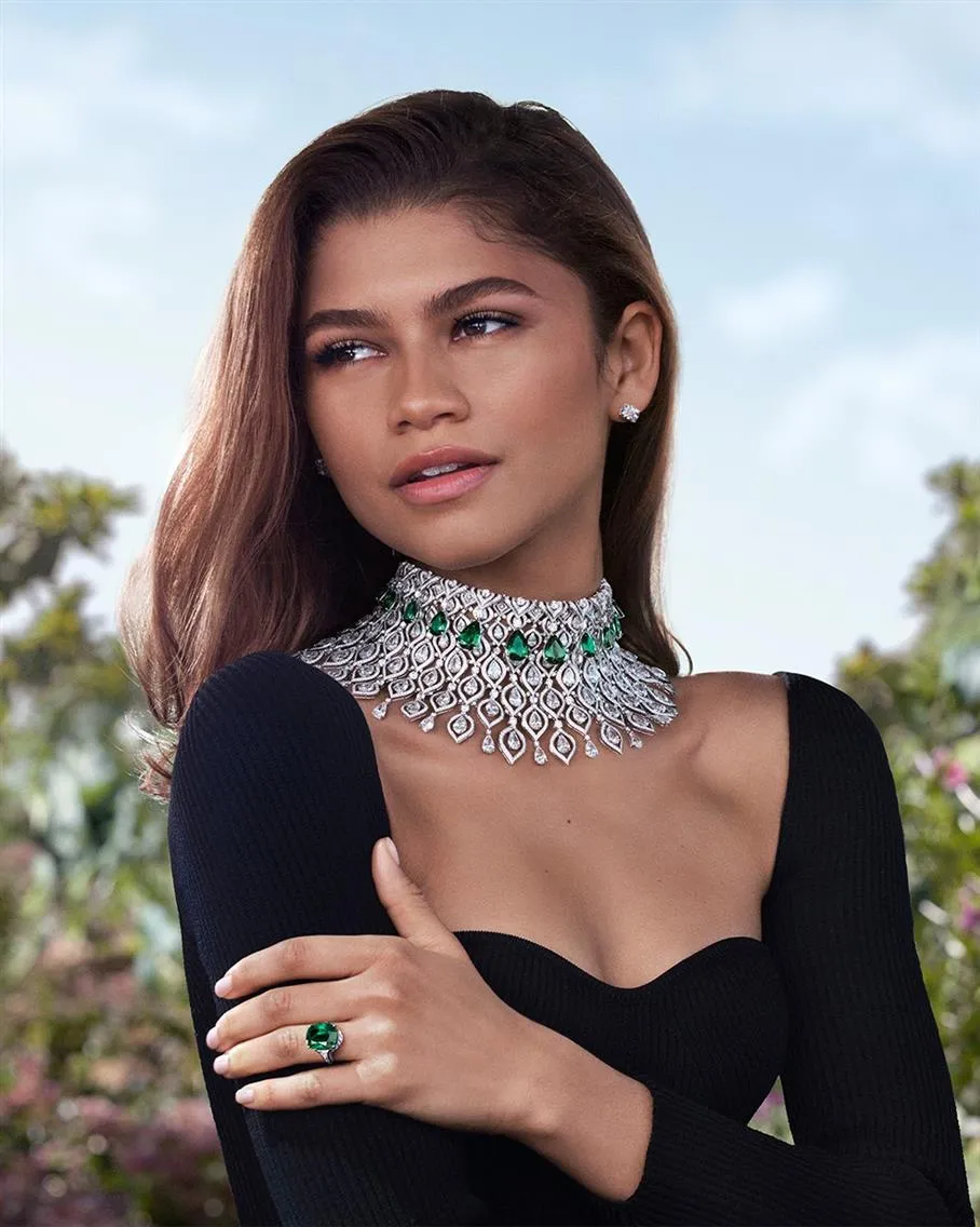
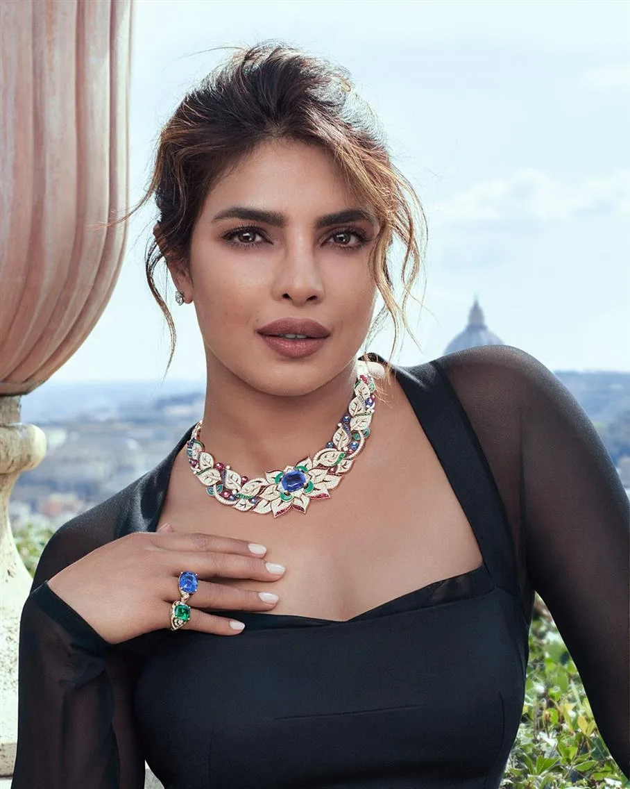
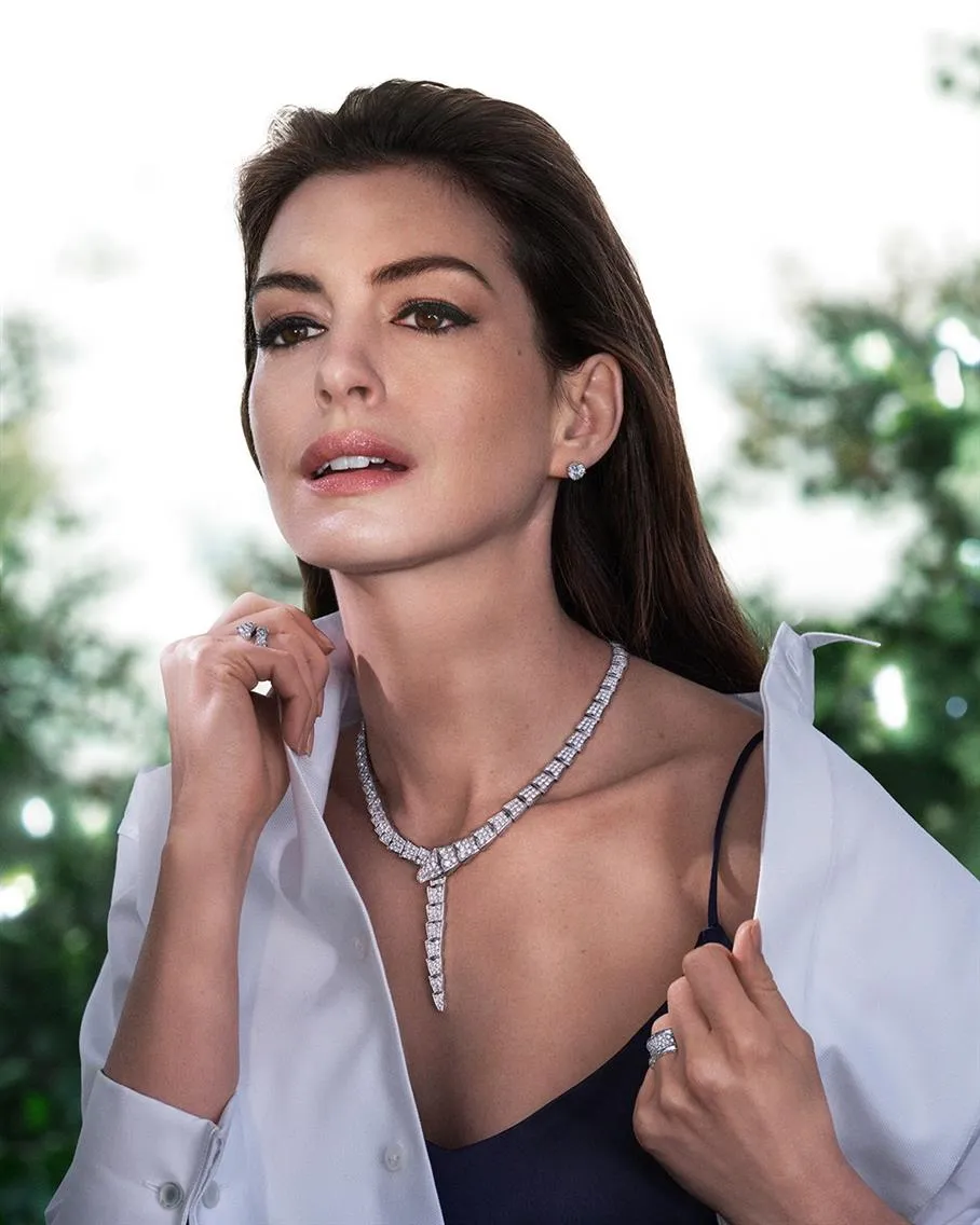
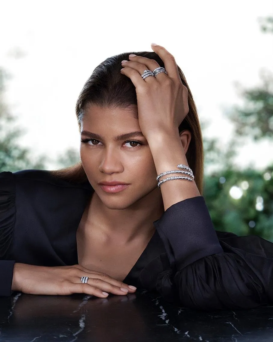
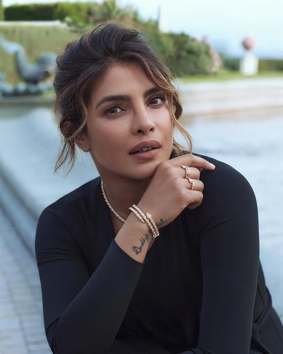
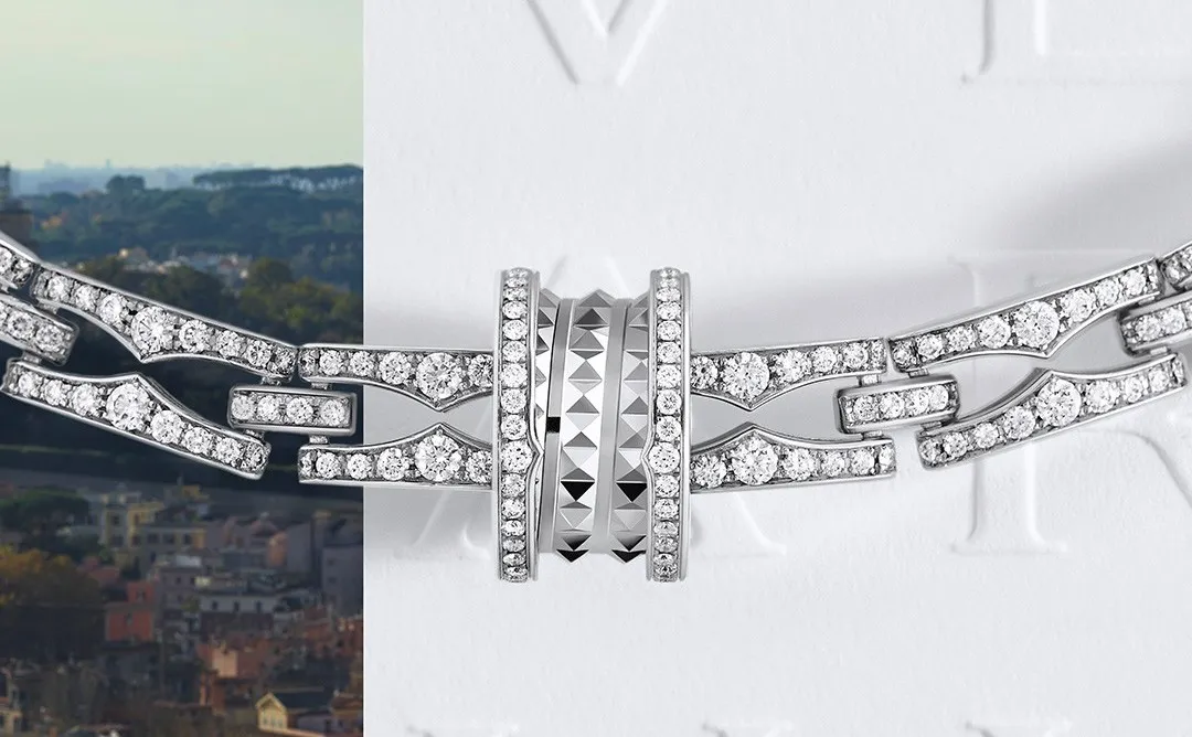
4. Bulgari "Unexpected Wonders" (2022) Fine Jewelry Campaign
The 2022 "Unexpected Wonders" campaign featured five global ambassadors: Anne Hathaway (debut as brand ambassador), Zendaya, BLACKPINK's Lisa, Priyanka Chopra Jonas, and Chinese actress Shu Qi. This strategic casting represented geographic diversity and demographic segmentation: Hollywood A-list (Hathaway, Zendaya), K-pop influence (Lisa), Bollywood crossover appeal (Chopra), and Asian markets (Shu Qi).
Bulgari employed two premier photographers with distinct strengths: Dan Jackson shot Anne Hathaway and Zendaya's portraits, while Chris Colls captured Lisa, Priyanka Chopra, and Shu Qi. Jackson specializes in portraying "strong and multifaceted nature of personalities," while Colls brings different technical expertise to jewelry photography. This division prevented creative monotony while maintaining campaign cohesion through consistent Roman locations and lighting philosophy.

Academy Award-winning director Paolo Sorrentino created a companion brand film featuring Hathaway and Zendaya exploring Rome. The signature sequence, "magical rain of flowers" in a chandelier-lit palazzo, required complex practical effects coordination. Sorrentino's approach elevated product placement into artistic narrative, with jewelry becoming integral to story rather than decorative afterthought. The flower rain sequence likely required multiple takes combining practical effects (actual flowers) with potential CGI augmentation for consistent coverage and timing.
Shot entirely in Rome, the campaign utilized the city's architectural grandeur as an active design element rather than a passive backdrop. The historical palazzo setting provided three-dimensional luxury validation: ornate interiors, terraced views of the Roman cityscape, and period architectural details reinforcing Bulgari's heritage narrative. The location choice required sophisticated lighting equipment to balance natural window light with interior illumination while maintaining jewelry visibility.
Each ambassador wore collection pieces matching their public personas: Hathaway in High Jewelry and Serpenti pieces (sophisticated elegance), Zendaya in B.Zero1 and BB collections (contemporary edge), Lisa in B.Zero1 (edgy youth appeal), Priyanka in High Jewelry and Serpenti (cross-cultural luxury), Shu Qi in Divas' Dream (refined femininity). This approach maximized collection visibility while creating authentic personality-product relationships.
Capturing five different celebrities across multiple jewelry collections required extensive technical precision: macro lens work for jewelry detail, careful color temperature management across Roman interior/exterior locations, and specialized retouching maintaining each celebrity's distinct visual identity while ensuring consistent product representation. The campaign likely required focus stacking techniques for comprehensive jewelry sharpness and extensive post-production color grading to unify diverse lighting conditions into cohesive visual narrative.
Unlike minimalist approaches emphasizing reduction, Bulgari's "Unexpected Wonders" strategy celebrated maximalism: multiple celebrities, extensive product range, elaborate locations, and surreal visual elements. This abundance messaging reinforces luxury through variety and spectacle rather than exclusivity through limitation, appealing to customers seeking comprehensive lifestyle transformation rather than subtle refinement.
5. Lucy Williams x Missoma "1987 Collection" (2020) or Nostalgia as Visual Currency
The "1987" collection represented Missoma's third collaboration with fashion influencer Lucy Williams, named after her birth year and described as "the most personal collection I've designed to date." The campaign leveraged authentic nostalgia rather than manufactured sentiment, with Williams explaining: "This collection is all about nostalgia. Nostalgia in its truest, rawest most whimsical form. The kind of nostalgia that's tangible, bittersweet and can be triggered by the simplest of things."
Photographed in Los Angeles, the campaign features the city's golden light and architectural backdrop to reinforce the 1980s/90s aesthetic. Creative direction and styling by Williams herself ensured an authentic personal vision rather than external interpretation. The campaign featured hand-printed imagery, demonstrating commitment to artisanal post-production techniques that matched the collection's vintage-inspired aesthetic.
Williams cited specific visual influences: "I immediately think of TLC and the Beverly Hills 90210 ladies as my sartorial icons" and referenced "growing up with my mum and two older sisters in the 90s, so there were always loads of magazines with cool editorials lying around." This specificity prevented generic '90s pastiche, instead creating targeted cultural resonance with millennial consumers who shared similar reference points.
Rather than traditional product placement, pieces were presented as reimagined family heirlooms. Williams explained: "The waffle hoops are almost exact replicas of the ones my mum always used to wear out for dinner when I was growing up and the lucky charm necklace and bracelet are a re-jigged version of a gold, glass and enamel lucky bracelet of my grandmothers." This approach transformed commercial jewelry into emotional artifacts with personal backstories.
Photography emphasized texture and weight — crucial for conveying quality in digital-first jewelry marketing. The "chunky" aesthetic required specialized lighting to capture gold plating depth and brass base material contrast. Campaign imagery balanced close-up product detail with lifestyle integration, showing pieces layered with previous Missoma collections to encourage multiple purchases.
The campaign's "Retro Reimagined" positioning encouraged customers to mix pieces across Williams' multiple Missoma collaborations. As Williams noted: "We really wanted this collection to be layered with all the others. The snake chains and curb chains layered up with Roman coins." This strategy maximized customer lifetime value by making previous purchases feel incomplete without new additions.
What these campaigns have in common
Five brands, five budgets, five distinct visual approaches — but the same underlying logic across all of them. Every campaign was built around a deliberate lighting strategy rather than a default setup. Every casting decision was a creative direction decision, not a media decision. Every location or surface choice was made based on how it would behave in the image, not how it looked in isolation.
The campaigns that work at the scale of Bulgari and the campaigns that work at the scale of Hernán Herdez share this characteristic: someone made specific decisions about what the light should do and what the image should make a viewer feel before production began. That is creative direction, regardless of budget.
For brands planning jewelry photography and campaign content, the practical implication is straightforward: the decisions made in pre-production determine the quality of the output. Briefing a studio with visual references, a defined mood, and a clear sense of what the images should communicate produces better results than briefing around technical specifications alone.
For guidance on the pre-production process and how to brief a studio effectively: Art Direction Guidelines for Your Jewelry or Fashion Brand
LenFlash produces jewelry photography and campaign content from our studio at 45 West 36th Street, New York. Online ordering for catalog work, pre-production consultation for campaign and editorial content.


