
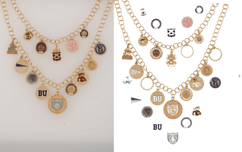

Creating Art Direction Guidelines for Your Jewelry or Fashion Brand’s Photoshoot
Most jewelry and fashion brands arrive at a shoot with their positioning clearly defined. The brief says luxury, craftsmanship, timeless design. The product delivers on that. But the images come back and something is missing — the mood does not match the message, the campaign looks like it could belong to any brand in the category.
Art direction is what closes that gap. It takes a brand's positioning and translates it into specific visual decisions: which surfaces, which quality of light, which model posture, which props stay in the frame and which ones are removed. Without it, photography produces attractive images. With it, photography produces a recognizable brand.
In jewelry and fashion, the difference is material. A ring can look delicate or inexpensive depending on the light source. A dress can read editorial or mass-market depending on how it is framed. Art direction determines how valuable, fresh, or desirable a product feels before the viewer has processed a single word.
Part of our complete guide: eCommerce Brand's Guide to Jewelry Photography
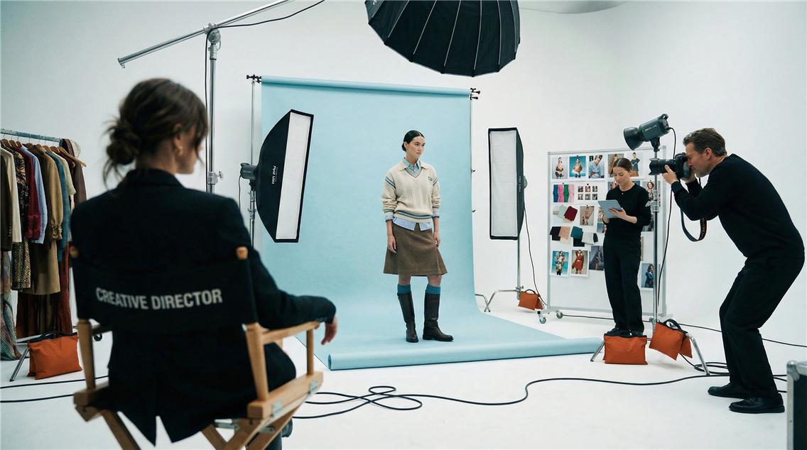
Creative Direction vs. Art Direction: Understanding the Difference
These two terms are used interchangeably in the industry but they operate at different levels.
Creative direction defines the brand's long-term visual identity — the overall aesthetic voice, the emotional territory the brand occupies, the governing logic behind everything the audience sees. It is strategic and persistent across seasons and campaigns.
Art direction applies that identity to a specific shoot or campaign. It is tactical and immediate. If creative direction says "modern minimal luxury," art direction decides how that actually looks on set: the surface textures, the light quality, the casting choice, the shadow depth. Creative direction is the brief. Art direction is the execution of the brief.
For a full breakdown of how these roles divide in commercial production: Creative Director vs Artistic Director in Commercial Photography
Building Art Direction for a Campaign or Single Photoshoot
Art direction turns abstract brand values and strict guidelines into structured creative decisions. Every lighting choice, texture, and prop begins to work together toward one emotional goal: to make the viewer feel your brand. Let’s break the process down step by step.
Step 1: Concept Foundation
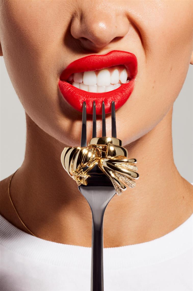
Art direction starts with this conceptual foundation. It’s where your brand’s creative direction and marketing goals are distilled into one particular campaign message that can be expressed visually. Without it, even the most beautifully executed photo shoot will lack cohesion or meaning. A strong concept answers three key questions:
What are we communicating beyond the product?
Your campaign might aim to convey craftsmanship, sustainability, sensuality, or confidence, but you must define which of these becomes the emotional anchor. For a jewelry brand built on heritage, “time and continuity” could drive the shoot’s pacing, lighting, and model gestures. For a fashion label celebrating youth, the concept might focus on motion, spontaneity, and imperfect authenticity.
What emotional tone should the viewer feel?
Serenity can be expressed through symmetry, soft focus, and pastel tones. Desire can be communicated through contrast, proximity, and rich shadow work. Strength can come from bold composition, direct gazes, or architectural framing. This emotional tone becomes the invisible language your visuals speak before anyone reads a word.
What context frames the story, and why?
A minimalist studio setup might represent timeless craftsmanship. A warm, imperfect interior could express intimacy and authenticity. An outdoor shoot at dusk could symbolize transition, evolution, or aspiration.
Without a concept foundation, every new shoot risks drifting away from the brand core, as teams might rely on surface trends. By defining the concept first, you’re effectively writing the “visual thesis” of your campaign. It also helps align all stakeholders: your photographer, stylist, marketing team, and post-production studio. Everyone knows not just what to create, but why it should look that way.
Step 2: Moodboard and References
The moodboard turns abstract ideas into something everyone on the team can literally see: lighting tone, composition rhythm, emotional temperature, and material direction. In jewelry and fashion, a moodboard guides production decisions.
Why Create a Mood Board?
A mood board serves as the foundation for your creative process. It allows you to:
Define Your Visual Style: Decide on the overall aesthetic (minimalist, bold, vintage, modern, etc.) that aligns with your brand.
Plan Poses and Storytelling: Identify the types of poses or scenarios that will best showcase your products.
Specify Model Types: Determine the physical attributes (age, body type, gender, etc.) that align with your target audience and product needs.
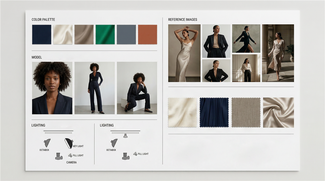
A professional moodboard is a visual strategy document, a concise summary of how your campaign should look, feel, and move. It ensures every department, from the photographer to the stylist, makeup artist, and retoucher, interprets your brand the same way. Core elements to include:
1. Lighting
Show examples that clearly demonstrate: The type of light (daylight, strobe, tungsten, continuous, etc.), the direction (front, side, top, rim), and its intensity, the shadow structure, whether it is soft, diffused, or hard-edged.
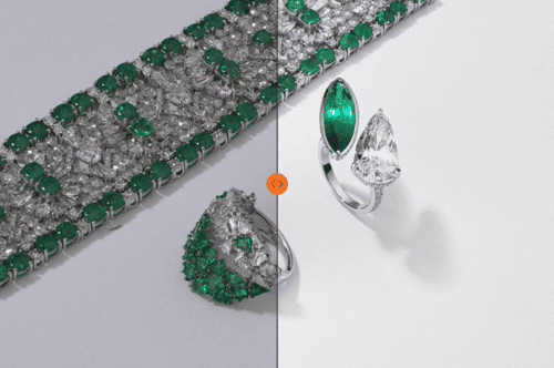
Lighting defines mood more than any other factor. For example, jewelry campaigns often favor side or top lighting to emphasize sparkle and texture. Fashion brands working with natural fabrics might prefer diffused daylight for softness and realism. Avant-garde fashion often experiments with color gels, reflections, or architectural light play. Don’t just pick what looks beautiful; choose what expresses the campaign emotion defined in your concept.
2. Color Palette
Colors shape perception subconsciously. They carry emotional and market associations. A good art direction moodboard limits itself to a defined range of hues — ideally 3 to 5 primary tones, with accents. This helps control post-production consistency later.
3. Mood and Emotion
This is where you define what the audience should feel. Include 4–6 key visual references that capture the emotional texture of your story. These can be architectural, cinematic, or textural references. When you present your moodboard, use short descriptors: “weightless, tactile, timeless” or “graphic, cool, directional.” These words anchor the interpretation for the creative team.
4. Textures and Materials
These references connect the concept to tangible surfaces. For jewelry, that could be stone veins, silk reflections, brushed metals, or sand textures. For fashion, fabrics, folds, or architectural lines that influence styling direction.
5. Composition and Framing
Show how close or far you want to be from the subject. Should jewelry fill the frame or appear in lifestyle context? Are you aiming for symmetry, balance, or asymmetry? Is the camera static or dynamic (motion blur, tilt, etc.)? This part sets the visual pace of your shoot.
A detailed mood board clarifies your vision and streamlines the model selection process by providing a clear framework for what you're looking for.
Step 3: Casting, Styling, and Posing
If concept and moodboard define what the shoot communicates, casting, styling, and posing determine who delivers that communication and how.
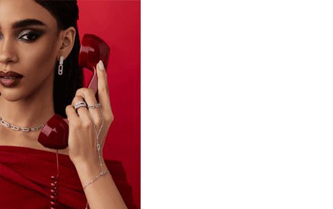
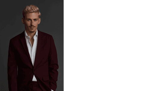
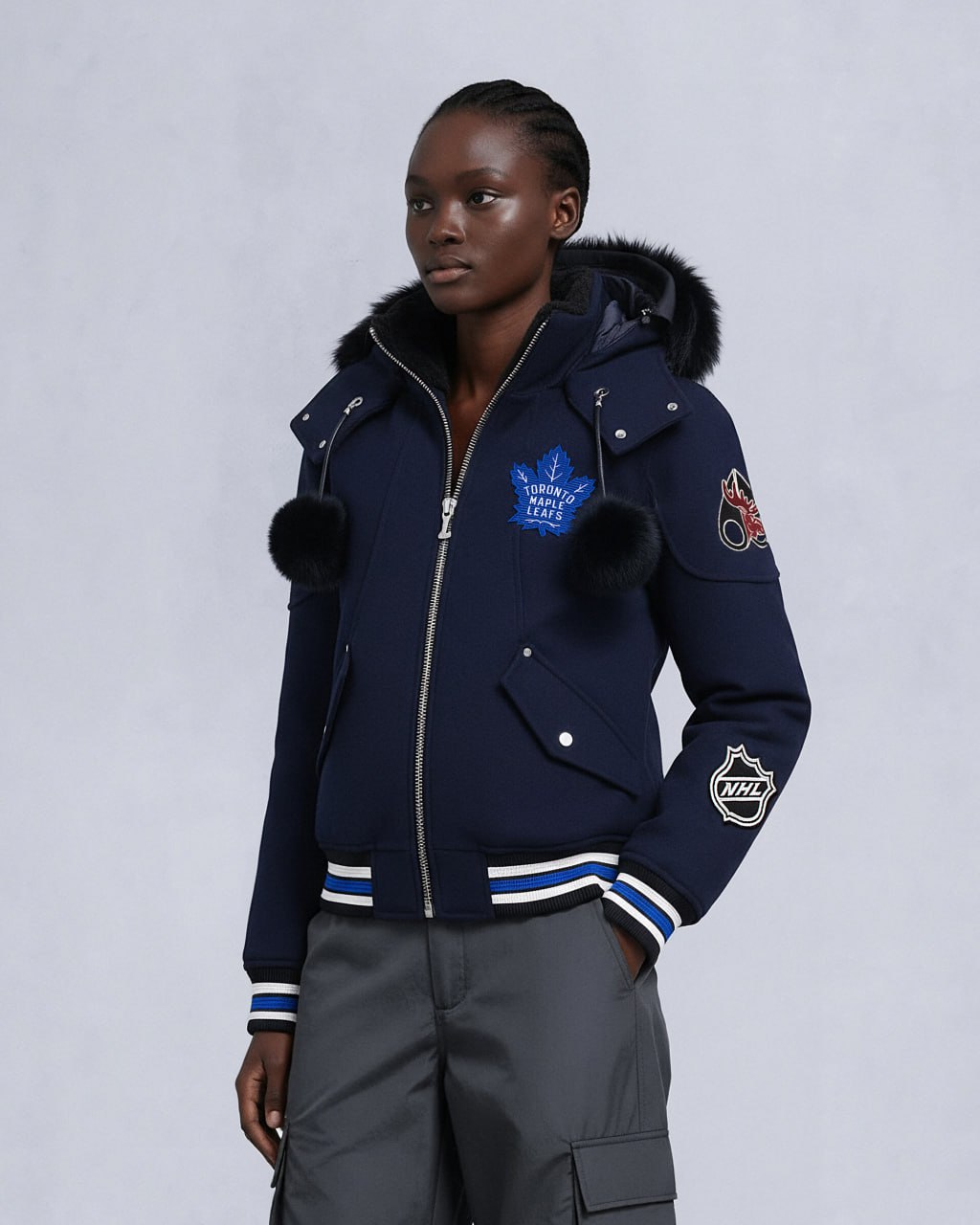
| Model casting is not about selecting the most conventionally attractive model. It is about finding someone who embodies the brand archetype — typically a representation of the customer's identity rather than a generic beauty standard. Model references in the art direction document should show gesture, posture, energy, and emotional register. Whether the model reads as introspective and still or dynamic and expressive, distant and sculptural or warm and accessible — these nuances directly shape how the campaign reads. Related read: The Smart Way to Find and Choose Models for Your Brand Photoshoot | 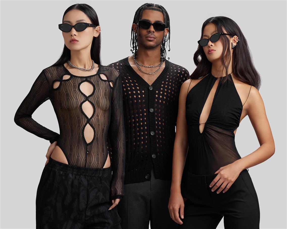 |
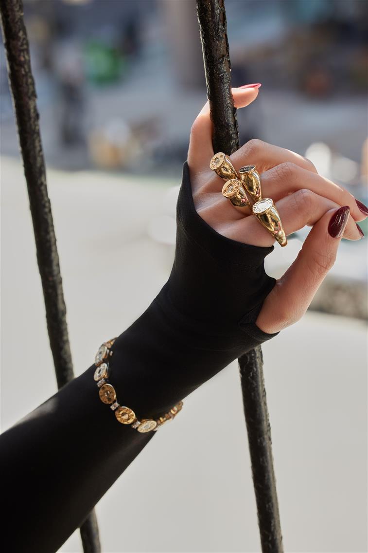 |
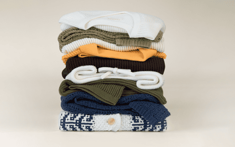
Styling builds the framework around that identity. For jewelry, styling should amplify scale and texture: necklines that frame pendants, sleeves that direct attention to hands, fabrics that contrast with metal surfaces. For fashion, the focus is on silhouette, movement, and material dialogue. Styling direction should also address visual continuity across looks — color transitions, fabric tone, and layering logic that maintains balance throughout the series. Related read: Why Your Shoot Needs a Professional Fashion Stylist |
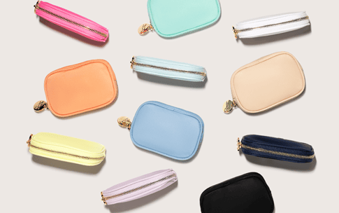
| Props, makeup, and hair complete the narrative. Props require justification — not decoration, but context. Makeup and hair set the realism level: natural texture for authenticity, sculpted detail for precision, wet or dewy finishes for sensuality. Related read: Role of Hair, Makeup, and Nail Artists in eCommerce Photography | 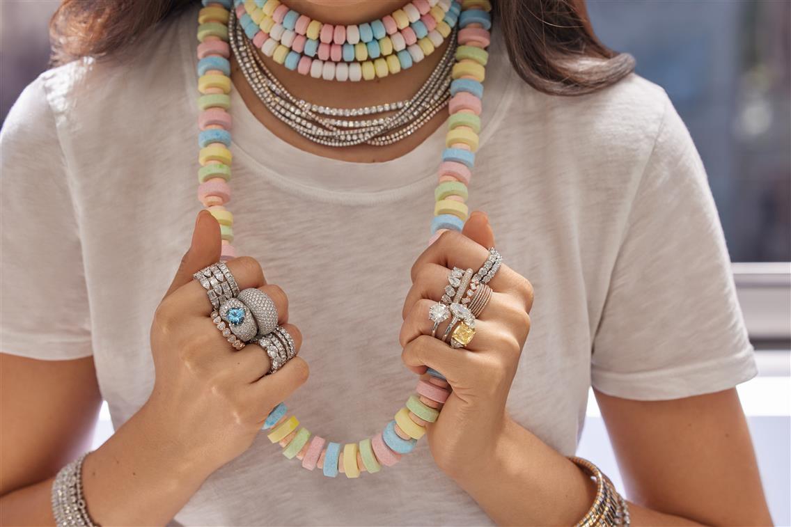 |
Finally, posing brings all of this to life. Posing is body language in alignment with the brand’s tone. Jewelry shoots often require control, hands positioned to emphasize reflection and geometry. Fashion shoots rely on rhythm, motion that feels believable yet designed. Good art direction defines not only poses but the energy behind them. It explains how a model should inhabit the scene: relaxed and human, or stylized and iconic.
In professional production, the moodboard, styling, and posing guidelines become a reference document on set. Printed or shared digitally, it guides:
- The lighting crew (to match contrast levels)
- The stylist (to balance color accents)
- The makeup artist (to match tone and texture)
- The photographer (to interpret the composition)
- The retouching team (to preserve visual continuity post-shoot)
Step 4: Shotlisting
A shotlist is the most practical part of art direction. The purpose of the shotlist is to make sure that every image you capture has a clear reason to exist, supports your campaign narrative, and fits into your overall marketing plan.
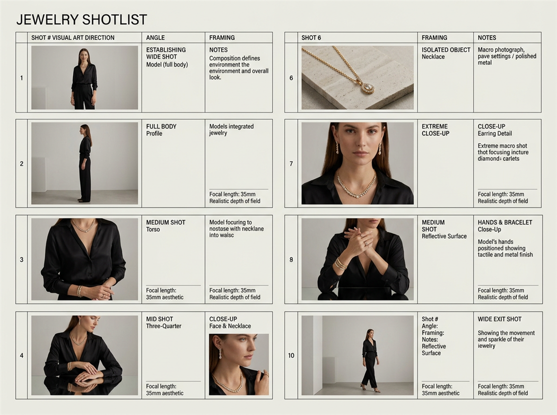
When creating a shotlist, start from the end goal. What platforms will these visuals live on? A brand’s hero campaign image, a lookbook cover, and an e-commerce thumbnail may share one concept but need entirely different compositions. Thinking this through beforehand avoids wasting time and budget on set.
- Hero visuals, usually high-end and editorial, express the emotion of the collection — the “why” behind the product. They’re about story and tone, not detail.
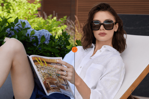
- Lifestyle shots bridge the emotional and practical. They help audiences imagine how the product fits into life. They go live on social media, website, and sometimes on product pages as well.
- E-commerce images bring discipline to the process. They’re where light, distance, and composition stay consistent across collections, ensuring visual trust. These visuals are for a product catalog for website and e-commerce platforms like Amazon.
A good art-directed shotlist connects all these in a single flow, balancing creativity with logic. It defines how many shots per product, the sequence of setups, and the camera distances. For example, if a model wears five pieces of jewelry, the shotlist ensures each one gets an isolated close-up before moving on. For fashion, it plans transitions between full-body and cropped shots to capture fabric detail, fit, and movement without breaking rhythm.
At Lenflash, we often see how this step determines production quality. Teams that arrive on set without a clear shotlist end up with additional shooting days. Meanwhile, with a structured shotlist, your lighting, styling, and posing flow naturally, and everyone from photographer to retoucher works toward the same visual intention.
Ultimately, the shotlist is about freedom within structure. It ensures that creativity doesn’t depend on luck and that every frame contributes to a coherent visual story aligned with your brand direction.
E-Commerce vs. Campaign Art Direction
Both serve the same brand but operate on entirely different emotional frequencies. Applying campaign logic to product pages, or catalog discipline to brand storytelling, produces work that functions poorly in both contexts.
Campaign Art Direction
Campaign imagery is about storytelling. It’s where emotion leads and the product supports. The purpose is to make people feel what owning a product represents. Campaign visuals set tone, aspiration, and identity, they define how your brand lives in the audience’s imagination.
The art direction for campaigns should emphasize:
- Mood and narrative: what’s the story behind the collection? What feeling should linger after someone sees the image?
- Atmosphere: lighting, set design, and movement that convey emotion, for example, soft daylight and natural materials for intimacy, or structured light and architectural backgrounds for sophistication.
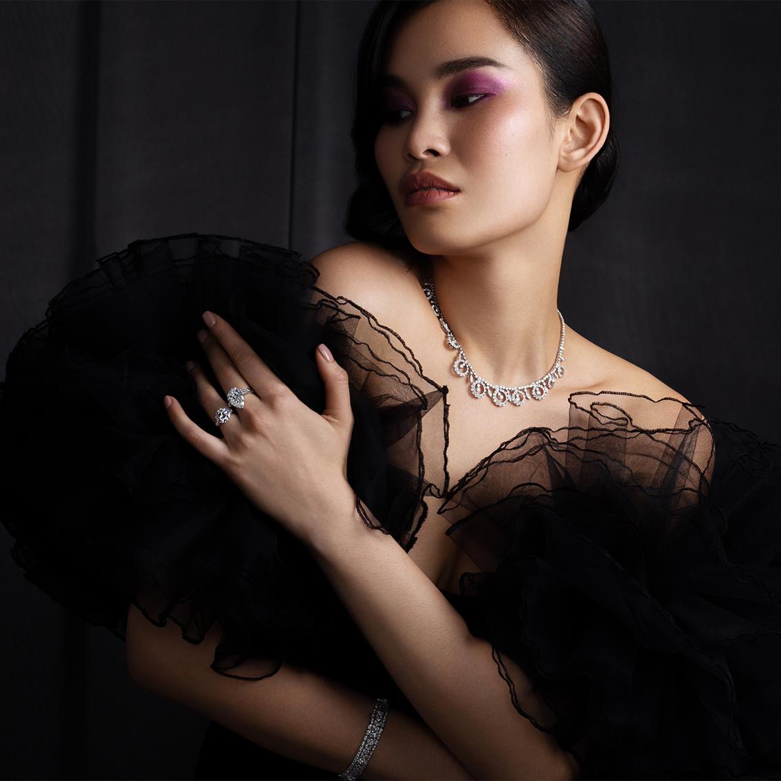
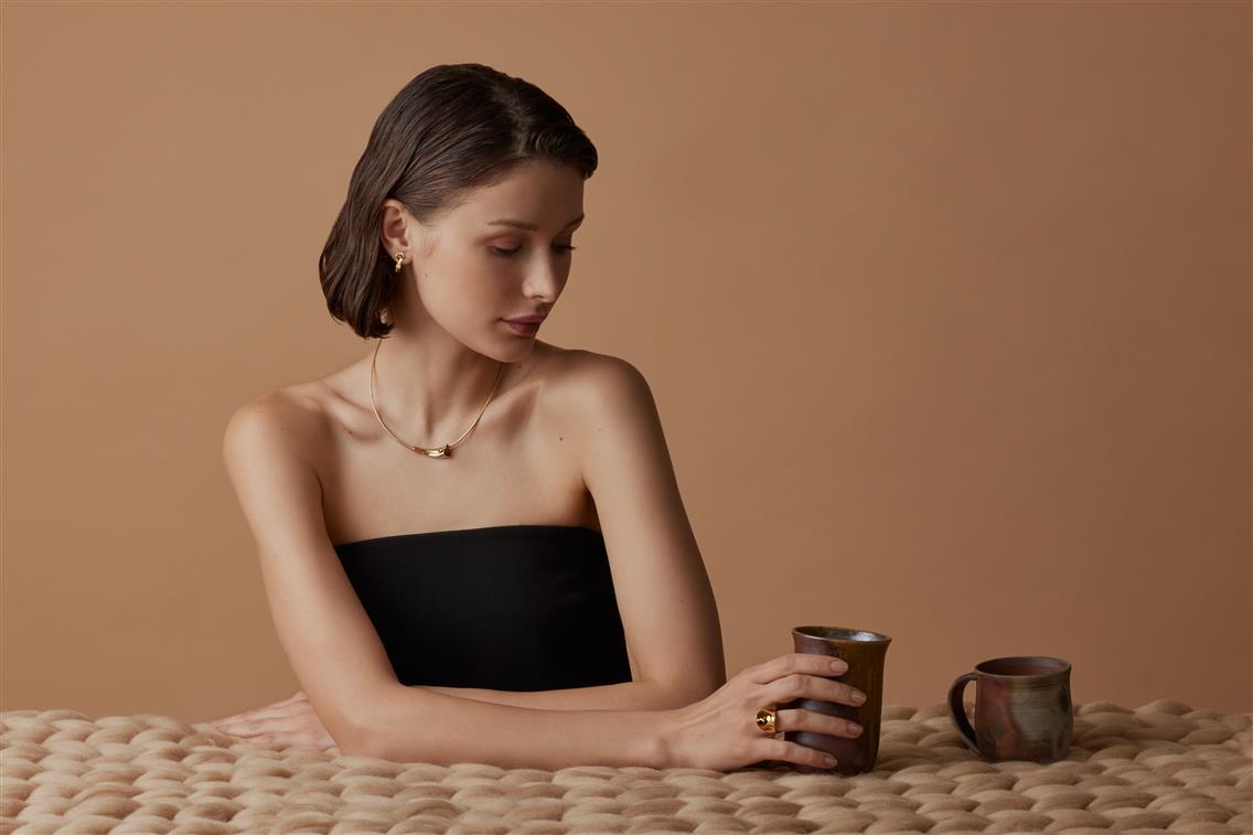
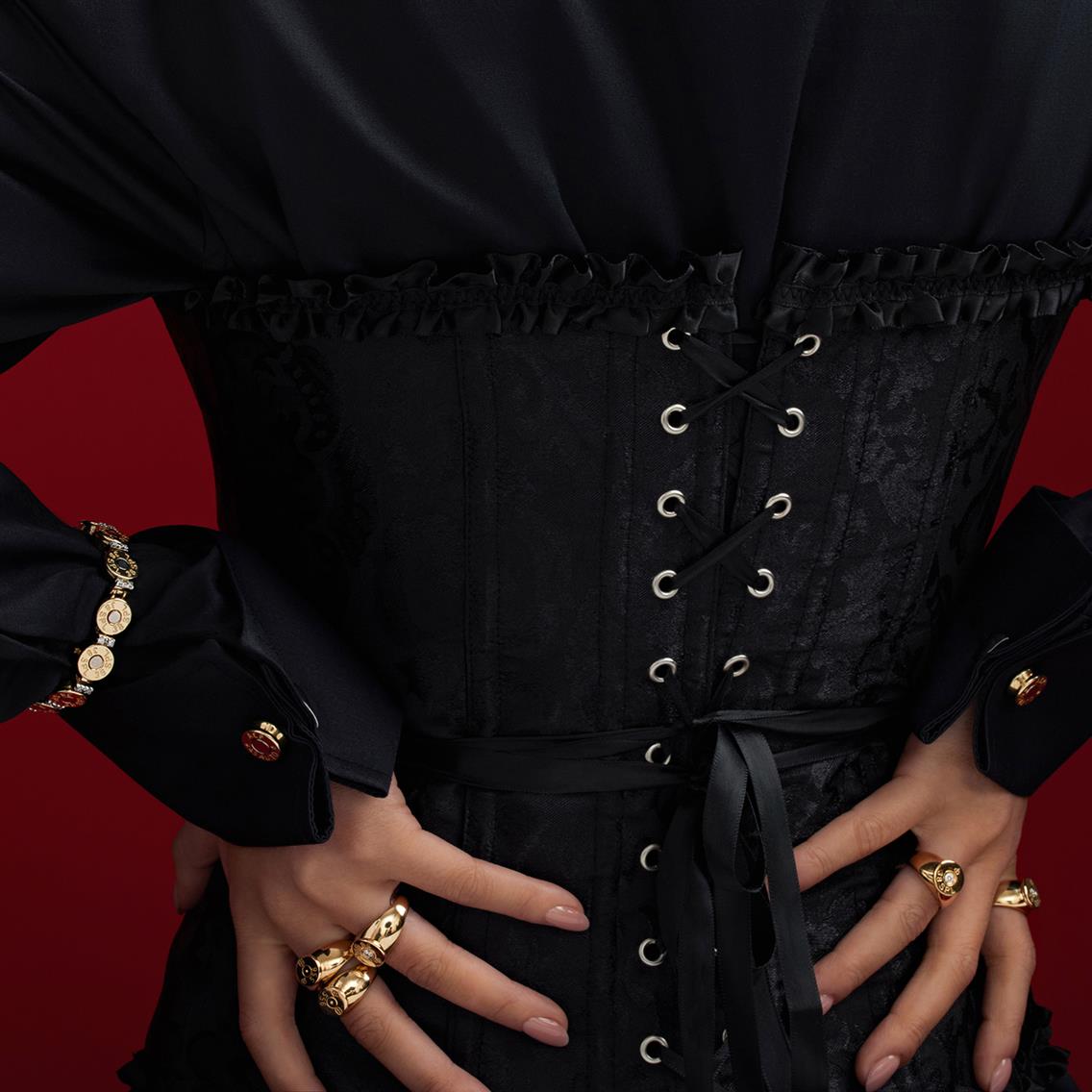
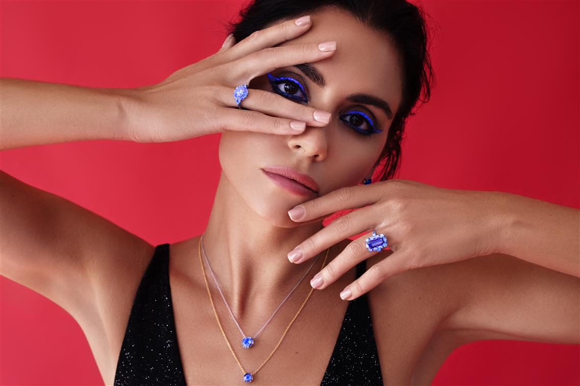
Campaigns give freedom to explore: motion, blur, unconventional crops, or experimental color palettes. They exist to build memory and desire that allows your brand to charge premium prices and stay recognizable across seasons.
E-Commerce Art Direction
E-commerce imagery, in contrast, is about precision and consistency. It’s where customers make purchase decisions, so clarity and visual reliability matter most. But “consistent” doesn’t have to mean “bland.” Strong e-commerce art direction ensures that even simple catalog images feel aligned with your brand’s aesthetic and color philosophy. A professional approach to e-commerce direction defines:
- Lighting logic: every product is photographed under the same tone and angle to maintain brand color accuracy.
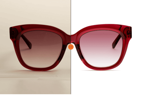
- Backgrounds: neutral, but chosen to complement your brand’s palette. For example, off-white or beige for warmth, gray or stone for contemporary minimalism.
- Angles and scale: predetermined compositions so collections remain uniform across product updates.
- Retouching style: subtle texture preservation, controlled contrast, and consistent shadow depth to create a recognizable brand rhythm.
For jewelry, this could mean maintaining a similar shadow style across the entire catalog. For fashion, it might involve consistent body framing and garment movement to ensure visual trust in fit and quality.
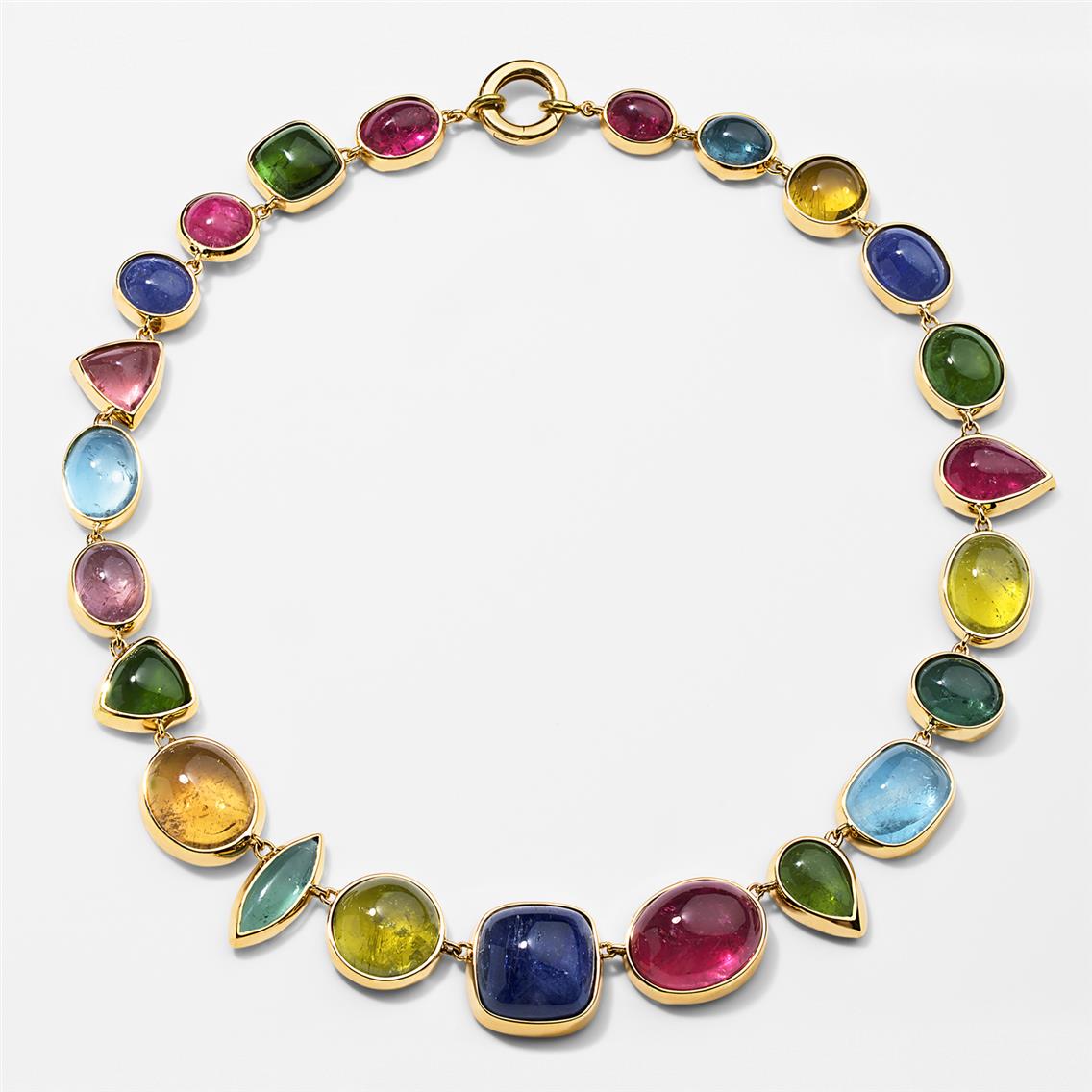
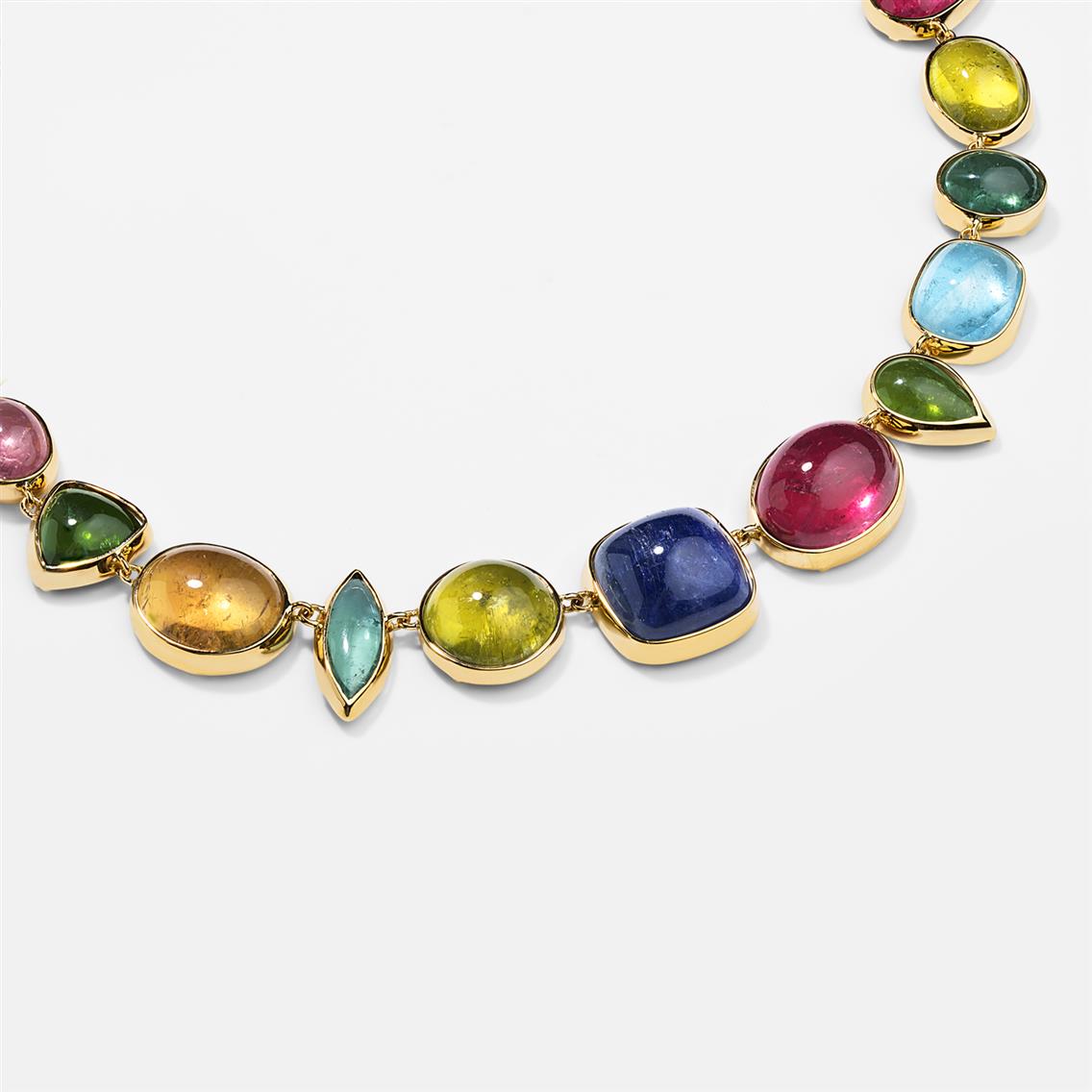
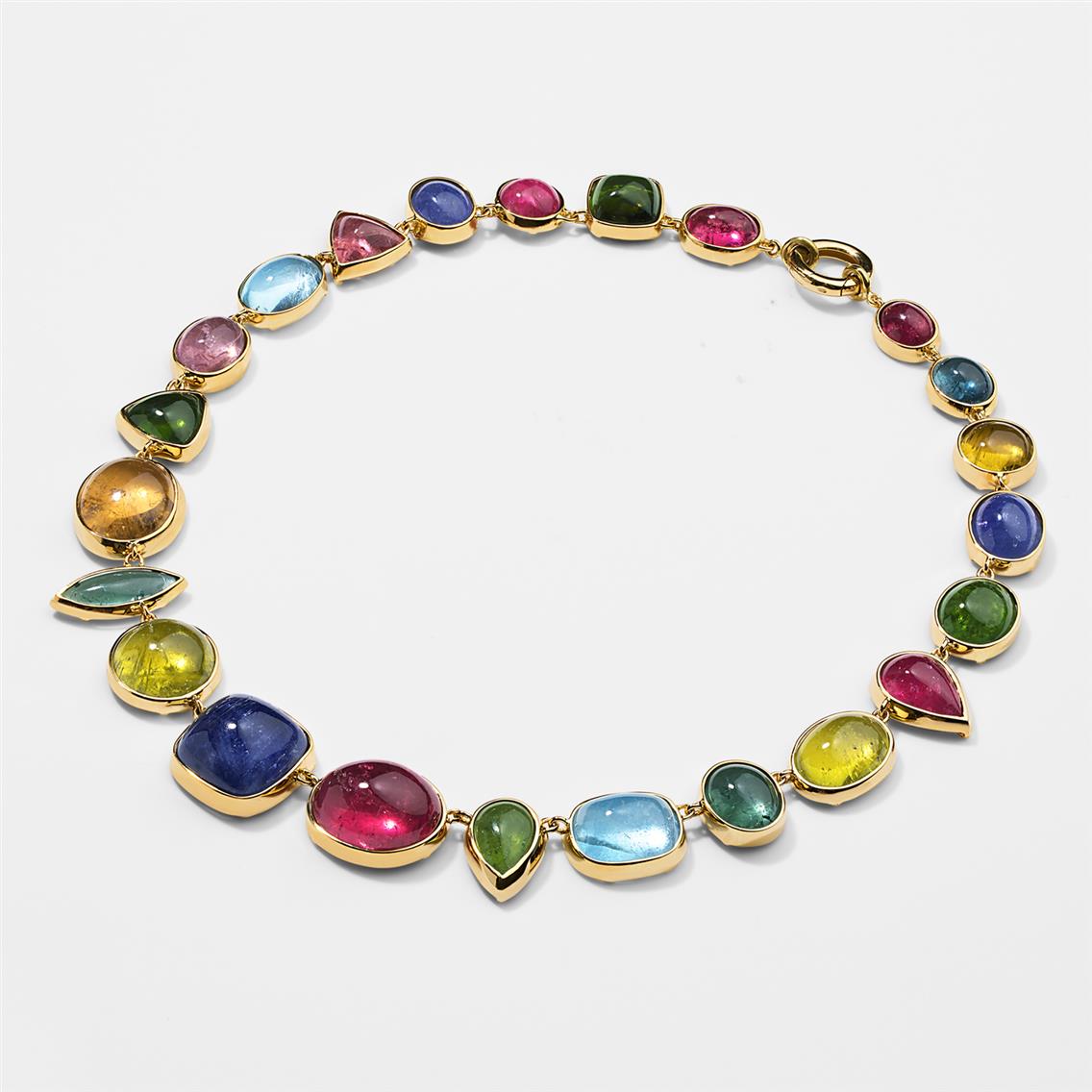
Campaign and e-commerce visuals are two halves of one brand experience. Campaigns make people want the product; e-commerce makes them buy it.
Common Art Direction Mistakes Brands Make
Most failures in brand photography are not caused by weak ideas. They come from inconsistency, overcomplication, or gaps between what was defined in pre-production and what actually happened on set.
1. Confusing Variety with Inconsistency
Visual variety and brand inconsistency are not the same thing. Switching between different lighting styles, editing tones, or photographic moods from one campaign to the next fragments the brand's visual identity. A unified emotional language can accommodate changing contexts and seasonal styling while keeping tone, composition logic, and light behavior recognizable across everything the brand produces.
2. Overdecorating the Scene
Jewelry and fashion photography regularly suffer from visual clutter. Props, fabrics, and flowers that seem artistic in isolation end up competing with the product. Every element in the frame must serve the concept. If it does not reinforce the message, it weakens it.
3. Treating post-production as a technical afterthought
Retouching and color grading are part of the art direction process. The tone, brightness, and finish level of final images determine emotional perception as much as lighting or styling do. When post-production is not guided by the same visual logic that shaped the concept, even well-executed photography can drift away from the brand's intended character.
4. Working with multiple teams without a shared framework
Different photographers, stylists, or studios interpret a brief differently. Without documented art direction guidelines, each collaboration risks pulling the visual identity in a different direction. A written art direction document lets new collaborators work within the established visual language rather than reinventing it.
5. Not testing visuals across platforms
Images that look well-balanced in isolation often lose proportion when adapted for social media, website layouts, or advertising formats. Checking compositions and color balance across devices and formats before final delivery prevents misalignment at the point of publication.
LenFlash works with jewelry and fashion brands on art direction from concept development and moodboard creation through shoot execution and post-production. Bring a brief, a brand positioning, or a product — and the visual direction is built from there.
See jewelry photography at LenFlash
Photography Art Direction FAQ
What is the difference between creative and art direction in practical terms?
Creative direction defines the brand's long-term visual DNA — the emotional territory, aesthetic values, and positioning that remain consistent across everything the brand produces. Art direction applies that vision to specific shoots or campaigns, translating strategy into detailed decisions about lighting, casting, props, composition, and post-production.
How early in the planning process should art direction begin?
As early as a campaign or product collection is defined. Art direction that starts during the shoot rather than before it typically produces reshoots, inconsistent files, and additional post-production correction. The earlier it joins the process, the cleaner the output.
What should a moodboard contain for a jewelry or fashion shoot?
At minimum: lighting references with clear direction and quality, a defined color palette, emotional references with descriptors, texture and material references, and composition examples. A moodboard functions as a production tool — every reference should inform a specific decision on set rather than simply communicate a general feeling.
Can a studio develop art direction for a brand that has no internal creative director?
Yes. Many growing brands have a strong product and a defined market position but no documented visual system. A studio experienced in jewelry and fashion photography can interpret the brand's positioning and build a working art direction framework — one that the brand applies consistently across future productions regardless of which teams are involved.
How does art direction affect retouching?
Significantly. The retouching brief should be derived directly from the art direction document — defining finish level, texture preservation, color grading direction, and shadow treatment. Retouchers who receive the moodboard alongside the files produce work consistent with the shoot's intent. Without that context, retouching defaults to a generic aesthetic that may not reflect the brand.