


Visual Branding for Jewelry Companies
Jewelry is not bought for utility. People choose it because it represents something larger — desire, trust, identity, appreciation, or lifestyle. A brand’s visual presence is what makes customers connect a piece of metal and stone with status, romance, or a sense of belonging. It’s what makes them not only want the jewelry but also want the brand behind it.
Strong visual branding makes a customer feel that a piece belongs to their world, whether that world is understated elegance, bold artistic expression, or modern minimalism. Branding is about transmitting an aesthetic and a set of values that customers want to associate with themselves.
A strong brand turns craftsmanship into aspiration. Weak branding leaves even the best designs overlooked. This article explores how jewelry companies can build visual branding that aligns with their brand DNA, influences perception, and establishes lasting value.
What Is Visual Brand Identity?
Branding starts with DNA — the foundation that defines who the brand is, who it speaks to, and how it positions itself in the market. For jewelry companies, this DNA is not abstract. It shows up in decisions such as:
- Which audience do you court: collectors of high jewelry, trend-driven Gen Z buyers, or everyday luxury shoppers.
- What role you play: for example, a house that protects tradition, or a challenger that reshapes conventions.
- What your product signals: rarity and status, affordability and fun, or craftsmanship and design.
-visuals-
Visual identity is the layer that makes this DNA legible. It’s the part of branding that customers encounter first, often before they know the story, price point, or even the product details. In jewelry, where emotion and aspiration drive purchases, visuals carry more influence than any written manifesto.
Placed within the broader branding framework, visuals’ duties are:
- Translate positioning into imagery. A heritage brand like Cartier relies on timeless campaigns with restrained palettes, while a modern disruptor like Mejuri leans on clean lifestyle photography and relatable casting.
- Signal consistency. Whether on a website, Instagram feed, or store display, the same visual rules reassure the customer that they’re inside one coherent brand world.
- Anchor perception. The way a diamond is lit, the background chosen, or the typography on packaging all work together to tell the buyer, “this is luxury,” “this is playful,” or “this is aspirational but attainable.”
In short, visual brand identity is the visible code of a brand’s DNA, the part that makes people recognize it instantly, feel its values, and decide whether it belongs in their life.
How Visual Branding Shapes Jewelry Consumer Perception
Jewelry isn’t bought the way shoes or electronics are. A necklace or ring is rarely just a product, but an emotional object tied to love, recognition, identity, or aspiration. That’s why visuals don’t just demonstrate the product, they communicate its meaning.
Jewelry as Emotional, Status-Driven, and Gifted
When customers browse jewelry online, they’re already imagining the role it will play in their lives. Will it mark an engagement? Will it project authority in a professional setting? Will it be a gift that carries weight years later? Visual branding needs to frame jewelry in these contexts. Visual content that doesn’t support the big idea strips away that meaning; a consistent visual language makes it clear how the piece fits into someone’s story.
Navigating High Competition and Crowded Marketplaces
The jewelry market is dense. Classic designs are everywhere, and overly niche or artistic products risk alienating buyers. Visual branding is how companies present themselves to potential clients. A strong identity makes them understand instantly whether it belongs to their world.
-visuals-
Visuals Influence Perceived Value More Than Pricing
The same gold chain can look like fast-fashion or fine jewelry depending on how it’s photographed, what background it’s set against, and how consistent the brand’s visuals are across channels. Consumers rarely evaluate carat weights and craftsmanship first; they evaluate what the brand looks like.
Branding as a Signal of Belonging
Strong visual branding tells the right audience: this product is for you. A modern minimalist identity appeals to a different buyer than a heritage-inspired campaign. By signaling aesthetics and lifestyle, visuals filter the audience and attract the right customers without needing to explain everything in words.
Business Advantages of an Established Brand Identity
Investing in visual branding produces measurable advantages:
- Pricing power: strong brands justify higher margins because the perceived value is higher.
- Customer loyalty: a recognizable brand world makes repeat purchases more likely.
- Market positioning: clear visuals protect against being mistaken for mass-market or generic competitors.
- Operational efficiency: once visual rules are defined, every new campaign or photoshoot has a framework, reducing wasted effort.
In a product category as saturated and emotionally charged as jewelry, perception drives business outcomes. Visual branding is the most direct way to shape that perception.
Core Elements of Jewelry Visual Branding
Visual branding for jewelry is a system of interconnected choices that together define how the brand is perceived. The difference isn't always in the metal or stone. It's in how the brand is seen, understood, and desired.
In jewelry, visual branding does something most products can't replicate: it becomes a proxy for the physical experience customers can't have until after purchase. Your visuals aren't supporting the sale,they are the sale.
Photography as the Primary Visual Branding Tool
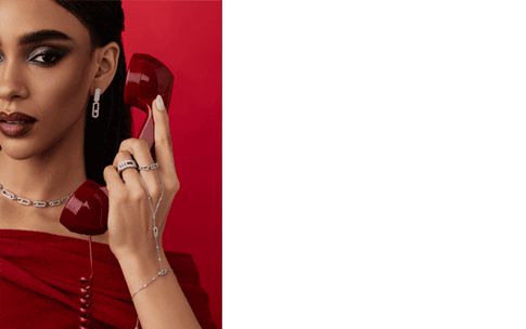
Photography is your brand's most visible language. Before a customer reads your manifesto or understands your supply chain ethics, evaluate the craftsmanship of your designs, they see your images. And in those first seconds, they've already decided what tier you occupy.
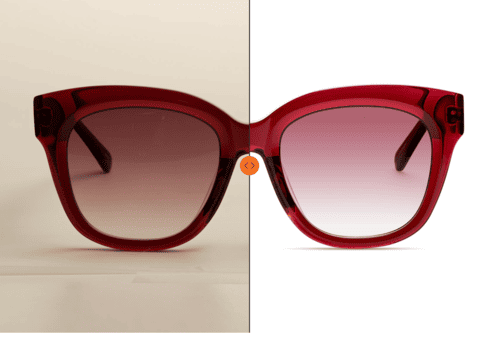
Stylistic choices define perception instantly. Consider how a single ring can tell completely different brand stories based purely on how it's shot. A tight macro crop that fills the frame emphasizes craftsmanship and detail. This is the language of artisan brands and heritage houses where technique matters. Pull back to a wide composition with generous negative space, and suddenly the same ring reads as sophisticated, refined, aspirational. The jewelry hasn't changed. The brand perception has.
Angle and composition are positioning decisions. Overhead flatlays suggest editorial, lifestyle integration. Low angles with dramatic shadows communicate bold, fashion-forward energy. Soft, straight-on perspectives feel accessible and wearable.
-visuals-
Casting and context filter your audience. Who wears your jewelry matters as much as the jewelry itself. Cartier campaigns featuring black-tie styling and formal postures communicate status, exclusivity, and occasion-driven luxury. The customer who responds to that visual language expects a certain price point, a certain retail experience, a certain social signal.
Compare that to Mejuri's visual revolution in the fine jewelry space. Natural light. Casual wardrobes. Real skin textures. The jewelry is photographed as part of daily life rather than special occasions. Same category, radically different visual branding, and therefore, radically different customer and business model.
The environment matters just as much. A diamond ring on a marble surface communicates one lifestyle. That same ring photographed on a hand wrapped around a coffee cup in a sunlit apartment? You've just repositioned the entire brand toward self-purchase, everyday luxury, and modern femininity.
-visuals-
Narrative consistency creates instant recognition. Over time, the "rules" for how you photograph jewelry become brand shorthand. Tiffany blue backgrounds, for example, are intellectual property. Bulgari's saturated color palettes and bold styling are immediately identifiable. Customers don't need to see a logo to know whose campaign they're looking at.
When your visual system is strong enough, every product shot, lifestyle image, and editorial photo reinforces the same DNA. Customers begin to recognize you from visual patterns alone.
om brands they identify with.
-visuals-
The Role of Brand Colors and Set Design in Positioning
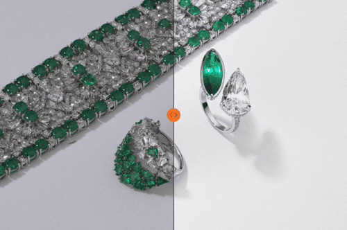
Color acts as positioning shorthand. Deep blacks, crisp whites, and metallic accents signal heritage luxury and established authority. Think Cartier, Boucheron, Van Cleef & Arpels. These colors communicate: we've been here for generations, we're not chasing trends, we're the standard.
Softer pastels and natural earth tones do something completely different, they suggest everyday wearability, modern lifestyle integration, approachability.
Bold, saturated color palettes stake out yet another territory: artistic, fashion-forward, collectible. Bulgari's use of vibrant color communicates that its jewelry is as much about creative expression as it is about precious materials.
These aren't random aesthetic preferences, but calculated signals about who the brand is for, what occasions it serves, and what value it represents.
-visuals-
Set design creates lifestyle stories. A bare studio background isolates the product and forces attention entirely onto craftsmanship and design.
Introduce a styled environment: marble surfaces, velvet textures, raw wood, architectural elements, and suddenly you're not selling a ring, you're selling the life that the ring belongs to. The same piece will feel entirely different photographed against a mirrored surface (sleek, urban, minimalist) versus captured in warm, natural light with organic textures (artisanal, sustainable, authentic).
Set design decisions are matching the aspirational lifestyle of your target customer so precisely that the jewelry feels like it already belongs to them.
-visuals-
Same colors and settings across touchpoints build trust. Here's where many jewelry brands lose their positioning: inconsistent visual treatment across platforms. An Instagram feed that feels warm and lifestyle-driven, but a website that's cold and clinical. Email campaigns that feel heritage-luxury, but product pages that look e-commerce generic.
Defining color palettes and set design rules within a cohesive brand system ensures that whether someone encounters you through an ad, Instagram post, retail display, or website banner, they immediately recognize they're in the same brand world. That consistency builds the cumulative trust that luxury purchasing requires.
-visuals-
Typography, Logo, and Graphic Integration
If photography is your brand's primary language, typography and graphic systems are the grammar. They're often overlooked, but they carry equal weight in determining whether your brand reads as authoritative or amateur, considered or chaotic.
Typography signals cultural positioning. A high-contrast serif font, think Didot or Bodoni, carries centuries of luxury publishing history. It conveys heritage, permanence, and establishment. When Cartier or Tiffany use these typefaces, they're borrowing cultural capital from editorial history.
A geometric sans-serif like Futura or Gotham does something completely different. It suggests modernity, minimalism, and forward-thinking design. It tells customers this brand understands contemporary aesthetics and isn't relying on historical legitimacy.
Typography is a tone of voice in visual form, signaling immediately whether you position as heritage institution or modern disruptor.
-visuals-
Logo treatment reflects brand confidence. Beyond the symbol itself, how you use your logo reveals brand maturity. Restrained logo placement, small, subtle, confident, communicates that the product speaks for itself. This is the approach of established luxury houses that don't need to shout.
Inconsistent logo sizing, competing placements, or overuse sends the opposite signal: insecurity about brand recognition. The logo becomes compensation rather than confirmation.
Strong brands establish clear logo usage rules: scale, placement, clear space, contexts where the logo appears, and doesn't. These guidelines are strategic guardrails ensuring every brand touchpoint reinforces authority.
How Branding Becomes Recognizable
What separates jewelry brands that people instantly recognize from those that blend into the saturated market are all three elements: photography style, color and set design, typography, and graphics work as a unified system.
When stylistic photography rules align with color palettes, when typography choices reinforce the mood created by set design, when graphic treatments frame photography consistently, that's when visual branding crystallizes into something customers can identify without seeing a logo.
This integration requires strategic thinking before the first shoot, comprehensive brand guidelines that extend beyond logos, and disciplined execution across every touchpoint from social media to flagship stores.
How Different Types of Visual Content Contribute to Brand Identity
A customer might first encounter you through an Instagram Reel, then visit your product page, later see an ad in their feed, and finally see a lookbook before purchasing. Each touchpoint serves a different function.
Because customers don't experience your content in organized categories labeled "product," "lifestyle," and "editorial." They experience it as a scattered, non-linear sequence of impressions across weeks or months. Only when those scattered impressions consistently reinforce the same visual identity does recognition crystallize into brand memory. And brand memory turns browsers into customers, and customers into devotees.
For example, on-white product photography doesn’t win creative awards. But what it absolutely does is the foundation of trust that every jewelry brand lives or dies on.
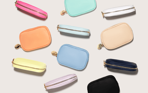
E-commerce product shots are your credibility baseline. In the online field, consistent product photography is your proof of legitimacy. Precise focus that reveals every detail, accurate color rendering, controlled reflections that show metal quality without distraction, and consistent angles across the entire catalog.
Consider how Zahn handles product photography. Their on-white shots are technically flawless, sharp, clean, vivid; they maintain luxury appeal through defined textures and consistent angles that keep pieces feeling bespoke with attention rather than mass-produced. Catalog photography is not creative in the common sense of this word, but it also bears your branding through details and the consistency across hundreds of SKUs, which creates a sense of curation and care.
-visuals-
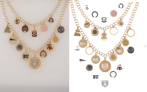
On-model catalog shots add the proportion story. Flat product shots can't communicate scale. A delicate chain that looks substantial in isolation might disappear on the body. A ring that seems oversized on white might actually be perfectly balanced when worn.
On-model catalog photography also introduces styling decisions that reinforce positioning. Wwake, the Brooklyn-based fine jewelry brand, photographs pieces on models with minimal styling, often showing imperfect hand positions and real skin texture. Their shots feel like they could be your friend showing you something special, not a luxury house presenting untouchable objects.
Contrast that with Foundrae, whose on-model catalog shots incorporate styled clothing and more considered compositions. The jewelry is still the hero, but the context is more editorial, more curated. It positions their pieces as serious investments worthy of thoughtful curation, not impulse purchases.
-visuals-
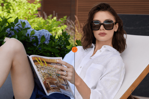
Lifestyle visuals translate the product into emotion. A ring photographed on a white background communicates its design. That same ring photographed on a hand holding a vintage book in afternoon light, or gesturing mid-conversation at a dinner table, or layered with other pieces during a weekend morning, communicates meaning.
This is especially critical for social media, where you're not competing with other jewelry brands alone. You're competing with every piece of content in someone's feed. Lifestyle photography keeps brands human, relatable, and contextual. It gives followers a reason to engage beyond "this product exists."
The key there: genuinely casual. Forced lifestyle photography, like models awkwardly holding coffee cups, obviously staged "candid" moments, undermines the very authenticity it's trying to create. The brands that execute this well invest in casting, locations, and styling that feel true to their customers' real lives, not a sanitized fantasy version.
-visuals-
Lookbook photography builds seasonal narrative. While lifestyle content can be ongoing and spontaneous, lookbooks represent considered moments where brands showcase how pieces work together, how they layer, and how they create a complete point of view.
Mejuri's seasonal lookbooks have become case studies in this approach. They photograph capsule collections in cohesive environments like a sun-drenched Mediterranean villa, a minimalist Tokyo apartment, a moody Copenhagen studio, creating visual worlds that make the jewelry feel like curated elements of a lifestyle rather than individual purchases. You're not buying a necklace; you're buying into that world.
-visuals-
Editorial Ads Campaigns plant images in cultural memory. The goal of campaign imagery is emotional resonance. These are the images that should stick in someone's mind, that surface weeks later when they're considering a purchase, that make the brand feel like it belongs in a larger conversation about style, identity, or culture.
Over time, even without seeing a logo, that saturated color language and bold simplicity become recognizable as theirs, because you are showing them pieces from that world they've already emotionally connected to. The jewelry feels precious, personal, talismanic. The campaign work creates a halo effect that elevates everything else.
-visuals-
LenFlash AI Photography Services for Memorable Visual Content
Understanding the strategic role of different visual content types is one thing. Producing them consistently, at scale, and at a level that builds brand equity rather than just fills content calendars is a moment when it’s easy to hit a wall.
Traditional lifestyle and editorial production come with brutal economics: casting, locations, styling, crew, post-production, all for a handful of images that have a limited content lifespan.
LenFlash transforms how jewelry brands create lifestyle content. Using advanced AI photography workflow with a model, trained specifically on jewelry presentation, LenFlash generates lifestyle imagery that would traditionally require full production, but without the shoots, without the locations, without the timeline, without the five-figure budgets.
Need your new collection photographed in a sun-drenched Mediterranean villa with diverse, contemporary casting? Done. Want to show pieces styled casually in a minimalist Scandinavian apartment with natural morning light? Done. Building a campaign that positions your jewelry in moody, intimate moments with editorial-quality lighting and composition? Done.
The technology handles what used to require location scouts, travel, permits, and weather contingencies, while providing consistency at scale, speed, and cost-efficiency.
Instead of one major campaign per year supplemented by weak social content, you produce editorial-quality imagery continuously. Instead of being limited to on-model shots that show a fraction of your catalog, you photograph everything styled and contextualized.
LenFlash's AI photography makes the systematic approach to visual branding, previously reserved for heritage houses with eight-figure marketing budgets, accessible to brands at every stage.
Whether you're an established jewelry brand looking to scale content production without scaling costs, or an emerging designer who needs editorial-quality visuals to compete from day one, the question isn't whether AI photography can match your vision. It's whether your current production approach allows you to build visuals at the speed your brand deserves.
Because in jewelry, what customers see isn't just marketing. It's the primary mechanism through which value, aspiration, and identity are communicated. Explore LEnFlash AI photography now!